The web style guide is an emerging tool, important for modern development. Traditionally design guides are mocked up by designers or static component guides maintained by developers. A living style guide brings the two worlds together and can provide benefits to freelancers and teams alike.
What is Storybook?
Creating and maintaining a living style guide can be a common challenge. Storybook is a framework that has quickly been adopted as a standard platform to develop and demo projects, while seamlessly maintaining a living and interactive style guide.

Despite its quick adoption, 50% of Javascript developers still haven’t even heard of Storybook, based on the State of JS 2018 survey. This is something the internal Storybook community is considering as they work on the upcoming v5.
Still, current versions of Storybook support an array of functionality that fills a variety of gaps in the modern web development workflow. This post aims to familiarize the community with Storybook’s quick startup and illuminate ways your process, your team’s process, and your mentorship can benefit.
Before continuing
After reading, you’ll be able to use Storybook to quickly prototype, more easily communicate with your team, and envision how Storybook can be extended to fill other gaps in your process.
To get the most out of this post, you should already be familiar with using a terminal and working with npm. React will be used throughout the post, but Storybook supports standard HTML and a wide-range of other frameworks such as Vue, Angular, etc.
Basic setup
The basic setup for Storybook is actually pretty quick. This simple process allows for nimble prototyping. For more detail beyond what's covered below, the official docs and learnstorybook.com are great resources.
We’ll kick things off by installing Storybook through npm. As mentioned above, this post is using the React version of Storybook. If you’re using a framework like this, you’ll need to install the peer dependencies as well.
npm i --save-dev @storybook/react

// peer dependencies

npm i --save react react-dom
npm i --save-dev @babel/core
npm i --save-dev babel-loader
Create a new directory in your project folder named .storybook/.
Inside that directory, create a new file called config.js, adding the configuration code below.
// config.js

import { configure } from '@storybook/react'

function loadStories() {

}

configure(loadStories, module)
To get it up and running, all that’s left is adding a startup script to the package.json
// package.json

  "scripts": {
    "storybook": "start-storybook -p 9001 -c .storybook"
  }
From here you can start Storybook and see the barebones configuration in action.
npm run storybook
Creating a Story
Now that Storybook is installed, you can create your first Story. Stories become interactive wrappers around Components as you build them. The Story in this post showcases a simple Button Component.
The Story file can be located anywhere in the codebase. For now, create a new file called Button.story.js and add the code below.
// Button.story.js

import React from 'react'
import { storiesOf } from '@storybook/react'

const Button = ({ backgroundColor, label  }) => {
  return <button
    style={
      background: backgroundColor
      color: white;
    }
  >
    { label }
  </button>
}

storiesOf('Button', module)
  .add('default', () => (
    <Button
      backgroundColor={‘blue’}
      label={‘Submit’}
    />
  ))
As you can see, we can already start styling with CSS-in-JS and adding React functionality inside the Story without fiddling with Webpack or Babel.
To attach this Story to Storybook, update .storybook/config.js with the path to the Story file.
// config.js

import { configure } from '@storybook/react';

function loadStories() {
  require('./Button.story')
}

configure(loadStories, module)
Now the Storybook instance in your browser should update with the new Button Story listed.
Registering an addon
Addons are what give Storybook it’s extensibility. The rest of this post details a variety of beneficial addons, but we’ll keep it simple for now.
The Knobs addon allows someone viewing a Story the ability to tweak props fed along to the Component. These props would normally be internal values passed around the codebase, but the Knobs addon allows for experimentation without all the architecture needed to reproduce.
To include any addon, we’ll need to create a new file called addons.js in .storybook/.
Install the Knobs package through npm and add a new line to addons.js to register the addon.
npm install @storybook/addon-knobs
// addons.js

import '@storybook/addon-knobs/register'
Now we need to configure our Button Story with Knobs. The full Button.story.js has been updated below.
// Button.story.js

import React from 'react'
import { storiesOf } from '@storybook/react'
import { withKnobs, text, color } from '@storybook/addon-knobs'

const Button = ({ backgroundColor, label  }) => {
  return <button
    style={
      background: color(‘backgroundColor’, backgroundColor);
      color: white;
    }
  >
    { text(‘label’, label) }
  </button>
}

storiesOf('Button', module)
  .addDecorator(withKnobs)
  .add('default’, () => (
    <Button
      backgroundColor={‘blue’}
      label={‘Submit’}
    />
  ))
Many addons require individual Stories to config how the addon will work using “decorators” like withKnobs. Decorators are a further way to extend Stories and are documented in more detail in the official docs.
Beyond the decorator, the original hardcoded props fed along to the Button component are replaced with specific calls for each variable type, for exampleboolean(), text(), number(), etc.
With the updated code, the Button Story should show a “Knobs” tabs in the Addons Panel. The button text and background color should be dynamic and easy to experiment with. This shows how helpful and simple addons can be.
There is a lot more to explore beyond this basic configuration. If you’re looking for specific documentation on any of the code used in the setup process, check out the official API. The rest of this post details how individuals and teams can include custom additions to empower their workflows.
How Storybook can benefit the freelancer
That quick setup process illustrates some of the prototyping benefits Storybook provides.
Traditionally, it can be hard to justify the infrastructure investment for a prototyping environment is practical, especially for small, short-lived freelance projects. Storybook removes that friction in the startup process and encourages a manageable workflow at scale. There is very little overhead when creating new Stories and refactoring, and there’s never a need to decouple Storybook from Components for production.
Demoing features and progress to clients becomes tangible and easily reproducible. A living style guide like Storybook also becomes an invaluable resource later on in the project’s life. It can be a quality and reassuring piece of the handover, or it can help you return to a long-forgotten project.
Architecting for communication
A regular issue when working with non-technical team members is a lack of a common vocabulary for elements in the project. Designers have created their own nomenclature, but really, when it comes to development, Components can be so specific that there likely isn't a common word for functionals so technical.
This presents challenges when trying to converse between spheres of expertise. This often results in the use of words like “this”, “that”, and “it”, which aren't descriptive and cause confusion and frustration. This then requires further mental overhead from the developer to evaluate the specific element being discussed, and even more, discern where in the codebase the functionality resides.
By matching the names of Stories to the directory and file of their Components, we provide clients and team members a common language to discuss Components. Even more, by naming the props provided to the Knobs addon, we’ve opened up our exact variable nomenclature to the rest of the team, further reducing the friction that comes with feedback.
// config.js

import { configure } from '@storybook/react';

function loadStories() {
  require('../components/Search/SearchBar/Input.story')
}

configure(loadStories, module)
// components/Search/SearchBar/Input.story.js


import React from 'react'
import { storiesOf } from '@storybook/react'
import { withKnobs, text, } from '@storybook/addon-knobs'

Import Input from ‘./Input.story’

storiesOf(‘Search/SearchBar/Input’, module)
  .add('default’, () => (
    <Input
      placeholder={ text('placeholder', 'Search..') }
    />
  ))
In the example above, Storybook would be populated with a story that matches the naming structure of the actual Component file (in this case the SearchBar Input). This allows clients and teammates insight into how we (the developer) work within the codebase, providing an exact name and location for the functionality they are referencing.
How Storybook helps product teams
The style guide has emerged as an important tool for modern product teams through a similar evolution to Wireframes and User Flows. Designers and product teams learn how to fill the gaps in their workflows with new, flexible, tools.
Styles guides expand on the flexibility of traditional design tools, building in further benefits. By creating a tangible place for the team to centralize around, designs become concrete and branding clear.
This consistency facilitates a more efficient production cycle and encourages innovation. It ensures everyone is on the same page, reduces overhead, and keeps the product maintainable. On the customer end, consistency makes products more user-friendly, which translates into more engagement and sales.
Static style guides vs Living style guides
While all these benefits are great, static style guides, hardcoded versions of components alongside documentation, quickly become out-of-date and hard to maintain. Living style guides avoid this issue by updating along with production. This reduces the time spent on maintenance, which could be better spent on user research and handling technical debt.
With regular access to a living style guide, design becomes everyone’s job. Just like with a public beta, UX edge cases get rooted out by interacting with the elements directly and individually.
Team-wide
This constant tangible place to interact with components, without the need to spin up an environment, becomes a great benefit for product teams.
As mentioned above, by naming Stories to match the codebase directory structure, a common language is created to communicate about Components large and small. With the Knobs addon, feedback for developers can be more exact, returning values in Hex, RGB, arrays, or even exact JSON object shapes.
Beyond the Knobs addon, there are several other official and community addons that teams can benefit from.
Jest addon
Jest is a popular option for writing unit tests. Most testing is run as a separate script, traditionally as part of a build script. This works great for developers, but the test results and logic are often hidden from any non-technical team members.
With the Jest addon, test results can be populated into Storybook automatically. By displaying the results and descriptions inline with Components, teammates can read through tests to get a sense of how things work. These logical checks from other humans can be helpful to circumvent common problems with unit testing, tests passing with logical bugs and miscommunication on implementation details.
Links addon
Because Storybook manages the Story state in the URL, links and redirects from within Components aren’t executed. This can create inconsistency when testing user flow. To root out any possible edge cases, Components should be reproduced in an environment that can match the production experience.
To resolve this issue in Storybook the Links addon was created. It enables navigation between Stories in a way that matches the UX of browser navigation and redirects. This smoothens some of the friction that can come with testing UX in a style guide.
storyshots-puppeteer addon
Puppeteer is an open-source project released by the Chrome team to allow the isolated execution and simulation of web code. This enables more precise server-side testing and even rendering.
Jest Snapshots, and by extension, Storybook Storyshots, are flat text files with hardcoded versions of the Components. These can be used to easily reproduce and test the Component for consistency, literally, line-per-line.
The storyshots-puppeteer addon combines these technologies and allows the snapshots to be rendered. This can be a seamless way to integrate visual regression testing.
Beyond the testing benefits, the addon generates image files of the screenshots for each of the Story snapshots. This becomes a reliable place for non-developers to find high-quality marketing materials without creating them manually.
QA
Being able to quickly reproduce and diagnose a bug is vital for successful Quality Assurance (QA). Storybook provides that environment to QA team members out-of-the-box. And with the Links addon mentioned above, human end-to-end (E2E) testing becomes even easier.
Viewport addon
Beyond the Links addon, the viewport addon enables tools for quickly resizing a Component to screen size presets. This streamlines the tedious process of device testing and encourages the natural responsiveness of the web.
Even more, the viewport addon can be combined with the storyshots-puppeteer addon to handle device-specific visual regression testing.
Designers
Designers have become familiar with the emergence of tools to quickly wireframe and document user stories.
Just like with the rest of the team, style guides are significant tools to designers because they provide a tangible place to interact with designs. On top of this, other design systems, like atomic design, become more maintainable when built alongside style guides.
Though style guides aren’t the newest innovation, Storybook can provide a few key benefits that aren’t present in even the most modern design tools.
Inline Designs
Even with well organized teams, it can be a struggle to keep the latest mockups in sync with all team members. Designers often make small tweaks and keep a separate drive full of “final” designs. Their latest version of the mockup may be different from the latest version the team or the developer has.
The Figma and Brand.ai addons bridge this gap by inlining the designs directly from their source alongside the relevant Component.
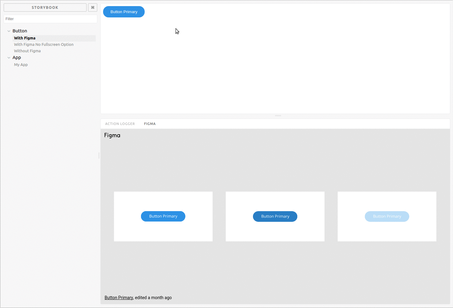
In this way, Storybook becomes the “single source of truth” for the latest designs and a solid connection between design and front-end. Stray pngs and project files are no longer considered the “latest version”.
Anyone who needs the Component can see what the latest version of it should look like. And much like Jest testing, this enables non-technical teammates the ability to check the UX against their assumptions about the mockup.
Export Story to Sketch
For the right team, the story2sketch addon can provide monumental benefit. Beyond inlining static designs, this addon allows the conversion of Stories directly to Sketch project assets.

Onboarding new team members
No matter the role, a style guide like Storybook is a great place for new team members to get familiar with the product. As senior members move on, a living style guide is a way to preserve a common design language and coding style from generation to generation.
For designers, the style guide can be a place to explore and experiment without stretching beyond the project’s branding or re-inventing design elements. Often these new designers can struggle finding their place and a style guide can give them somewhere to start.
For developers, a style guide like Storybook is a way to get familiar with the codebase and the building blocks of larger architecture.
A few addons enable further benefits for team members new to the product.
Source Code and Readme addons
The source code and storysource addons add the source code for the Story inline with each Component. This, along with the readme addon, can provide all the documentation needed to get started with any Component in the codebase.
Versioning addon
The versions addon provides a way to traverse past versions of the Storybook build, allowing the entire team the ability to explore the product’s history. This can teach new members about the product, and can even be an educational tool for those trying to understand why a past feature failed.
Joel Chippindale discussed a similar way of using git commits to document a precise history of codebase evolution at LeadDev 2016.
How Storybook helps learners
Beyond yourself and your team, Storybook can be a huge help to new developers and beginners. Just like when onboarding new team members, Storybook provides a consistent platform to demo components, familiarize yourself with a codebase, and interact with community projects.
Because Storybook is framework agnostic and doesn’t require specific framework knowledge, it’s more approachable than a lot of the JS ecosystem. Just like CodeSandbox and Codepen, Storybook can be a playground to work with complex tooling without diving into build requirements.
Conclusion
While steadily growing, the applications of a living style guide as extensible as Storybook have yet to be fully fleshed out. With a few addons and a simple setup, you can jumpstart a scalable project. And as a single source of truth, a product team can build tooling that makes the process fluid.