
3 Steps to Scalable Data Visualization in React.js & D3.js
This article will go through the 3 essential steps of a scalable way to visualize data with React.js and D3.js. The tutorial is based on the Codementor Office Hours hosted by Zach Nation, a software engineer at Dato.
Codementor Office Hours with Zach Nation: Scalable Data Visualization in React.js
Why Use Data Visualization?
Just to give some context for what we’re doing, a developer has to go through four steps when building a predictive application:
Step 1: Understand the data.
Step 2: Pick out some relevant information. Data scientists will call this feature engineering and feature selection.
Step 3: Build a model, which essentially involves taking some machine learning algorithm and training it on the existing data that you have, using the features that you’ve selected.
Step 4: Deploy the model. This involves a production life cycle. Web developers will be familiar with these steps, where you’re taking something you’ve developed on your machine and deploying it to production. You’d have test infrastructure, monitoring, etc. that to make sure it’s working and behaving the way you expect.

Throughout this whole pipeline, data visualization can be a really important tool to helping you understand everything from what’s in the data itself to how you’re manipulating that data, how a model is working and performing, and then how a service is working and performing in terms of things like latency and through-put. Human beings are really good at visual pattern recognition.
The Benefits of Data Visualization
There are a lot of types of data, data sets and shapes of data where looking at summary statistics does not give you a very clear picture of what’s actually going on in the data. However, visualization can immediately give you that picture without having to dig too much deeper or spend too much time on it. It’s a very quick way to get an understanding of the shape of some piece of data.

The example shown above is called Anscomb’s Quartet, and this is the classic example in data visualization of why visualization is necessary in the first place. As you can see, each of these examples has the same summary statistics but clearly they are very different data sets, so that’s just one place where visualization is a very important tool.
Real World Example: Bitcoin Transactions

The data above is a hex dump of a real world example on Bitcoin transactions. It’s a larger data set than you could typically fit in a browser, so I think it’s representative of the types of challenges that we’re facing. It’s sequentially arranged which means we can visualize it while streaming the data through.
Parsing the Blockchain
For the most part, the hex dump above is binary data, so it’s hard to make sense of. However, I did start to notice a pattern: this repeating F9BEB4D9.

That’s actually the magic header for each block in the blockchain. A Bitcoin blockchain is essentially one long array of blocks, and each block represents a set of transactions on Bitcoin. In other words, it’s a giant public ledger that everyone writes to by performing transactions and all of the data is stored sequentially here and it can be parsed out. I actually wrote some JavaScript code to parse the data, loaded it up into GraphLab Create as an SFrame, and got some really useful display of what was actually going on in that file.

As you can see, we have about forty-five million rows. This has now been parsed out into individual transactions. We have transactions numbers, and each transaction has a timestamp and an amount. There are some other data as well in that blockchain that I did not include here just for brevity (e.g. a to and a from address). Essentially, you can think of this as a long list of transactions and transaction amounts.
Visualizing the Data
I’m actually just going to run my local copy of this demo code. For those who want to follow along with the code at home, this is actually on Github. This is the same demo and the set of slides that I used at ReactJS Conference, but I’m going to go into a lot more depth here about how to actually structure the code, how to do data transfer between node server and a React application with a large amount of data like this, and how to use D3 to contribute information to a React component but still use React for rendering.
The demo is a small component I built to show the total number of Bitcoin transactions per day over time, and I have a node server going in the background that’s processing this blockchain. In other words, this demo actually using the node binary to parse the raw blockchain.
It helps that the Bitcoin blockchain is arranged sequentially over time because we can stream through the whole file in a single linear pass and we don’t have to do any more complicated transformations to get a good visualization out of the data.

As you see, the demo gives me a histogram showing the total Bitcoin transaction amount per day, so we’re binning on each day and then showing a bar for each day that happened historically. At the same time, we have a history log, which will update over time as we move into the future in the blockchain.
I also found a Wiki page that detailed the history of Bitcoin, and I just took down what was the date on which each event occurred. In my React component, I am filtering on the max date of what’s being displayed here to know what to display in this component as well.

So, the graph will help you easily see some interesting correlations between the real events in the blockchain and large spikes in the transaction volume. For example, when the exchange rates were published, that correlates to a really big spike because that suddenly indicates to people: “Now I can trade Bitcoin for real dollars.” So you can see actually real world events do correlate to changes in transactions volume, and that’s something visualization can tell us much more easily than if we were to try to just look at the raw data or summary statistics to get the same information.
Challenges with Visualizing Large Data
The biggest challenge involved in visualizing large data sets is condensing that amount of data into a smaller set of visual elements. We start with over twenty gigabytes of raw data, but we clearly can’t ship all twenty gigabytes to the browser. Therefore, we have to have some architecture that lets us do that data reduction and aggregation on the server, and then send a smaller amount of data to the client to render as visual elements (anything that shows up in a plot, including a history ticker, access data, labels, and all the data points themselves that are showing up in that plot.)
Another challenge is maintaining a high level of interactivity and performance while doing computation in a streaming fashion.
The third challenge is maintaining the interaction state across the whole-application UI and controlling server-side long-running computation based on that UI state. I’m not going to get into this challenge too much in this article, but that’s a big challenge for data analysis in general, because if you’re switching back and forth between large data sets, now you have to manage what’s in RAM on the server based on the UI state on the client. We have an architecture where your server is running on localhost, and you can think of that as an implementation detail because the whole thing is one application running on your machine.
It turns out, these are actually the things ReactJS is good at!
Visualizing Data with ReactJS: an Overview
Rendering visual elements, maintaining interactivity, and then keeping track of state suddenly became easy when I started using ReactJS. Now that we’ve been using it at Dato for about a year, I think it has been a good fit so I’m happy to keep doing it and I’m glad to tell the world about how we’re doing it. Below is a Pipeline for Data Visualization:

To get a raw data like that twenty-gigabyte blockchain into a rendered visualization that shows up in the browser, the first step you’d have to do is aggregation or data reduction to get some other visual result. This involves essentially taking that data and turning it into a smaller amount of other data that will represent the plot more directly. However, we’re not really plotting twenty gigabytes of data here, as most plots can’t really accommodate that much data to begin with. I don’t think as humans we’re really capable of looking at say twenty million or forty million unique points of data anyway, so this is a critical step in understanding what’s in that data overall.
The next step is to describe the scene graphs, where you’ll be taking that aggregated or reduced data and turning it into a set of visual elements. This means going from a block of data (e.g. an array of numbers) into things that we can think of (e.g. axes, tick marks, labels, the width and height of bars on the screen, etc.) This is something that d3.js is traditionally really good at. I’ve always been a big fan of D3 and it’s a huge tool belt library for visualization in JavaScript, and it’s sufficiently low-level to let you express whatever you want to express to craft any visualization you want to. D3.js has a lot of really good tool kits for things such as scaling, so you won’t have to reinvent the wheel as you’re constructing visual elements out of aggregated data.
The final step in this pipeline is rendering. A lot of people use D3.js for this as well. It has its own data binding solution, although considering we have a larger application in ReactJS, I prefer to use ReactJS for this rendering step as well. So you take in the visual elements, put them on the page as SVG or as a Canvas element, and then do some data binding (at least in the case of SVG.) Neither D3 nor React have a good abstract way to do data binding to a Canvas element, but Canvas is essentially an immediate mode UI anyway, so you can just redraw the whole frame or every frame if you need to, assuming it doesn’t take too long or you may have to micro-optimize.
Step 1: Data Aggregation
The first step of aggregation or data reduction is designing and optimizing a data pipeline that will reduce a large block of data (e.g. two terabytes of data) into a form you can ship over to a browser.

The first principle you have to follow is compute close to the data. You can imagine it this way: you have a very beefy server with a huge amount of data on it and a really, really tiny pipe to a web browser. That web browser is where everything is ultimately going to get displayed, but you can’t just ship over all of that data. If you were to try, it might crash your browser long before it all gets there. So, always compute close to the data. Do the data reduction where the data is.
The FLUX Architecture

To accomplish this data reduction, we use an architecture that is flux-like. I’m sure a lot of you are familiar with this diagram above. You have a dispatcher and a store component. Dispatcher’s responsible for taking actions and making changes in the store. The store is essentially responsible for being the single source of truth about state. Everything flows from the store into the view, which actually renders on the page. Overall, this helps you keep track of stat changes throughout the whole application. We use a very similar architecture for the GraphLab Canvas:

However, as you can see we’ve actually replaced the dispatcher with an xml http request and/or web socket, so essentially we’re crossing the wire over the network for every action. Furthermore, our store is actually a stateful object on the server which, unlike most flux implementations, this simplifies state management quite a bit because we don’t have to keep anything in sync across the client and server. Everything goes to the server and the server is the single source of truth.
This works because our application is on localhost, so this is not necessarily an architecture I would recommend an internet-facing application. However, if you’re building something that reads off of your local disc and then is rendering in a web browser with a server on localhost, this could be a good architecture. I know it’s been good for us.
Scalable Aggregation
Techniques
Some of the types of data aggregation we do are binning. If you’re doing binning in one dimension, you get a histogram (which is essentially a bar chart). It’s almost like pivot tables if you’ve seen that in Excel, where you can count items into ranges, and then you display the number of items that fall into each range. So here’s a visual example of that:

As you can see, we’ve got equal width bins here. The first one has one item, the second has four and so on.
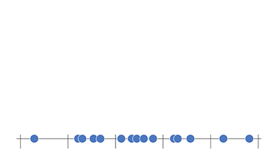
Essentially you just count the items, then you have bars whose height is represented by the count of items in each bin and you’ll get a histogram.
This is an effective data reduction technique because now we have five data points where we used to have quite a few. If you do this in two dimensions, you get a heat map. You can think of it as a scatter plot. It’s a 2-D plot with typically two variables or two columns in the same data set plotted against each other. With a heat map, you’re using color to represent the density of points in each region. Another technique we use is sketch data structures. If you use a linear algorithmic complexity (with 1~3 passes over the data), you can get accurate statistics in some cases, and approximate statistics or approximate results in other cases. And you can do so in a streaming fashion, which means you can start rendering the visualization before the sketch is complete.
Streaming is key to everything we’re doing in GraphLab Canvas because one of the principles in developing this is to prevent the user from waiting. If you’re dealing with large amounts of data and doing everything as batch processing and you have to wait fifteen minutes until your data has been aggregated, you’d lose your flow, essentially because your software interrupted you. That’s not a user experience that I would want to deliver, which is why we have a principle of streaming everything we do to get immediate results. And we do get partial results. There’s been some great academic research in this area into visualization as well, so we’re inspired by that and I think we’ve been giving good results here.
Tips
Tip 1: have constant or very slowly growing memory complexity. You’re making sure the aggregation scalable because you don’t know how big the state is going to be in advance, so you don’t want to scale linearly, or worse with the amount of data on memory.
Tip 2: produce results incrementally. This again is key to the user experience. Make sure the user doesn’t wait too long.
Tip 3: send results to the client periodically Don’t constantly send results, because you’ll overwhelm rendering for no particular reason. You could be re-rendering sixty times a second, but I don’t think that’s actually helpful to the problem of visualization, and it’s just going to eat a lot of CPU so I wouldn’t recommend it.
How to do Scalable Aggregation

Above is a small diagram of how we do scalable aggregation for GraphLab Canvas. Essentially, we’re aggregating in chunks over the data and then occasionally (not every chunk necessarily) sending data back to the client.
This is an example of a server code that’s actually sending data to the client:

And we’re doing this every hundredth of a percent of blockchain. That’s just an arbitrary metric that I decided was a good way to determine when we’re ready to send more data. In practice, this results in sending a new batch of data to the client about every few seconds. In the meantime, the server is running uninterrupted and just processing all of the blocks. The for loop above is taking transaction amounts from each block, adding them all up, and then sending them down to the client.

Similarly on the client, we’re actually receiving in a message from where the server was sending.
this.setState({ histogram: hist(message.data) })
In the JavaScript typed array above, I’m just passing the message we’ve received directly into the hist function, which is a function I wrote. The hist function is not shown here, but it will take the message and return an object representation that we can then query from a React component.
Step 2: Turning Data into Visual Elements
The next step is to take the aggregated data and turn them into a set of visual elements.

Everything labeled above is a visual element.
If you think about how you would break down a React component into subcomponents, each subcomponent and each subcomponent of those could be a visual element in this.
React & D3.js
In a React component, the text values are typically data-dependent, but in a visualization, the sizes and positions of elements on the screen are also usually data-dependent. D3.js really shines in combination with React, especially when used to find out the sizes and positions of elements in a visualization. D3.js is an interesting library. It’s kind of a “do everything” visualization library in JavaScript, where it has a core set of functionality and then a bunch of name spaces within as well.

The image above is an inventory of all the different parts of D3, and what I discovered is that almost all of the parts as you can see highlighted in purple here are actually either pure item-coded functions or something close to it—maybe objects that are stateful, but you can query them for results.
All of these purple items are useable from within a React component without any hoops you’d have to jump through. I’ve gotten a lot of mileage out of D3 in combination with React thanks to this way. However, you’ll notice that selection transitions and drag-in zoom are not included on that list. These are the parts of D3 that are really specific to data binding, so if you’re using D3 to do rendering, those would come into play as well.
Techniques
I’ve seen a number of techniques that go in the direction where you have essentially a leaf node React component in your tree, and then you have a D3 component underneath. In that kind of setup, D3 is doing all the rendering and React just hands off data. You can use the lifecycle methods like shouldComponentUpdate() to make sure that React will not touch the DOM after that point, and then it won’t be concerned about the DOM underneath that component. However, I’m going to show the technique I prefer to use, which is to use React to actually do the rendering to an SVG DOM tree and to use D3 to do all the computation.

As you can see, I’ve defined a React component called Axis and I’m passing in a D3 scale object as its property, so I’m calling d3.scale.linear here. I give the component a domain and a range, and then D3 gives me back a query-able object for a scale from that domain to that range. This is great because I don’t have to implement scaling now.

Within the child component that gets scale as a property, you can see I can use the scale function on each tick to get a list of ticks. Again, this is just the data d3.scale itself.
Then, my React render return a list of SVG group elements with a {line} and a {label} on each one (and this is a tick line and a tick label). Overall this is going to give me a list of ticks. Finally, React is doing the rendering, which means you get all the virtual DOM goodness.
Step 3: Rendering the Visualization
Choosing a Render Target
<svg>, <canvas>, and React-ART are common render targets. React-ART provides a lot of possibilities such as WebGL, XAML, Direct2D, iOS, and Android (especially now with React Native).
However, Just to keep things nice and simple, I’m just going to talk about SVG and Canvas. React-ART is a great abstraction layer on top of SVG and Canvas, but what I’ve found is that when I want to use SVG, I really want the specific features of SVG itself. This means I want to use CSS styling on it and I want to use DOM events, but React-ART is a little bit more limited there.
If I want to use a Canvas element, I’m going to use the Canvas element directly and bypass React-ART as well. Usually you can decide your render target up-front based on the characteristics of what you’re rendering.
- the number of visual elements you’re rendering
- the amount of animation you want to do
- the level of interactivity that you want to support, *browser support.
Notably, React-ART has support for IE8 rendering with VML, but if you’re not targeting IE8, you don’t need that.
SVG vs Canvas

Looking at just SVG and Canvas, what you get from SVG is the ability to use CSS styles, CSS animations and DOM events. This is really powerful because you can use the full power of the browser just like you normally would for an html DOM with divs and spans. But you get a really graphic-specific language to talk about it in with things like groups, rectangles, and different kinds of shapes.
When to Use SVG
If you have one thousand or fewer visual elements, then I think you’ll get reasonable performance out of either SVG or Canvas. So I think for smaller applications, it’s fine to use SVG, especially if you don’t have to draw too many things on plots and if you’re only drawing bars across a single dimension of data.
When to use Canvas
If you have more than a thousand or so visual elements, I’ve found that you can really slow down the browser rendering a lot of SVG elements to that. So heat map is a great example for Canvas, where if you want to have a heat map across two dimensions and you want to have, say five hundred bins in each axis, then you’re dealing with five hundred by five hundred rectangles which is way too many DOM elements for the browser to be able to handle with good performance. So there I would draw to a Canvas element where you can get good performance. And in doing so, you will give up on some of that DOM goodness like CSS and events.
A ReactJS Visualization Architecture
GraphLab Canvas uses the Dato visualization architecture. It’s 100% ReactJS-rendered with a stateful server, we use a streaming sketch data structure to perform aggregation while visualizing, and we’ve tested this up to almost ten terabytes. Responsiveness and performance remain roughly constant as the data size increases, so every technique we’re using scales to any amount of data.

The diagram above is an overview of Dato’s architecture. As you can see, we have a stateful server and a web browser displaying results from that server. On the Server-side, we have a constant streaming aggregation step that goes back and forth between our store (our state object). The store feeds data into the React component, and the React component sends updates to a dispatcher on the server, which sends updates to the store.
On the browser side we’re rendering to either a Canvas element or an SVG element, primarily determined by the plot type and the number of visual elements for each plot.
For more information about Dato’s architecture, you can check out this article.
Part 2: Adding Cross-Filtering & Mouse-Over Interaction to Visualized Data in React.js
Here is the the tutorial series to integrate React & D3. Step by step instruction.
http://www.adeveloperdiary…
Demo:
https://adeveloperdiary.git…
Please find my implementation here
Tutorial:
http://www.adeveloperdiary…
Demo:
https://adeveloperdiary.git…
Don’t know what you’re saying here “You can use the lifecycle methods like shift component update”. Shift component update is not a react lifecycle method
I think it’s a typo, meant to be
shouldComponentUpdate()