
Creating a simple form with Flexbox
The simplest form on the web contains an email field and a submit button. Sometimes, the email field and the submit button is placed on the same row, like this:
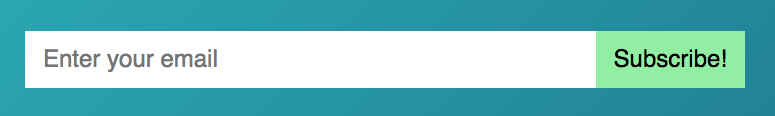 Email and submit button on the same row
This UI looks simple! But it can be difficult to build if you’re using older methods like inline-block. The hard part is getting the email field and button to align visually.
The great news is: CSS Grid or Flexbox can help you build this form easily.
Making the form with Flexbox
From the picture above, we know the form contains two elements:
- An email field
- A submit button
Here’s the HTML:
<form>
  <input type="email" name="email">
  <button type="submit">Send</button>
</form>
Here’s what you have when you write the HTML (after styling for appearance).
 Input and Button elements are both inline-block elements
Both input and button are inline-block elements. When you place inline-block elements together, you’ll get a whitespace of about 3-4 px between them. (You’ll also get whitespace of 3-4px at the bottom of each inline-block element).
To fix this whitespace issue, you can change input‘s and button‘s display property. One way is to use Flexbox.
If you use Flexbox, you want to set the parent element’s display property to flex.
form {
  display: flex;
}
Here’s what you get once you set the display to flex:
 Whitespace between elements disappeared we changed to Flexbox
Next.
You want to give a user as much space as possible to fill in their email address. We don’t have enough space in our example now.
To increase whitespace, we can ask the input element to grow so it takes up all extra space available. You can do this by setting flex-grow to 1.
input {
  flex-grow: 1;
}
Email field grew to take up any available spaces
Here’s a Codepen to try this out:
See the Pen Simple form with Flexbox by Zell Liew (@zellwk) on CodePen.
When elements are of unequal height…
This technique helps a lot if your input and button elements are of unequal height. We’ll simulate this by substituting the <button> text with an SVG. We’ll also make this SVG bigger than the input text.
<form action="#">
  <input type="email" placeholder="Enter your email">
  <button type="button"><svg> <!-- a smiley icon --> </svg></button>
</form>
 Adding a smiley icon as the to the submit button
Notice the input‘s height increases to fit the large SVG icon. We didn’t have to write any extra code! This happens because all elements are stretched vertically to fill up any available space by default.
If you want to change this behavior, you can change the align-items property to either flex-start, flex-end, or center.
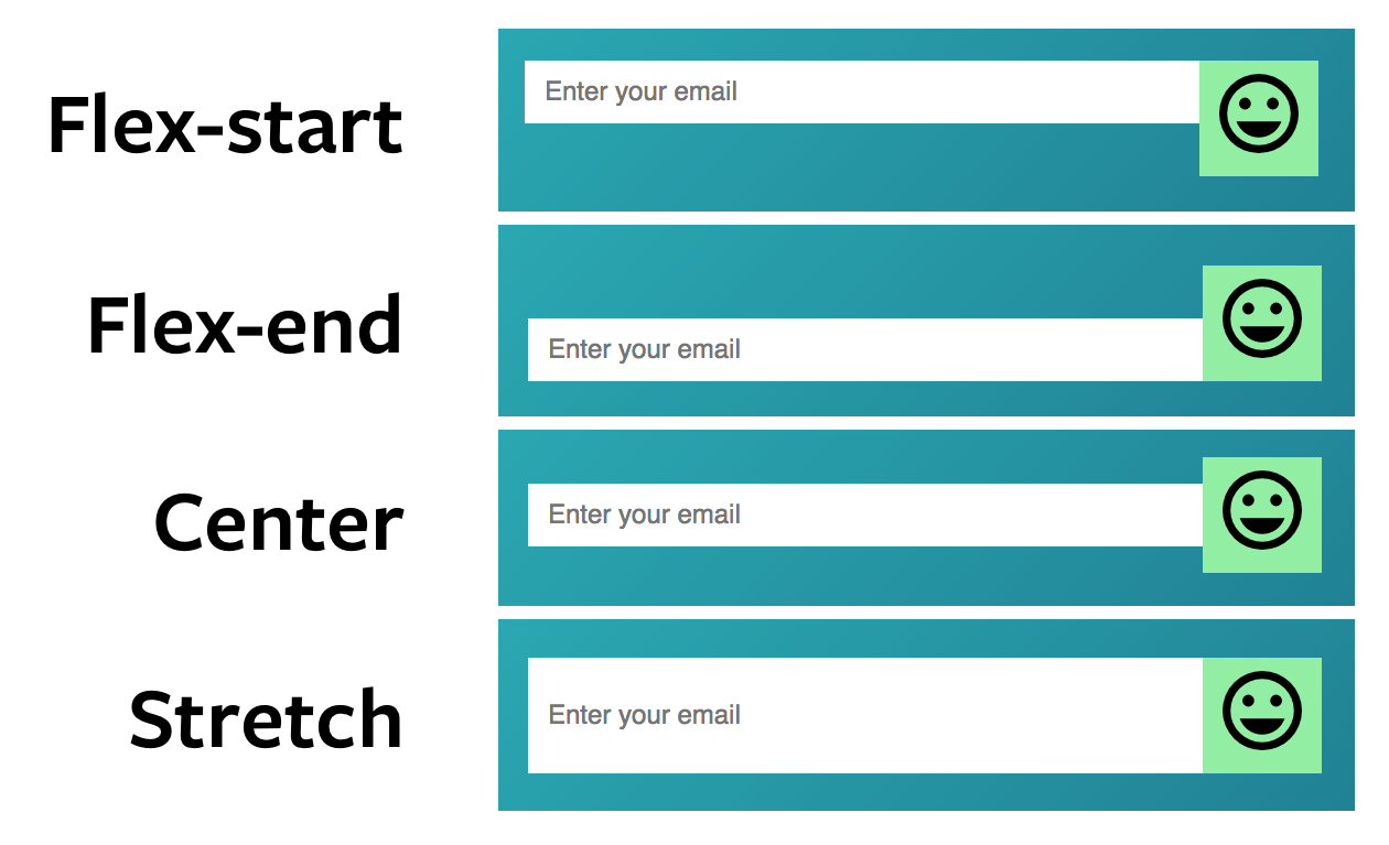 Items can be aligned differently if you set
 align-itemns to a different value
Notice there’s some extra space below the SVG icon. There’s an extra space because SVGs are inline-block elements by default. And inline-block elements have a 3-4px whitespace below them (mentioned above).
To fix this space below the SVG icon, we can change the SVG’s display property to block.
Here’s a Codepen to try this out:
See the Pen Simple form with Flexbox (with SVG Button) by Zell Liew (@zellwk) on CodePen.
Wrapping up
Flexbox makes it easy to align elements with unequal height. CSS Grid does the same too! I’ll show you how to create the same form with CSS Grid in the next article. a
Thanks for reading. This article was originally posted on my blog. Sign up for my newsletter if you want more articles to help you become a better frontend developer.