
Completely responsive CSS values, more than just media queries
The goal of this article is to achieve a font-size value that fluidly transitions from 14px at a browser window width of 769px, to 24px for a 2048px browser window width.
First off, let’s get the definition of a responsive DOM element out of the way. Responsive elements should respond to changes in viewport size, i.e when I reduce or increase the size of my browser window, a responsive DOM element should respond in some predefined way.
With CSS3 media queries, we are able to respond to screen resizes within CSS. Most of the time, these are breakpoints at 480px, 768px, and 769px. These are suitable for most web applications, but what if we could go further than just 3,4,5 break points? What if we could respond to every 1px browser resize all the way from over 2048px to 1px. That means we can create CSS declarations that respond to me reducing my browser window from 2048px to 2047px, responding to every 1px change all the way down to 0px.
Thanks to the CSS3 calc function, and viewport units (vh, vw), we can achieve this functionality.
The calc function lets you perform calculation when specifying CSS property values
Viewport units are represented as percentages of the visible area of a web page. That is the entire browser window, minus the address bar, scroll bar, tabs, etc.
Luckily both calc and viewport units have browser support all the way back to IE9.
In the code snippet above, if the browser width minus scrollbar is 1800px, font-size will be 18px, that’s 1% of 1800. That’s okay, but on a 800px screen, font-size will be 8px 😮. That’s not what we want.
Thanks to some clever calculations possible with the calc function we can overcome this problem.
If you have written Javascript or some proper programming language, there’s a good chance you’d have come across the mathematical expression below, if you have not, I’ve tried to explain it below.
(Math.random() * (769 - 2048) + 769)
This is a Javascript snippet and what it does is generate a random number within the range of 769 and 2048. Math.random() generates a random number between 0 to 0.9999999999999999. We get that number and multiply it by the difference between 2048 and 769, which is 1279. This ensures random number*(1279+769), always return a value between 769 and 2048. You can try it out yourself, 0*(1279+769) is 769 and 0.99*(1279+769) gives you 2035.21.
So we have the basis for further calculations.
In our case, we want a font-size within the range 14px to 24px, so our range is 10px and 14px is our base. What we want is to generate a random number between 0 and 0.999999999999, multiply it by 10 and add it to 14. So that, 0*10+14 is 14, and 0.9999*10+14 is 23.9999, but we don’t have access to Javascript’s Math.random within our CSS. How do we generate the random number we need then?
Let’s take a look at what we have. With the VW viewport unit, we can dynamically access the window’s width with 100vw. So 100vw on a 1366px screen is 1366px, on a 1560px screen, it’s also 1560px, without us hard-coding the specific pixel value.
With our target minimum screen width (769px), maximum screen width (2048px) and dynamically calculated screen width (100vw), we are armed with what we need to generate a random number from 0 to 0.99999999999. By simply doing (100vw — 769px)/2048px, we can generate any value from 0 upwards, depending on the value of 100vw. So if a users viewport width is 1800px, (100vw — 769px)/2048px is calculated as (1800px — 769px)/2048px by the browser, which results in 0.50341796875. Yay, we have our random number. We can now multiply 0.50341796875 by 10 (remember our range?), which results in 5.0341796875. The final step is to add 5.0341796875 to 14px 5.0341796875, which results in a 19.0341796875px font-size for a user with a 1800px viewport width.
The final formula can be written as,
html {
  font-size: minimumPixel + range * ((viewportWidth - minScreenWidth) / maxScreenWidth)
}

/* Example */
html {
  font-size: calc(14px + 10 * ((100vw - 769px) / 2048px));
}
So instead of serving all viewport widths between 769px and 2048px the same font width, usually 18px, we can dynamically serve users a more suitable range from 14px to 24px.
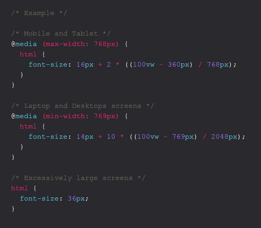
This can be combined with media queries to achieve as much responsiveness as possible
/* Example */ /* Mobile and Tablet */
@media (max-width: 768px) {
  html {
    	font-size: 16px + 2 * ((100vw - 360px) / 768px);
    }
}

/* Laptop and Desktops screens */
@media (min-width: 769px) {
  html {
    	font-size: 14px + 10 * ((100vw - 769px) / 2048px);
    }
}

/* Excessively large screens */
html {
  font-size: 36px;
}
This can be applied to be more than just font-size, it can be used to create paddings, margins, widths that stretch and squeeze as the viewport width increases and decreases.
I hope you enjoyed the article, hopefully you'll use this technique a lot more in your projects.