
Don’t Suck At Design!

As a developer, working on the backend saves you the trouble of making aesthetic decisions — deciding what background color to use, what font size, the type of image or icons and what the overall layout of your web application should look like. However, every web developer understands that no matter how functional your backend is, your frontend determines your app’s usability.
In this tutorial, I will discuss some basic principles of good design which I myself just picked up.
Sketch first
A sketch is a rapidly executed freehand drawing that is not usually intended as a finished work. The sketching process enables you to grasp the size and scope of the project. When you sketch, you get a clearer picture of the end-product and can explore how your design style affects the user experience. This ensures that design time is invested in the right direction and not wasted. Sketching can start loose, beginning with basic concepts, followed by compositions or layouts. After the overall direction is chosen, the concepts can be refined with detailed sketching.

Website sketch
Use of contrast
Good design should be kickstarted by ensuring that there’s a striking difference between the foreground and background colors. Dark-colored text on a light background is usually the way to go. When you have to use a dark background, ensure that the text on it is light enough to enable readability. If you have to squint in order to read the text on your design, you know you are getting it wrong.
Good and Bad use of contrast
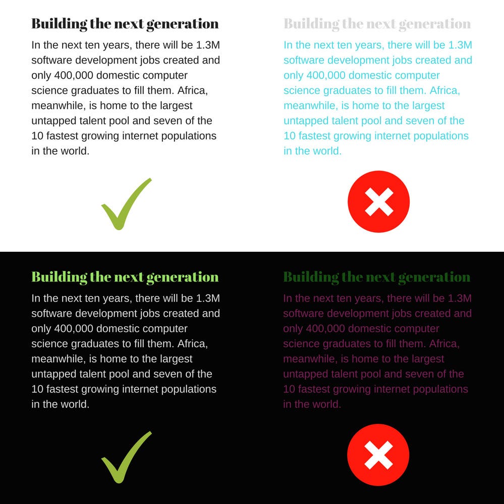
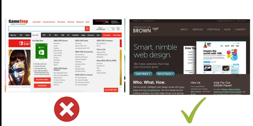
Important content first
One important thing to consider is what is important to your user. You don’t want to place the point of attraction at the lower part of the design. A user shouldn’t have to scroll, click a button or do other gestures to get the message your design is trying to convey. The figure below shows two different designs that highlight different placements. Which do you prefer?
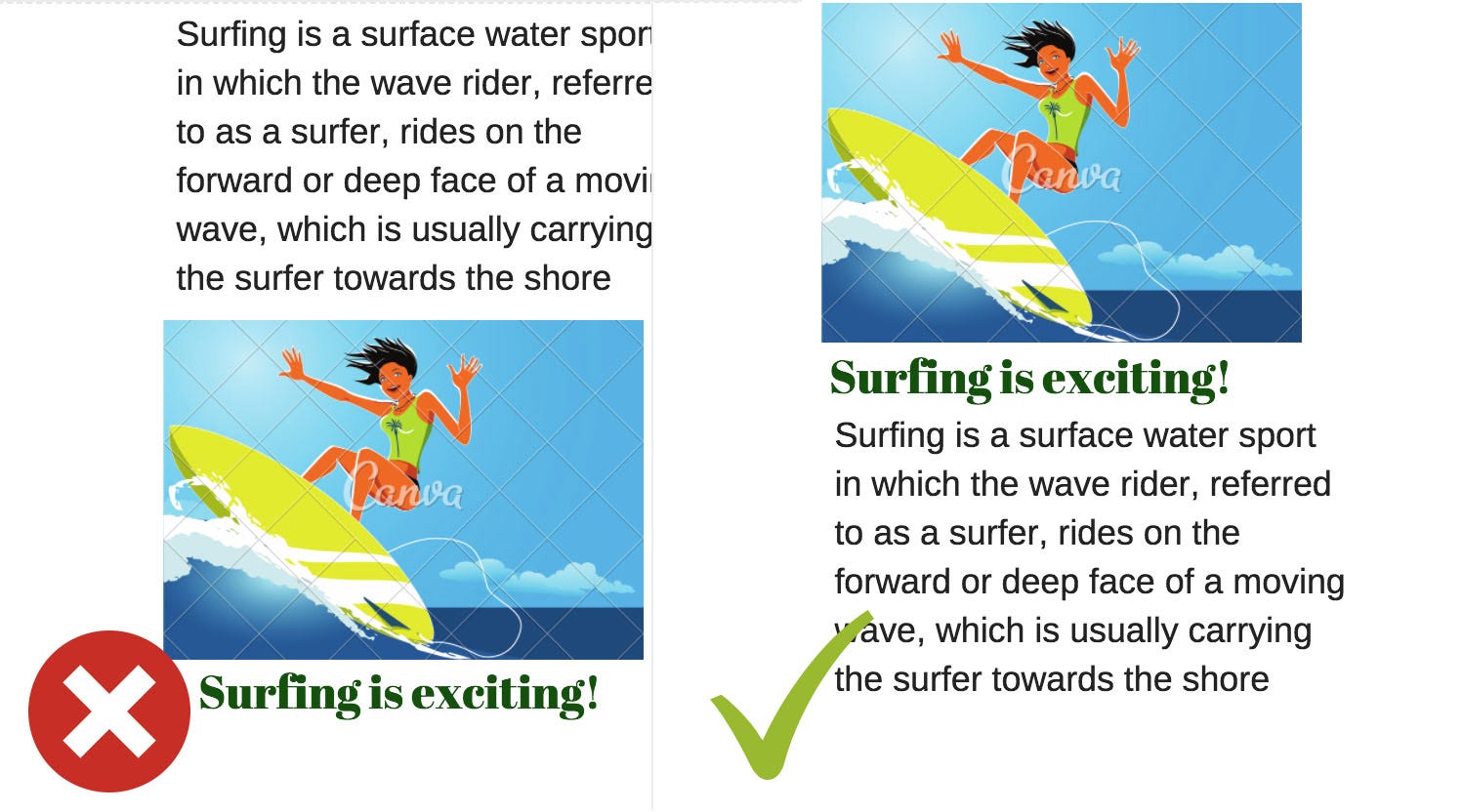
Control focus with font size and weight
Sometimes your design requires you to have the most important text information at a specific position that’s not the top. No worries! You can control the user’s focus by making the important text bigger, or bolder in a situation where there is no room to increase text size.

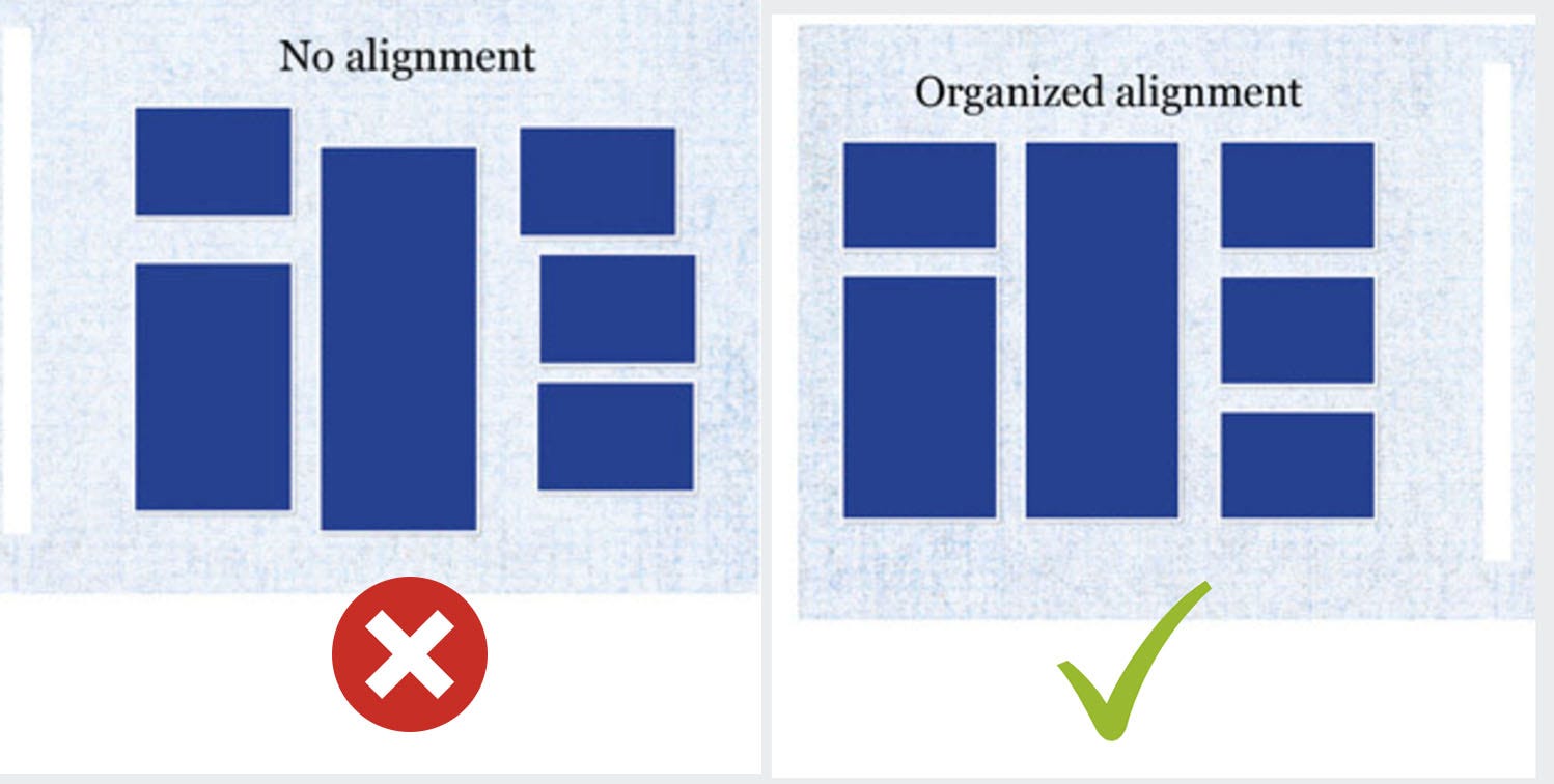
Alignment
Alignment is one of those obvious design concepts that’s low-key a big deal. You can’t afford to have your design not properly aligned. Proper alignment will make your design more visually appealing and will also make it easier for users to scan a page. It subconsciously offers a calmer reading experience by organizing information in an orderly manner.
Spacing
While images and fonts communicate a message, white space can be used to enhance and clarify the important information. Embracing white space as an element in itself can create unity and impact within your designs. Most blogs have large margins to ensure that other elements don’t distract the user’s eyes from the text body. This also ensures that information is delivered as efficiently as possible.
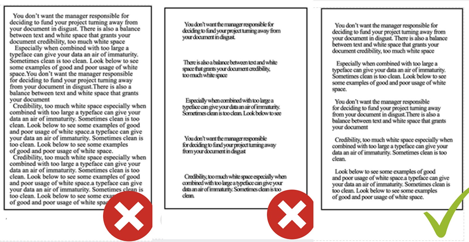
Not enough, too much and right spacing

Element spacing
List view vs grid view
Sometimes it’s hard to decide which to use, and this can be likened to sitting versus standing. When you’re seated, your body is generally relaxed and focused. You are at an optimal level of comfort and ready to be engrossed in a single thing. But someone standing usually shifts now and then. They can get restless and start to move around. As counter-intuitive as it may sound, standing is intrinsically an active state.
In short, if the order of the content is important and you want the user to focus on one thing at a time, a list view is the best option. But if you want the user to explore, a grid view is the way to go.

Pinterest’s Grid view

Twitter List View
Make search prominent
The moment a user can’t find what they’re looking for on a page, they look for the search bar. Thanks to Google for this search-first impulse. This tells us that it is important to have the search bar in an obvious place. Some schools of thought even propose having a search bar on every page.
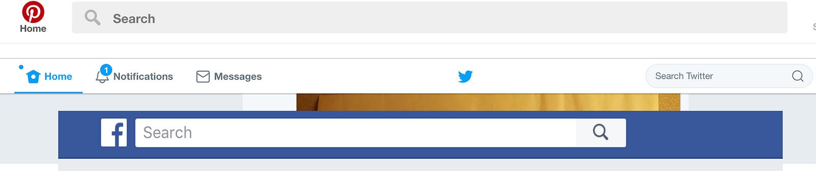
Pinterest, Twitter and Facebook all have their search prominent
Ditch mega menus
The more items there are in your menu, the higher the chance that users will scan past important items. Each time you remove a menu item, the remaining items become more prominent. Having fewer items on the menu allows for more space which helps control the user’s focus. If the user can’t find an item on the menu, they can use a search bar if the last tip is implemented.
Mega menu and simple menu
Follow conventions
Sometimes we like to be creative with our designs but a great website is one that feels familiar the first time a user browses through. Navigating from page to page is effortless, the user interface is straightforward, icons represent well-known actions, and users can find exactly what they’re looking for quickly and confidently.
Web conventions are your friends because they speak to your users in a language the user can easily understand. Familiarity makes happy web users. While innovative design may be appealing on the surface, it’s a disservice if visitors are confused or frustrated by unfamiliar elements.

Use familiar elements
Design templates free of distractions
Color evokes strong emotional responses and can interrupt a designer’s ability to focus on the core design problem. We could spend so much time deciding what color to use that these decisions tend to drive and/or change our design objectives, leaving us focusing on less important aspects of the design. Designing in black and white will keep the focus on improving the core experience of the app.

Starting template
Borrow color palettes
Designers share common challenges when dealing with color. In this respect, Nicky Laatz, owner of a typography and design shop, gives a key piece of advice:
“Whenever I see a picture or photo with colors that I love, or that really seem to go well, I screenshot it or pin it for later. Then, when its time to find a good color palette, I go to all my saved images for inspiration and I always find something appropriate.”
Allow yourself to search for palette inspiration anywhere — in historical art or online sources. You probably know about the usefulness of sites like Pinterest that allow you save and catalogue all kinds of digital palettes; and Dribbble that connects you to the world’s top designers.
You now know the basic principles of design, which can help you not suck at it. Kindly drop your questions or comments below. See you in my next tutorial!
I love every bit of your article. Straight to the point and rich with information.
I like the part where you mentioned “Follow Conventions”. Often times we get carried away with designs that we may forget that the new icons and designs may not be easily understood by users. It’s always good to follow what ppl are already familiar with…and keep things simple too.
I wanna ask, under “Important Content First”, what arrangement do you think is suitable for Video contents.
Should there be video first before write up, or vice versa.
The video is also very important in this context, but considering we have network issues for instance. Users may get frustrated if video doesn’t play smoothly and then abandon the whole page.
Do you think it is wise to put some leading write up first before videos, and then other write up can follow?
Also, do you think videos should auto play to catch attention than having users play themselves. The former may be intrusive though…but Facebook, YouTube etc use similar stuffs on their platform.
Thanks