
Profiling & Visualization Tools in Python - Part 1
Original post: https://www.narenvadapalli.com/blog/profiling-visualization-tools-in-python-part-1/
What in my python code is taking time ?
Sounds like a familiar question asked!
Well, I have that question pop up quite often, especially when dealing with legacy code bases and unfamiliar code. This is my effort in helping shed light on exploring an answer to the question
Setup
Consider the following simple piece of code in a file called test.py
def print_method():
    print("hello world")

def test_print_method():
    for i in xrange(2):
        print_method()

for i in range(3):
    test_print_method()
When you execute the code using python executable, following output of hello world is printed 6 times
$ python test.py
hello world
hello world
hello world
hello world
hello world
hello world
Probing Parameters
Let’s look in to different tools which we could use to determine
- Code path
- Number of calls and
- Which method took the most time !
Disclaimer
This blog has been created after executing the commands on a Linux distro. If on a different platform, I assume one knows how to get to the required (or similar) software packages
Basis for profiling
We basically rely on profile module, more specifically cProfile module to generate the data needed for different visualization tools. (https://docs.python.org/2/library/profile.html#module-profile) Easiest way to run cProfile on a python code is to run it as a module with python executable by passing the actual script as an argument to cProfile
Example
python -m cProfile test.py
Along with the expected output of hello world lines ,we see additional information about the time it took to execute each method.
$ python -m cProfile test.py
hello world
hello world
hello world
hello world
hello world
hello world
         12 function calls in 0.000 seconds
Ordered by: standard name
ncalls tottime percall cumtime percall filename:lineno(function)
        1 0.000 0.000 0.000 0.000 test.py:1(<module>)
        6 0.000 0.000 0.000 0.000 test.py:1(print_method)
        3 0.000 0.000 0.000 0.000 test.py:5(test_print_method)
        1 0.000 0.000 0.000 0.000 {method 'disable' of '_lsprof.Profiler' objects}
        1 0.000 0.000 0.000 0.000 {range}
Output might not be super digestible instantly at the first glance. Lets dive into different visualization tools available which can make the timing information more perceivable.
A picture is worth a thousand words
gprof2dot
My favorite one among all the available tools is gprof2dothttps://github.com/jrfonseca/gprof2dot
Install gprof2dot
pip install gprof2dot --user
Generate .pstats file
Execute the test.py script this time with the timing information being directed to an external output file, rather than standard console output. Observe the -o flag with the output filename being test.pstats
python -m cProfile -o test.pstats test.py
Visualize profiling information
Assuming you have dot and eog installed, run the following command in the terminal where the profiling output file test.pstats is located
gprof2dot -f pstats test.pstats | dot -Tpng -o output.png && eog output.png
Bingo, you get a window which shows something like the following
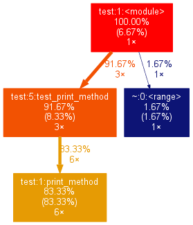
Analysis
Above graph shows you that 91.67% was spent in test_print_method and the same method was called 3 times (3x) , which in turn calls print_method (overall 6 times).
Other method calls like range is a tiny amount of total execution time, but it is also visible in the graph
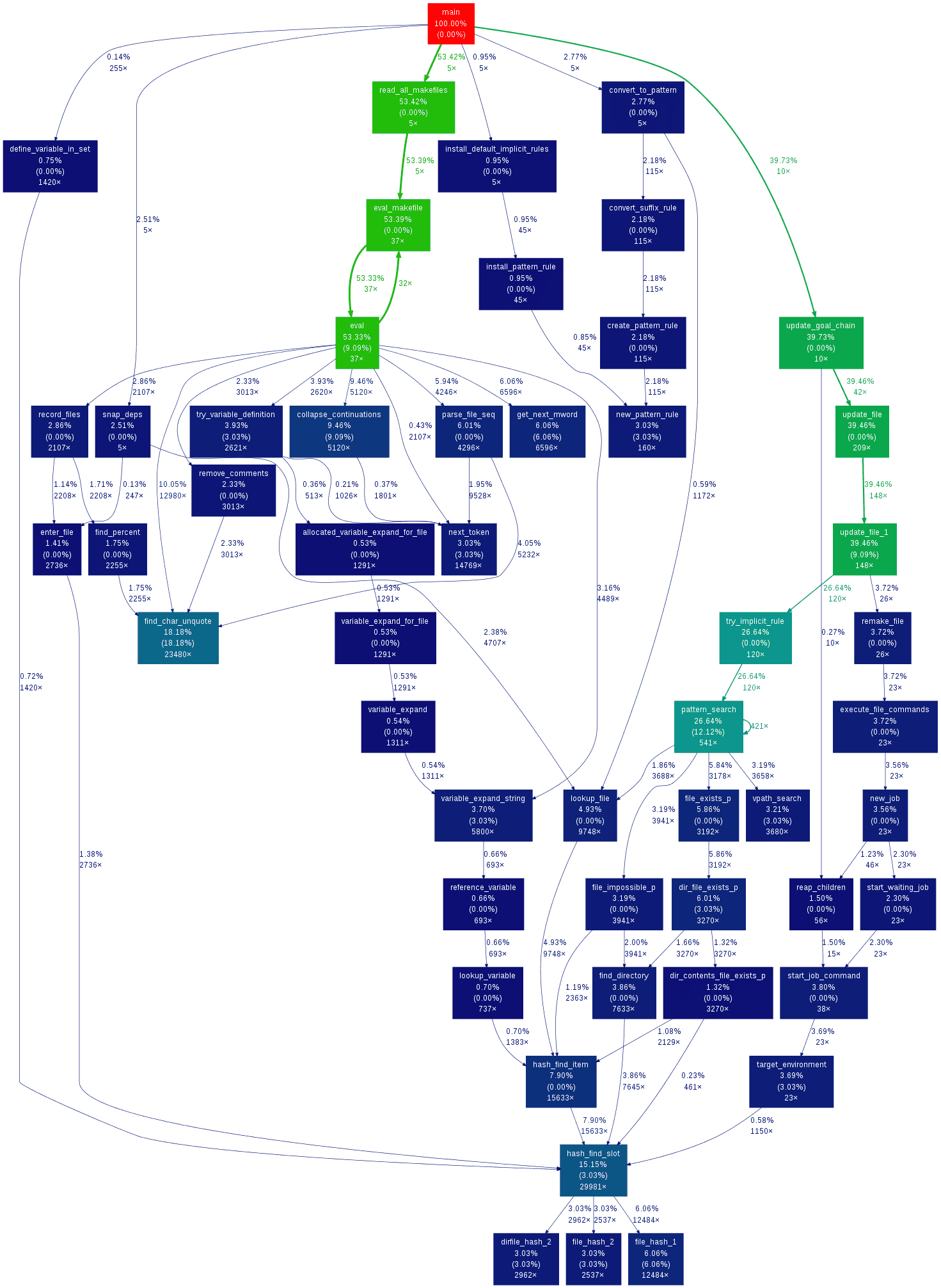
This was a simple python code. This method works equally well with complex code. Pasting a sample image from gprof2dot’s github repo
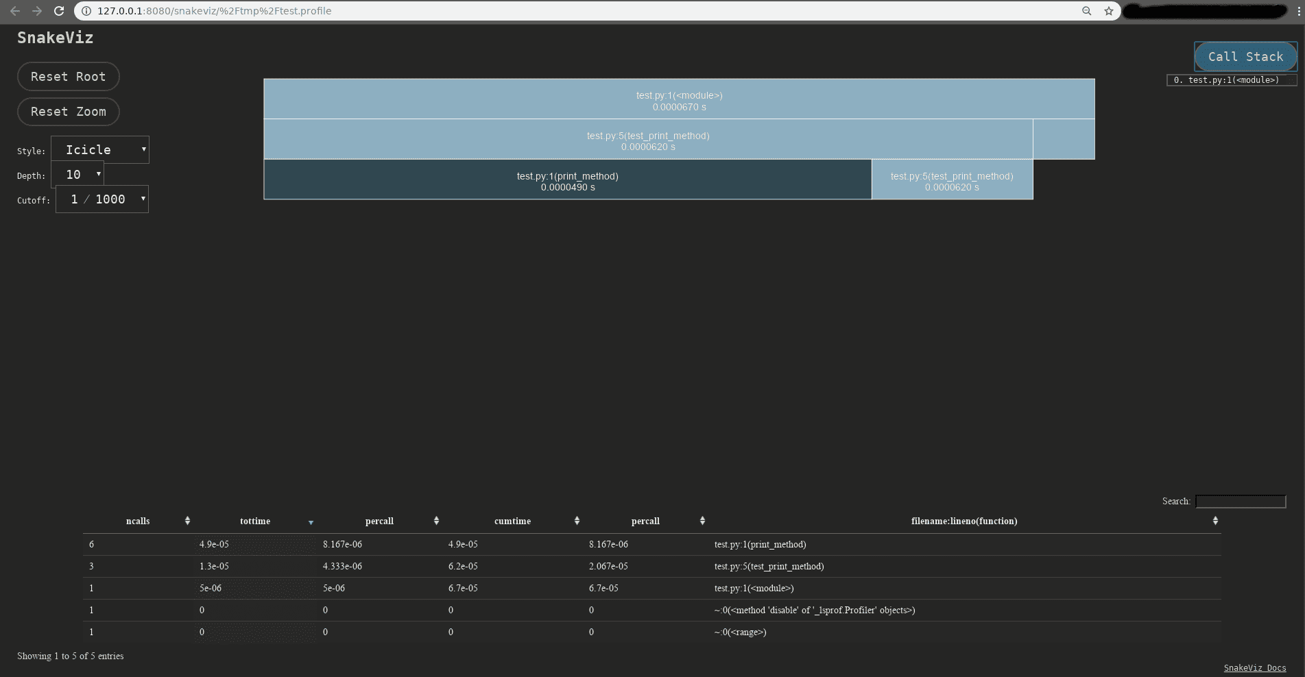
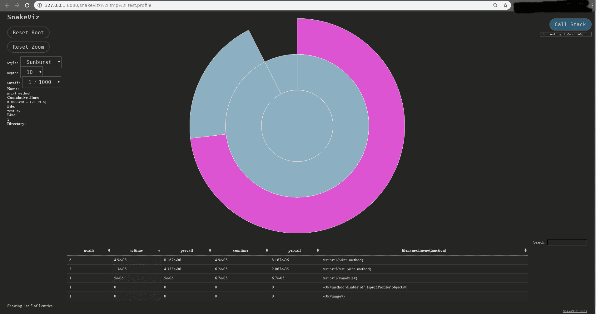
SnakeViz
SnakeViz is a browser based visualization tool. It needs the output in a .profile format, rather than .pstats when the profiling output is generated using cProfile module
Install snakeviz
pip install snakeviz --user
Generate .profile file
Execute the test.py script this time with the timing information being redirected using -o flag to output file named test.profile
python -m cProfile -o test.profile test.py
Visualize profiling information
Run the following command in the terminal where the profiling output file test.profile is located
snakeviz test.profile
Analysis
There will be some information printed in the console when the command is run and a new window which pops in a browser session
$ snakeviz test.profile
snakeviz web server started on 127.0.0.1:8080; enter Ctrl-C to exit
http://127.0.0.1:8080/snakeviz/%2Ftmp%2Ftest.profile
START /usr/bin/google-chrome-stable "http://127.0.0.1:8080/snakeviz/%2Ftmp%2Ftest.profile"
Opening in existing browser session.
WARNING:tornado.access:404 GET /images/sort_both.png (127.0.0.1) 1.04ms
WARNING:tornado.access:404 GET /images/sort_desc.png (127.0.0.1) 0.49ms
PyCallGraph
This seems to be an abandoned project, but hey ! still works.
Install pycallgraph
pip install pycallgraph --user
Generate png visualization file
Execute the script using pycallgraph executable, rather than going via python executable.
Disclaimer
The following examples specify graphviz as the outputter, so it’s required to be installed
pycallgraph graphviz -- ./test.py
Visualize profiling information
Above command generates a pycallgraph.png image. Open the image using any image viewer. Using eog as an example on my host
$ eog pycallgraph.png
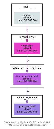
Shows the timing and number of calls information.
Conclusion
I still believe gprof2dot does a better job at giving % and eye tracks naturally the flow in the graph much easier than other visualization methods.