
AirBnB Clone with React Native Part 6: Animated Checkmarks
This tutorial is the fifth chapter of our implementation of an AirBnB clone in React Native. In the previous chapter, we successfully implemented a login error notification system. In case you need to get caught up, here are links to parts 1–4
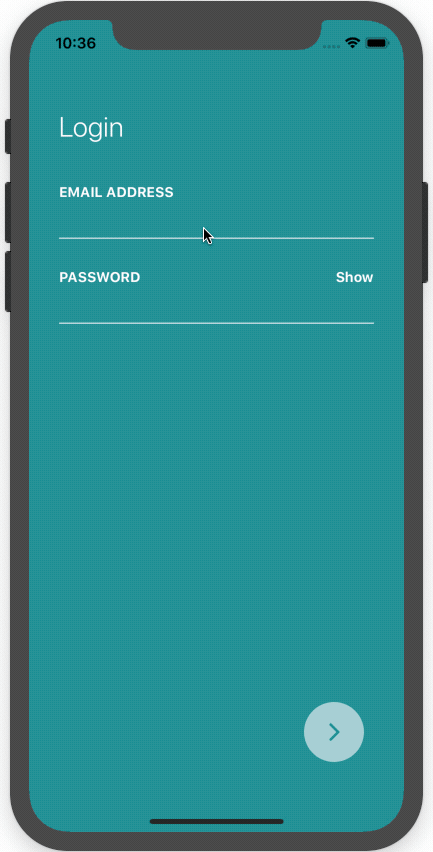
In part 6 of the implementation of our AirBnB clone, we’re going to continue from where we left off—implementing animated checkmarks on the login screen input fields, which validate if the email and the password are correct or not.
The implementation of animated checkmarks is pretty simple and can be used in many other cases as well. So it might be helpful for you to learn how to make use of them here. The idea is to show the checkmarks on the right side of the input fields when the email and password that we entered is correct.
This part of our clone implementation directly relates to part 2 of this tutorial series, where we implemented the Login UI—just in case any revision is needed.
So let’s get started!
This step doesn’t really relate to the actual implementation of animated checkmarks, but it might be helpful in many cases. Here, we’re going to change the keyboard style on the basis of which input type the input fields take.
In our Login screen, we have two input fields—one for an email and another for a password. So what we’re going to do is show the keyboard suitable for the email input field and the default keyboard for the password entry field. The code to implement this is provided in the code snippet below:
this.state = {
  secureInput: !(props.inputType === "text" || props.inputType === "email"),
  scaleCheckmarkValue: new Animated.Value(0),
};
In the code snippet above, we’ve initialized a keyboardType constant inthe InputFields.js file, which takes a value as email-address if inputType equals email; otherwise it’s default.
Next, we’re going to bind this to our TextInput component of the InputField.js file, as shown in the code snippet below:
const iconScale = scaleCheckmarkValue.interpolate({
  inputRange: [0, 0.5, 1],
  outputRange: [0.01, 1.6, 1],
});
Now let’s test to see if this works in our emulator:

As a result, we can see that the keyboard style changes for the email fields.
Implementing Checkmarks
In this step, we’re going to add the checkmarks on the right side of our input fields in Login Screen. The file we’re going to be working on is the InputField.js file. The idea here is to import the ‘checkmark’ icon from the react-native-vector-icons package and then add it to the Input fields.
First, we need to import the FontAwesome icons from the react-native-vector-icons package in the InputFields.js file, as shown below:
import Icon from ‘react-native-vector-icons/FontAwesome’;
Adding checkmark icons
Now we’re going to add those checkmark icons into our input fields by using the following piece of code:
<Icon
  name="check"
  color={colors.white}
  size={20}
/>
<TextInput
  autoCorrect={false}
  style={[
    { color: inputColor, borderBottomColor: borderBottom },
    styles.inputFiled
  ]}
  secureTextEntry={secureInput}
  onChangeText={onChangeText}
  autoCapitalize="none"
  keyboardType={keyboardType}
/>
As we can see in the code snippet, we have defined an Icon with name ‘check’ above the TextInput component. This will display the icons on our input fields, as we can see in the emulator screenshot below:
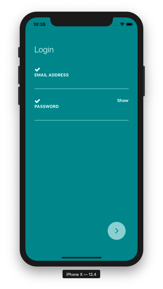
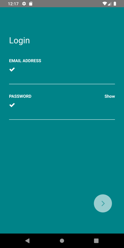
But, the icons are visible on the left side of the input fields. So we need to correct the positioning of the checkmark icons to the right side of the input fields.
Positioning the checkmark icons correctly
Here we’ll position the checkmark icons on the right side of the input fields. For that, we need to wrap the Icon component with the View component. Then, we need to bind some styles to our View component. The code and style are provided in the code snippet below:
<View style={styles.checkmarkWrapper}>
  <Icon
    name="check"
    color={colors.white}
    size={20}
  />
</View>
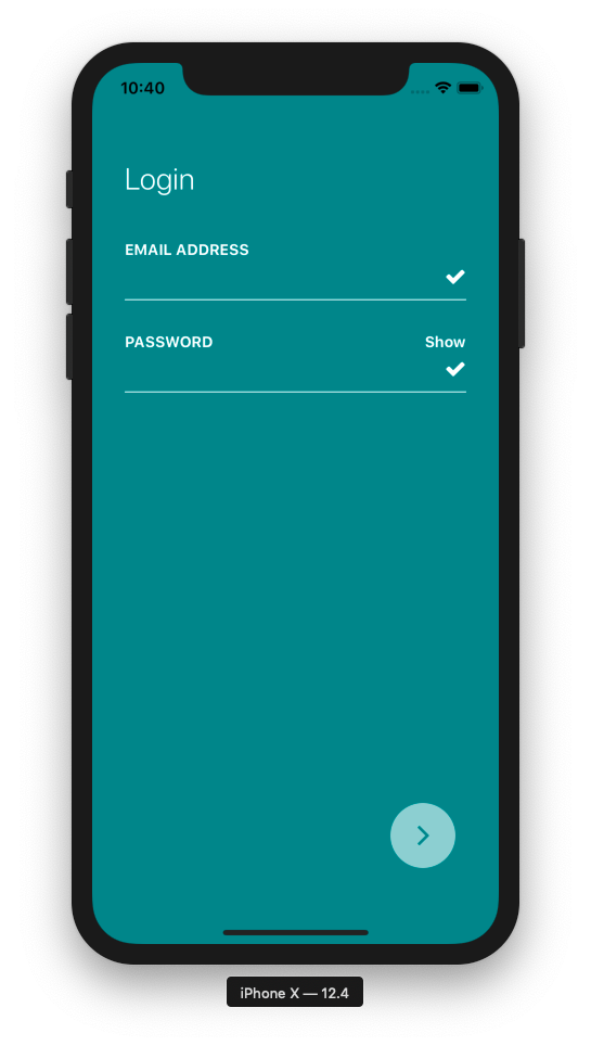
As we can see, the View component wraps the Icon component and checkmarkWrapper style is bound to it. The style configuration for the checkmarkWrapper is given below:
checkmarkWrapper: {
  position: 'absolute',
  right: 0,
  bottom: 12,
},
As a result, we get the checkmark icons on the right side of the input fields, as shown the emulator screenshot below:
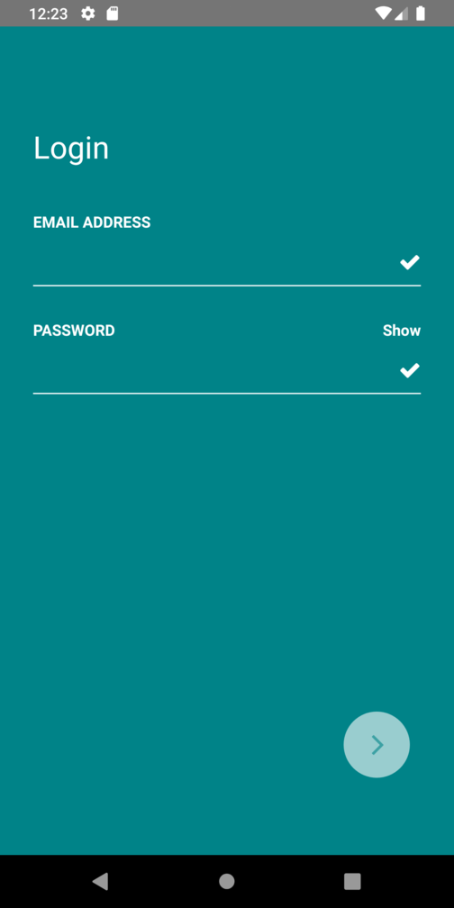
Now we need to show those checkmark icons with the animations that communicate whether or not the email and password we entered are correct.
Handling checkmark icons with Animation
Finally, this is the step where we animate our checkmark icons and make them look more appealing. We’re also going to handle the hiding and showing of the checkmark icons when our entered email and password are correct.
First, we need to import the Animated and Easing component from the react-native package into our InputField.js file, as shown in the code snippet below:
import {
  View,
  Text,
  StyleSheet,
  TextInput,
  TouchableOpacity,
  Animated,
  Easing
} from "react-native";
Setting up Animation and Scale properties
Now we’re going to set up the animation configuration. Here, we need to initialize a state called scaleCheckmarkValue with a default Animated value, which is 0.
Next we need to define a function named scaleCheckmark(), which takes in boolean scale value as a parameter (either 1 or 0). In the function, we’re going to configure the overall animation properties. The code for the state variable and the function is provided in the code snippet below:
this.state = {
  secureInput: !(props.inputType === "text" || props.inputType === "email"),
  scaleCheckmarkValue: new Animated.Value(0),
};
Now, for the function to handle the animation:
scaleCheckmark(value) {
  Animated.timing(
    this.state.scaleCheckmarkValue,
    {
      toValue: value,
      duration: 400,
      easing: Easing.easeOutBack,
    },
  ).start();
}
In thescaleCheckmark() function, the timing method in the Animated component is used to configure the overall animation. It takes the first parameter as scale value, which is scaleCheckmarkValue and the second parameter as an animation config option in which toValue is set to a boolean scale value which will be either 0 or 1, duration of animation is set to 400ms and easing animation style is set to easeOutBack from the Easing component.
Now, need to initialize the animate variable—i.e. scaleCheckmarkValue —inside the render() function of our InputField.js file:
const { secureInput, scaleCheckmarkValue } = this.state;
const keyboardType = inputType == 'email' ? 'email-address' : 'default';
Now by using the scaleCheckmarkValue, which provides an interpolate() method, we’re going to set the scale value for animation, which is defined in the iconScale constant. The interpolate() method takes an object parameter with an inputRange and outputRange for the scale values. The code for this is provided in the snippet below:
const iconScale = scaleCheckmarkValue.interpolate({
  inputRange: [0, 0.5, 1],
  outputRange: [0.01, 1.6, 1],
});
Now we’re going to wrap the View enclosing the Icon component withthe Animated component and add new a transpose style with iconScale as the scale value. The code for this is provided in the snippet below:
<Animated.View style={[{ transform: [{ scale: iconScale }] }, styles.checkmarkWrapper]}>
  <Icon
    name="check"
    color={colors.white}
    size={20}
  />
</Animated.View>
This helps to animate our checkmark icons. Now we need to handle the hiding and showing of checkmark icons by sending the prop condition value from Login.js to InputField.js based on the correct email and password entry.