
Matplotlib: An Introduction To Its Object Oriented Interface

Mar 5
I write applications for embedded platforms. One of my applications is deployed in a network where it receives the data from several network nodes and processes them. Timing is important here. My application should be able to process the data from all the nodes in specified amount of time. This is a hard constraint. I rely on matplotlib along with pandas to visualise/analyse the time profiling information for each network packet received.
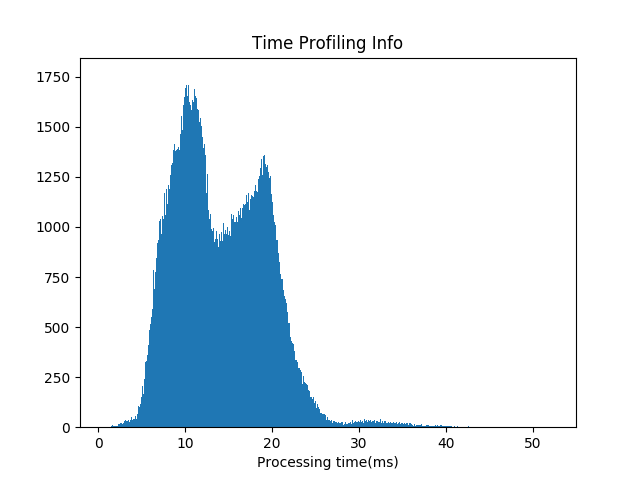
Above graph is histogram plot for the processing time of each received packet. This is generated using matplotlib. There were almost 2,00,000 data points for this experiment. This graph tells me several important things. It tells me that most of the time a network packet is processed within 30 ms of its arrival. It also tells me that there are two peaks, one at 10 ms and other at around 20 ms. You can see visualisation is important here and matplotlib does the job nicely.
matplotlib is vast. It is a very useful plotting tool but sometimes it can be confusing. I got confused when I first started using it. matplotlib provides two different interfaces for plotting and we can use any of the two to achieve the results. This was the primary cause of my confusion. Whenever I searched the web for any help, I found at-least two different ways of doing it. It was then I decided to dig a little deeper into its interfaces and this tutorial is a result of that.
The focus of this tutorial is narrow — To understand the “Object Oriented Interface”. We will not start with a large dataset. Doing that would shift the focus to the dataset itself rather then the matplotlib objects. Most of the time we will be working on very simple data, as simple as a list of numbers. In the end we will work on a larger dataset to see how matplotlib can be used in the analysis of a larger dataset.
Matplotlib Interfaces
matplotlib provide two interfaces for plotting
- MATLAB style plotting using pyplot
- Object Oriented Interface
After my study of matplotlib I decided to use its “Object Oriented Interface”. I find it easier to use. Every figure is divided into some objects and the object hierarchy is clear. We work on objects to achieve the results. So I will be focusing on the object oriented interface in this tutorial. Some pyplot functionalities will also be used wherever it is convenient to use them.
Matplotlib Object Oriented Interface
A Figure in matplotlib is divided into two different objects.
- Figure object
- Axes object
A Figure object can contain one or more axes objects. One axes represents one plot inside figure. In this tutorial we will be working with the axes object directly for all kinds of plotting.
The Figure Object
import matplotlib.pyplot as plt
fig = plt.figure()
print(type(fig))
The output of the above code snippet is matplotlib.figure.Figure. plt.figure() returns a Figure object. type() method in python is used to find out the type of an object. So we have an empty Figure object at this moment. Lets try plotting it.
# Give the figure a title
fig.suptitle("Empty figure")
plt.show()
Executing above code returns an empty figure. I am not including the figure here because its just empty.
The Axes Object
One or more axes objects are required to get us started with plotting. There are more then one ways an axes object can be obtained. We will start with the add_subplot() method and later will explore other ways.
ax = fig.add_subplot(1,1,1)

# Set the title of plot
ax.set_title("Empty plot")
plt.show()
add_subplot(num_rows, num_cols, subplot_location) method creates a grid of of subplots of size (num_rows x num_cols) and returns an axes object for the subplot at subplot_location. The subplots are numbered in following way:
- First subplot is at (first row, first column) location. Start from this position and continue numbering till the last column of the first row
- Start from the left most position on the second row and continue numbering
- Ex: The 3rd subplot in a grid of 2x2 subplots is at location = (2nd row, 1st column)
So add_subplot(1, 1, 1) returns an axes object at 1st location in a 1x1 grid of subplots. In other words, only one plot is generated inside the figure. Executing above code gives us an empty plot with x-y axis as shown below.

Let us take one more example. We divide the figure in a 2x2 grid of subplots and get the axes object for all the subplots.
import matplotlib.pyplot as plt

fig = plt.figure()

# Generate a grid of 2x2 subplots and get
# axes object for 1st location
ax1 = fig.add_subplot(2,2,1)
ax1.set_title('First Location')

# Get the axes object for subplot at 2nd
# location
ax2 = fig.add_subplot(2,2,2)
ax2.set_title('Second Location')

# Get the axes object for subplot at 3rd
# location
ax3 = fig.add_subplot(2,2,3)
ax3.set_xlabel('Third Location')

# Get the axes object for subplot at 4th
# location
ax4 = fig.add_subplot(2,2,4)
ax4.set_xlabel('Fourth Location')

# Display
plt.show()
The output of the above code is:

2x2 Grid of subplots
Once we get the axes object we can call the methods of the axes object to generate plots. We will be using following methods of the axes objects in our examples:
- plot(x, y) : Generate y vs x graph
- set_xlabel() : Label for the X-axis
- set_ylabel() : Label for the Y-axis
- set_title() : Title of the plot
- legend() : Generate legend for the graph
- hist() : Generate histogram plot
- scatter(): Generate scatter plot
Please refer to matplotlib axes class page for more details about axes class. https://matplotlib.org/api/axes_api.html
Ex1 : A Simple XY Plot
We can plot data using the plot() method of the axes object. This is demonstrated in the example below.
import matplotlib.pyplot as plt

# Generate data for plots
x = [1, 2, 3, 4, 5]
y = x

# Get an empty figure
fig1 = plt.figure()

# Get the axes instance at 1st location in 1x1 grid
ax = fig1.add_subplot(1,1,1)

# Generate the plot
ax.plot(x, y)

# Set labels for x and y axis
ax.set_xlabel('X--->')
ax.set_ylabel('Y--->')

# Set title for the plot
ax.set_title('Simple XY plot')

# Display the figure
plt.show()
Executing above code will generate y=x plot as shown below

Ex2: Multiple Graphs In Same Plot
Lets try generating 2 graphs in single plot window. One is for y = x and the other one is for z = x²
import matplotlib.pyplot as plt

# Function to get the square of each element in the list
def list_square(a_list):
    return [element**2 for element in a_list]

# Multiple plot in same subplot window
# plot y = x and z = x^2 in the same subplot window
fig2 = plt.figure()

x = [1, 2, 3, 4, 5]
y = x
z = list_square(x)

# Get the axes instance
ax = fig2.add_subplot(1,1,1)

# Plot y vs x as well as z vs x. label will be used by ax.legend() method to generate a legend automatically
ax.plot(x, y, label='y')
ax.plot(x, z, label='z')
ax.set_xlabel("X------>")

# Generate legend
ax.legend()

# Set title
ax.set_title('Two plots one axes')

# Display
plt.show()
This time ax.plot() is called with one additional argument — label. This is to set the label for the graph. This label is used by ax.legend() method to generate a legend for the plot. The output of above code is shown below:

As you can see two graphs are generated in a single plot window. Also a legend is placed at the top left corner.
Ex3: Two Plots In A Figure
We will now generate multiple plots in a figure
import matplotlib.pyplot as plt

# Function to get the square of each element in the list
def list_square(a_list):
    return [element**2 for element in a_list]

# Multiple subplots in same figure
fig3 = plt.figure()
x = [1, 2, 3, 4, 5]
y = x
z = list_square(x)

# Divide the figure into 1 row 2 column grid and get the
# axes object for the first column
ax1 = fig3.add_subplot(1,2,1)

# plot y = x on axes instance 1
ax1.plot(x, y)

# set x and y axis labels
ax1.set_xlabel('X------>')
ax1.set_ylabel('Y------>')
ax1.set_title('y=x plot')

# Get second axes instance in the second column of the 1x2 grid
ax2 = fig3.add_subplot(1,2,2)

# plot z = x^2
ax2.plot(x, z)
ax2.set_xlabel('X---------->')
ax2.set_ylabel('z=X^2--------->')
ax2.set_title('z=x^2 plot')

# Generate the title for the Figure. Note that this is different then the title for individual plots
plt.suptitle("Two plots in a figure")
plt.show()
Executing above code generates the following figure:

Ex3: Histogram Plots
Histogram plots are useful in visualising the underlying distribution of data. Below is an example of histogram plot. Data for this example is generated using numpy. 1000 samples are generated from a gaussian distribution with mean of 10 and standard deviation of 0.5.
import matplotlib.pyplot as plt
import numpy as np


# Generate 1000 numbers from gaussian sample
mean = 10
std = 0.5
num_samples = 1000
samples = np.random.normal(mean, std, num_samples)

# Get an instance of Figure object
fig = plt.figure()
ax = fig.add_subplot(1,1,1)

# Generate histogram plot
ax.hist(samples)
ax.set_xlabel('Sample values')
ax.set_ylabel('Frequency')
ax.set_title('Histogram plot')

plt.show()

The x-axis in the above plot has values for the samples and y-axis is the frequency for each sample. We can observe a peak at value 10.
According to 3 sigma rule, 99.7% samples of a gaussian distribution lies within three standard deviations of the mean. For this example this range is [8.5, 11.5]. This also can be verified from the above plot.
Plotting on a larger dataset
We will be working with “California Housing Price Dataset” in this example. This dataset is used in the book “Hands-On Machine Learning with Scikit-Learn and Tensor Flow” by AurÈlien GÈron. This dataset can be downloaded from kaggle from the link : https://www.kaggle.com/camnugent/california-housing-prices
Each row in the dataset contains data for a block. A block can be considered a small geographical area. The dataset has following columns:
- longitude — Longitude in degrees
- latitude — Latitude in degrees
- housing_median_age — Median age of a house within a block
- total_rooms — Total number of rooms in the block
- total_bedrooms — Total number of bedrooms in the block
- population — Population of the block
- households — Total number of households, a group of people residing within a home unit, for a block
- median_income — Median income for households in a block(Measured in tens of thousands of US Dollars)
- median_house_value — Median house value for households within a block (In USD)
- ocean_proximity — Location of the house w.r.t. ocean/sea
Let us generate some plots to learn certain things about the dataset. I am interested in knowing following things about the dataset.
- Distribution of “median_house_value”
- Distribution of “median_income”
- My common sense tells me that houses should be costly at those places where income is high and vice versa. Also number of rooms in a block should be more at those place where population is high. Lets try to figure this out by generating some plots.
Pyplot subplots() method - We will use pyplot subplots method in this example to get the axes objects. We have seen that add_subplot() method returns only one axes object at a time. So add_subplot() method needs to be called for each subplot inside figure. pyplot subplots() API solves this problem. It returns a numpy nd array of axes objects. Generating plots using axes object is same as explained in earlier examples.
import matplotlib.pyplot as plt
import pandas as pd
import numpy as np

# Read the csv file into a pandas dataframe
# A dataframe is basically a table of data.
df_housing = pd.read_csv("housing.csv")

# Get figure object and an array of axes objects
fig, arr_ax = plt.subplots(2, 2)

# Histogram - median_house_value
arr_ax[0,0].hist(df_housing['median_house_value'])
arr_ax[0,0].set_title('median_house_value')

# Histogram - median_income
arr_ax[0,1].hist(df_housing['median_income'])
arr_ax[0,1].set_title('median_income')

# Scatter - population vs total_rooms
arr_ax[1,0].scatter(df_housing['population'], df_housing['total_rooms'])
arr_ax[1,0].set_xlabel('population')
arr_ax[1,0].set_ylabel('total_rooms')

# scatter - median_income vs median_house_value
arr_ax[1,1].scatter(df_housing['median_income'], df_housing['median_house_value'])
arr_ax[1,1].set_xlabel('median_income')
arr_ax[1,1].set_ylabel('median_house_value')

plt.show()

print('DONE : Matplotlib california housing dataset plotting')
I have used python pandas library to read the data from the dataset. The dataset is a csv file with name ‘housing.csv’.
plt.subplots(2, 2) returns a figure object and a 2D array of axes objects of size 2x2. Axes object for individual subplot can be accessed by array indexing over the 2D array of axes objects.

First plot has a nice gaussian like distribution except at the end. This plot tells us that the mean of the “median_house_value” lies somewhere between 1,00,000 to 2,00,000 USD. The upper cap is at 5,00,000 USD. Also there is surprisingly high number of houses priced at around 5,00,000 USD.
Second plot also has a nice distribution. It tells us that mean of the median income is somewhere between 20,000 to 40,000 USD. Also there are very few people with income above 80,000 USD.
Third plot (population vs total_rooms) confirms that number of rooms are more at those places where population is more.
Fourth plot (median_income vs median_house_value) confirms our common sense that “median_house_value” should be more at the places where “median_income” is more and vice versa.
This is just an example. More analysis can be done on this dataset but this would be out of scope for this tutorial.
Conclusion
I have provided an introduction of object oriented interface of matplotlib. The focus in this tutorial was to explain the Figure and axes objects and their relationship. I will try to come up with a post where I do complete analysis on a dataset using pandas, matplotlib and numpy.
All the examples of this tutorial can be downloaded from my github gist account — https://gist.github.com/kapil1987