
Rethinking hotels.ng
A Case for Design in African Start-ups

This work first appeared on my brand new, sparkling website.
Disclaimer: I don’t work at hotels.ng, and the views on this case study are strictly mine. I’m not suggesting that hotels.ng change their current design to mine. What makes me do what I love to do is simply for the fact that I can Identify problems, understand them and suggest ways to solve them. So, here’s one. 😀
Background
Over the years, digital products spearheaded by African start-ups have been pulled to the background by the e-commerce giants, and as the economy wobbles, digital products are jumping out into center stage. With the likes of Paystack, Hotels.ng, Alat, Kudi, OneMedical leading the gang.
Many Nigerian startup founders would have contacted a developer first like our sister Linda said she did when the idea of LIS (of blessed memory) first hit her.
The reality is that Product Design or User experience Design is a new buzz in this part of the world. Most Startup Founders, Stakeholders, and even Designers are yet to really understand what it is all about, and how it can have an impact on businesses and on people’s lives.
But until we truly understand and are fearless to make design a core of our businesses, then many of our Startups will continue to suffer stillbirths and never gets to make a leap to get funding.
Ponder and ask yourself —” how many African apps do I have installed on my phone? How often do I use it/them? Take a look at my app screens. Yes, troll on me for being a product racist.😱

My App Screen. Obviously no African app.
I’m sliced into two with a valyrian sword each time a new product launches in Africa. Glad that we are embracing technology, but sad that these products fail to live up to…………………....what do we even expect?
Some of these startups just buy a template, plaster their logo on it, change some text, and that’s it! No research, no validation, no knowledge of the best technologies to use for when the winter of scaling eventually comes.
The really successful startups are those that solve real people and business problems, by researching, understanding, defining and taking the time to design every bit of the business that comes together to fix those problems. Be it those little features that convert, or designing a team that shares a common vision, and ultimately every aspect of the business.
The challenge
The first time I used hotels.ng, I was very impressed by the aesthetics and design compared to many other indigenous products I had come across. It presented itself as an exciting product to use as a case study on how we can improve on our products as well as design better products that affect people’s lives.
This is not primarily about showing off some cool features hotels.ng can have, rather it’s about addressing a bigger problem: we don’t value design around this side of the globe, probably because we are ignorant of its importance to how we live our lives.
I have used hotels.ng just once, a time I traveled to Uyo for a Friend’s video shoot. Not enough to start chopping the onions?
But I thought, a hotel booking platform could do more than just show me states, hotels in them, and best deals. Vacation, events, business purposes, visit, random travel are all reasons for hotel booking.
With data being key in modern product design, I envisioned a personalized product that learns from user behaviors, patterns, and data, so as to present the user the best options and help people make the right decisions faster. (I know you just asked: Shey na me go code am). I shall come to that in a later article.
Anyways, while the ultimate goal is to make the user’s journey an easy and personalized one, increasing sales and conversions for the business was not to be forgotten.
My goals
- To design a more intuitive and personalized experience for hotel booking.
- To design a product that inspires, motivates and informs the user.
- To invent creative ways to generate more revenue for the business.
- To improve the aesthetics of the product to buy trust, and give delight.
Th e Process
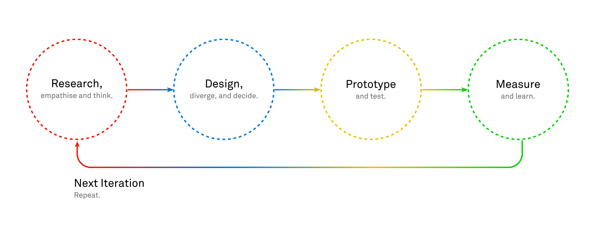
My Design Process
Empathy and User Research
To understand user problems, I had to empathize with them.
Empathy is simply the ability to understand and share the feelings of others.
Being an advocate against designing on assumptions, I needed to understand user needs. Getting existing users of hotels.ng was a challenge.
Everyone travels, and some people book hotels when they do. So I conducted online and offline interviews with traveler friends, relations and on recommendations. I used Typeform, email, and phone calls to get feedback from people.
I also looked at competitors like Jumia Travel, Wakanow, and Booking.com from where I drafted a competitive analysis which informed some of my decisions.

Competitive Analysis
The Discovery
Personal Insights
Value Proposition: The first thing I got to realize was the absence of a strong value proposition on the landing page. While it is clearly stated on the about us page, it wasn’t really evident on the design.
“Why should I use Hotels.ng out of the many booking products out there?” I thought.
Categorization: The prominent categorization on the homepage was by states and best deals. What if I needed to go for a vacation with no idea of where to go to? I would love to be inspired.
It took me time to discover “key attractions” which were tiny links on the footer. Maybe not a core aspect of the business model, but that could be a valuable feature after all.

Inspiration based on budget
Search and cognitive load: 249 hotels in Calabar was too much for me to sieve through and find my preferences. The filter feature was not detailed enough to help me streamline my choices fast.
Aesthetics: Being a Designer with great attention to detail, this one was a big one for me. A style guide was lacking. Important elements like call-to-action buttons were inconsistent.
Feedback from user research
Interviewing people was an eye opener for me on this project.
The key takeaways are:
- People who know their destination need to get the best hotel that fits their budget.
- People aren’t sure where they want to spend their next vacation/holiday. They only have basic ideas like a beach, in 3 months time, and a budget.
- People want to be inspired based on their budget.
- People want the best deals.
- People want to see tourist attractions and activities close to a hotel.
Personas
From my research and findings, I defined 2 personas. A leisure traveler needing inspiration on where to go next, and a traveller who knows her destination.
A persona is a fictional user, ideally based on real user research as part of the design process. The character, skills, priorities, and goals of this persona are used as a key point of reference during the rest of the design process.

Persona 2 -Leisure traveller who needs inspiration to plan his next vacation.

Persona 1 — Business Traveller who knows her destination most times.
Based on my personas, I came up with the following scenarios:
- Without having to search, Chris wants to see recommendations.
- Chris wants to be able to filter his search based on his budget and interests so that he can get the best deals.
- Chris wants to determine the proximity of hotels to tourist attractions and activities by seeing a detailed map highlighting experiences around a hotel.
- Chris wants to share a discovery with his bae.
- Stella wants to spend less time booking a reservation.
- Stella wants to save her favorite searches and hotels so that she can just access them anytime she wants.
- Stella wants to see recommendations based on her past interests and bookings.
The Solution
Content is King
Designing a product that inspires its users, qualitative data to help me map out hierarchical priority was a challenge. I hypothesized that content would be different if the customer does not have a high intent to book. Also, content should be different for new users and existing users.
I developed categories for the homepage and flashed out a user flow.

Search
Great products are designed and built around their value proposition. The key thing that makes the product unique and better than its competitors.
I leveraged on:
“finding hotels & attractions that fit user interests and matches user budget without hassle”.
I designed a search system that allows users find hotels based on their interests, budget and time of travel.
The premise behind this pattern is to reduce cognitive load for users by presenting to them refined, streamlined and personalized search results.
Also, for a more personalized experience, this would help collect key user data.
This solves Chris’ problem of being able to filter his search based on his budget and interests so that he can get the best deals, and Stella’s desire to spend less time making a reservation.
Search Interaction
Search Results
Based on user search inputs, the search results present the user with the best options.
Users also get to see deals, bookmark discoveries and flip through hotel images with rich immersive and deliberately taken photos that inspire and motivate.
I designed a map which shows makers highlighting hotels within the searched area with price as the focus, giving users an option beyond having to scroll past a list of results.

Search results
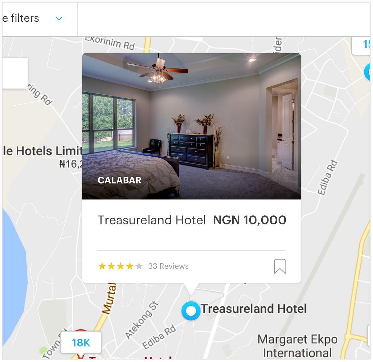
Card pops up when maker on map is clicked.
Markers on Map
On the map, users see hotels within a search proximity.
Filter Options

Simple and intuitive filter
I designed a filter which is a simple strip just below the main menu bar. Users can filter through destinations, hotels, select check-in/check-out dates, budget range, number of guests, reason for travel, number of rooms, and other secondary interests.

Bookmarking a hotel
With the power of “cookies”, users are able to save hotels whether they are logged in or not and access them by clicking on the bookmark icon at the top left of the header.
These bookmarks can be shared.
Chris wants this, and Stella wants to save some interesting discoveries.
Hotel Detail Page
I came up with a page having 4 tabs — The first is the hotel overview tab.
Users get to know more about their trophy. This is highlighted, in rich immersive photos, key amenities, hotel rules, check-in/check-out time and things to do or engage in.

Hotel main page
Map & Experiences
With the first persona, Chris, in mind, I designed the map and attractions tab where users can see markers showing experiences and attractions around a hotel.
Users can see tourist attractions, shopping malls, banks and ATMs, restaurants and lots more fun experiences close to a hotel.
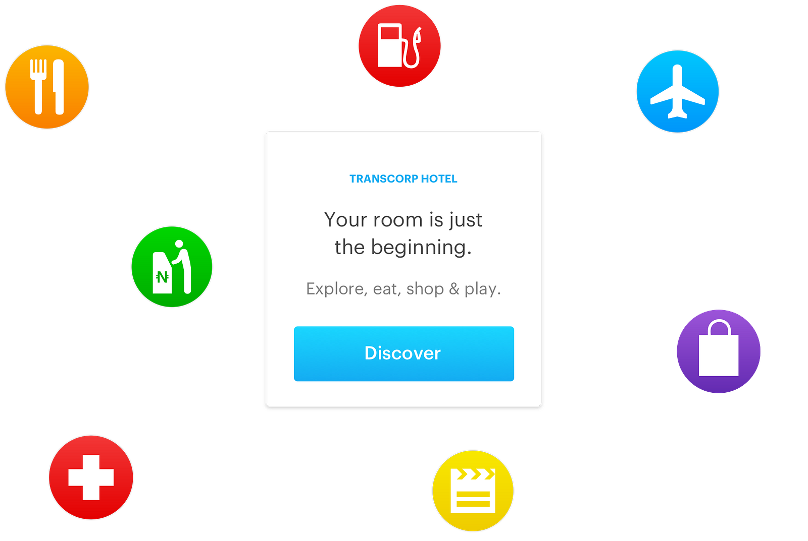

Experiences around a hotel
The Homepage
What if a user did not need to search?
First-time users are presented with best deals and recommended hotels. Previous users who are logged in, or whose actions have been cached are presented with recommendations based on their previous patterns, searches, and interests.
This solves Chris problem of wanting to see recommendations.
After best deals and recommended are popular destinations, a banner slide which could be used to highlight attractions, business travel, honeymoon offers and much more.
Next is a category displaying an array of featured hotels.
An aunt of mine whom I interviewed lamented that it was difficult for her and her husband to find an appropriate event center during their wedding. Her feedback informed my decision to include a section called “events and conferences” on the home page.

Attractions
What if Chris has no idea where to spend his next summer holiday? What if someone else wanted to embark on a travel adventure or was looking for a perfect honeymoon bliss? I designed the attractions page to solve all these problems.
I designed an onboarding page to help users streamline their options based on their interests.
Users simply enter a few details, select their interests and boom — you are on your way to bliss.

Onboarding for attractions

Assets and Style Guides
Although I created a little defined style guide for typography, colours and a few assets at the start of this project, as I moved ahead, things started to shape up which resulted in a definitive set of assets and guides ranging from buttons to cards, inputs, alerts, icons and more.

Conclusion
What I’ve done is just a fraction of what can be done. Running a successful start-up is more than just having a good digital product. Ultimately, the business is the product, and “design” doesn’t sit as comfortably in the concept of business as it should.
In this exciting times when technology is shaping the way we live, design plays a critical role in our economic growth, in businesses, and in our public services.
Design encourages innovation, creates competitive advantage, and drives growth, but we don’t use design enough.
What could you do in your business to put design right at the heart of it?
Get a Designer on the team, make them see the vision of the business, they should be part of every decision that is made. Be bold and invest in Design, even in this time of recession.
We have talented Developers and Designers. We have good marketing and business people. If we set priorities right, we can create remarkable businesses.
One last tip
I’ve been privileged to peep into the brothel where startups and investors make love. Investors don’t care how long your tech’s cork is, they only care about how your idea will make MONEY. For your unicorn startup to make money, you have to present it in the best form it can be. — That is Design!😀
I’d be glad to know your views on this case study. So please drop your heart piercing comments, and please hit the ❤️ icon.
More on my Website, Twitter, Instagram, and Dribbble.
Many thanks to my loving friends Kanu Derek, Fari Oluwatoyin, Larry Oti for their immense input on this project.
It’s an inspiring article.