
User friendly form validation
Have you ever created a web form that had more than just two login fields?
Or, ever better - tried to build a profile page that users would fill out with joy?
Ok, now imagine a SaaS application that is built upon an AI engine, which has one purpose and one purpose only - to analyze the huge amount of customer data. And you’re that lucky person that has the honor to find an extremely user-friendly way to convince customers to fill out tons of different forms to set everything up!
That is what I’m currently working on, and my puzzle loving mind is happy. 
If you answered yes to my questions above, you are already aware that motivating users to fill out a form is one part of the puzzle. Another part of this game is handling the form validation. This is a very tricky process when each step gives users a reason to quit.
So lately, I’ve been working on a form validation mechanics that should help users to fill out the forms, rather than bombarding error messages to their screens.
That sounds crazy at first, but let me show you where I’m at in this journey.
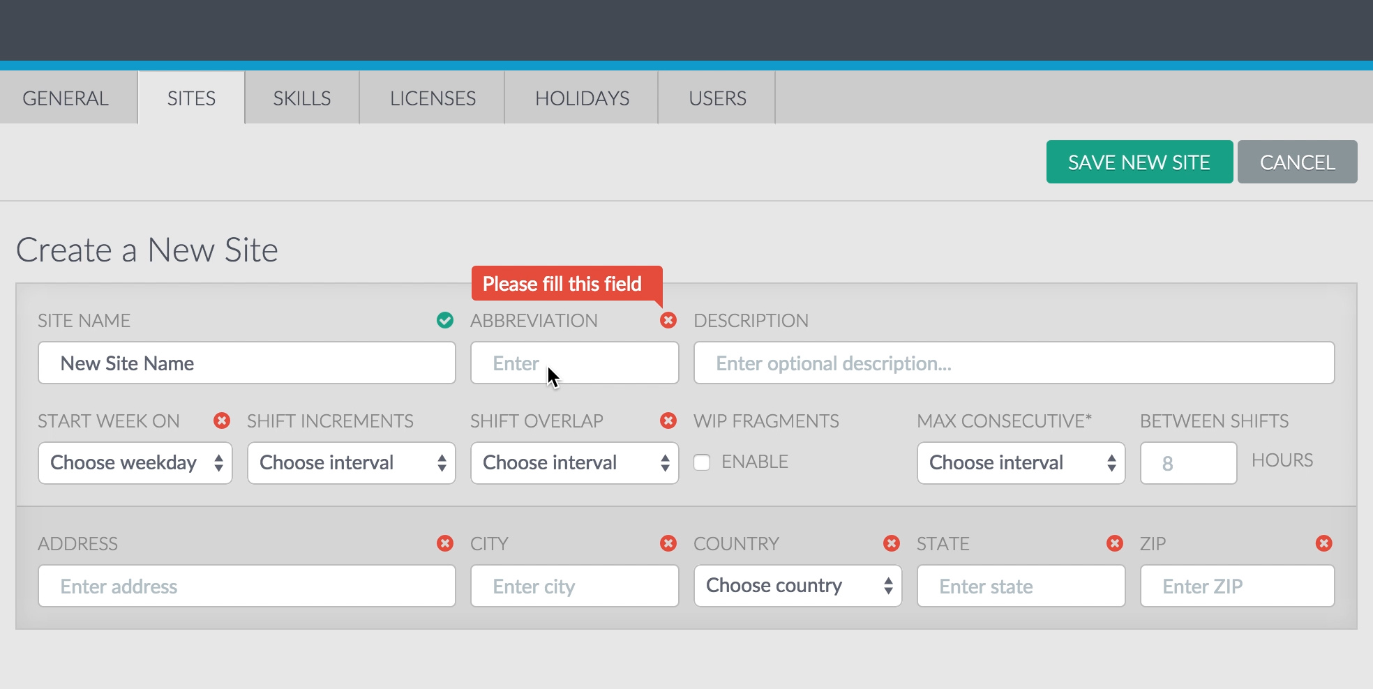
At the screenshot above you can see some elements that are being used:
- notification icons that display different validation states for every required field,
- error message that asks user to fill out some field.
Personally, I think that static images are outdated when it comes to interaction design and UI/UX. However, I posted this screenshot on purpose, so that you could imagine yourself being a user, who is in a middle of the process of filling out some form with lots of fields…
So if you were that user, what would your next step be?
I bet, you’d enter the Abbreviation field.
Let’s see what we’ve got here:
- A clear call to action - there is only one message that is pointing to the next field that needs to be filled;
- Users can tell right away how many fields will require their attention;
- Icons take a really small amount of space and play nicely even with very short fields with long labels;
- The messages don’t ruin the form markup, due to their absolute positioning.
Now, check it out in action on video walkthrough. You’ll notice how gently the form guides a user through the process. It feels more like a tutorial with several steps, rather than a complex form submission.
How it’s built:
- AngularJS Validation - to check if form and its fields are
$valid - AngularJS Ng-messages directive - to handle the messages
- Bootstrap Validation states classes - to change the fields’ style
- Custom AngularJS directive - to wrap it all up together with icons and handle all the DOM-related logic.
So it ends up with this re-usable line of code:
<!--
  AngularJS directive
  type: AE

  1. pass a field name (e.g. "formName.fieldName") into the "messages-for" attribute;
  2. pass a scope expression that returns "true" when users tries to submit the given form
-->

<!--  Validate Messages directive starts  -->
<div validate-messages messages-for="siteForm.siteName" submitted="submitted"></div>
<!--  Validate Messages directive ends  -->