
Magnus UI tutorial: Building out React Native UI component
Originally published and sponsored by logrocket blog
Having a great UI and UX is among the most important factors for any app’s success out in the wild, especially when there are so many alternatives available for almost every app. Getting your app to look and behave the way you want it to takes time, patience, and practice.
If you don’t have the help of designers and UX developers when building your app, though, you’re probably gonna spend most of your time getting your idea to work. Making the UI look pretty is probably the least of your concerns — especially if you’re a solo dev.
This is where tools like Magnus UI come in. With a handful of components and intuitive utility props, it allows you to very quickly and easily build out UI components for your React Native apps that look and feel great.
Utility-first style libraries are the hot new thing on the block — well, they’ve been around for a while now, but they are gaining traction rather quickly lately. Magnus UI is following that trend. If you wanna see what all that hype is about, this is the post for you.
In this blog post, I will be walking you through building two complete screens of an app using Magnus UI. I’m not anything close to a designer, so I’ll resort to picking something from Dribbble. This is how it looks:
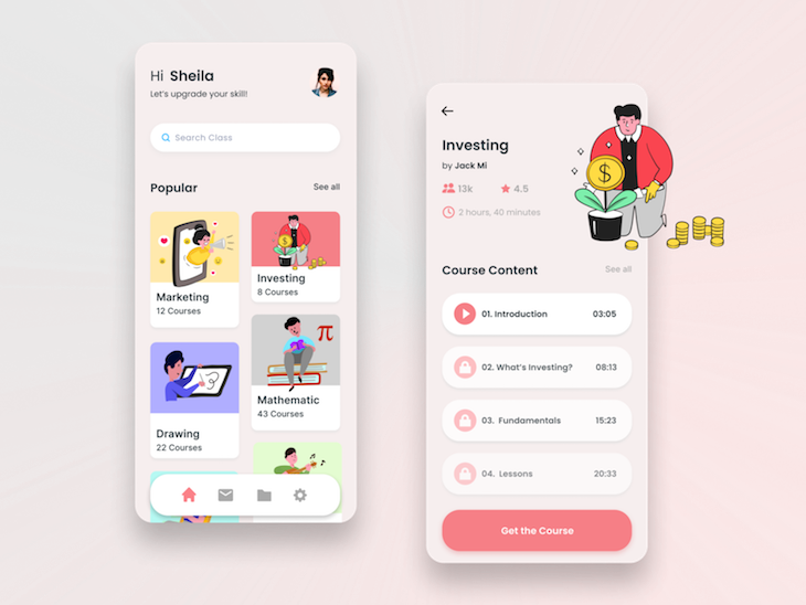
The reason I’m picking this design is because it contains a few of the most common UI blocks that almost all apps have:
- A list of things with images for each and some text content. In this case, it’s a list of course categories
- A bottom navigation that allows you to navigate between multiple pages
- A master detail pattern where each category has its own screen showing the courses in it and an action button for the screen
- Some smaller details such as user profile, search bar, stats display, etc.
Of course, Dribbble mockups always contain some extra bits that add no value to the end user and only serve to make the design pop. So we will trim this down a bit to keep the content of this post relevant and on-point.
Alright, now let’s get to it! Oh, and before we do, if you just wanna take a peek at what the end result looks like before committing to reading through the whole thing, here’s a quick preview for you, and here’s the entire codebase on GitHub.
Click here to see the full demo with network requests
Our toolkit
First of all, I love TypeScript, and once I started using it, going back to JavaScript just doesn’t feel right. So I will be using TypeScript for this project, but feel free to stick to the JS version if you prefer.
Getting started with and managing React Native projects can be a bit tedious, which is why I always prefer Expo, even though it has its limitations. Luckily, to demonstrate building a two-screen app, we won’t be hitting any of those limitations.
For master detail navigation between the course category and its detail page, I am choosing the react-navigation package. It will also help us quickly scaffold a bunch of complicated things such as bottom navigation bar, top header area, etc.
And of course, the main star of the show, Magnus UI, needs to be included in that list. In the design, there are a few illustrations that are not available separately, so I will be replacing those with illustrations from unDraw, which is an absolutely stellar website to quickly find gorgeous-looking illustrations for your project.
I’m listing these all out to give you, the reader, a chance to familiarize yourself with these tools before you dive in. However, it’s not mandatory since I will try my best to document the usage of all of these as needed.
Scaffolding our React Native app
If you’re not familiar with React Native or the Expo CLI, they both have some pretty handy boilerplates ready to kick off any project. Since we’re using Expo, the one that best suits our needs is the template with tabs.
To get the boilerplate, run the command expo init elarn in your terminal and choose the template from the prompt. Once done, get into the newly created folder using cd elarn.
The boilerplate has quite a bit of code already, but before we dig into it, let’s install Magnus UI from npm. You can follow their installation guide here, but this is what you need to run:
yarn add react-native-magnus color react-native-modal react-native-animatable -S
OK, now let’s see how the app looks with the boilerplate code in place. Run yarn start to fire off the Expo service. Once the service is running, you can either use the Expo client to run the app on your physical device of choice (iOS/Android) or run it on an emulator/simulator. I’m going to use Simulator for iOS. Please follow the Expo documentation if you have trouble with any of these. Once the app is running, you should see a screen like below:
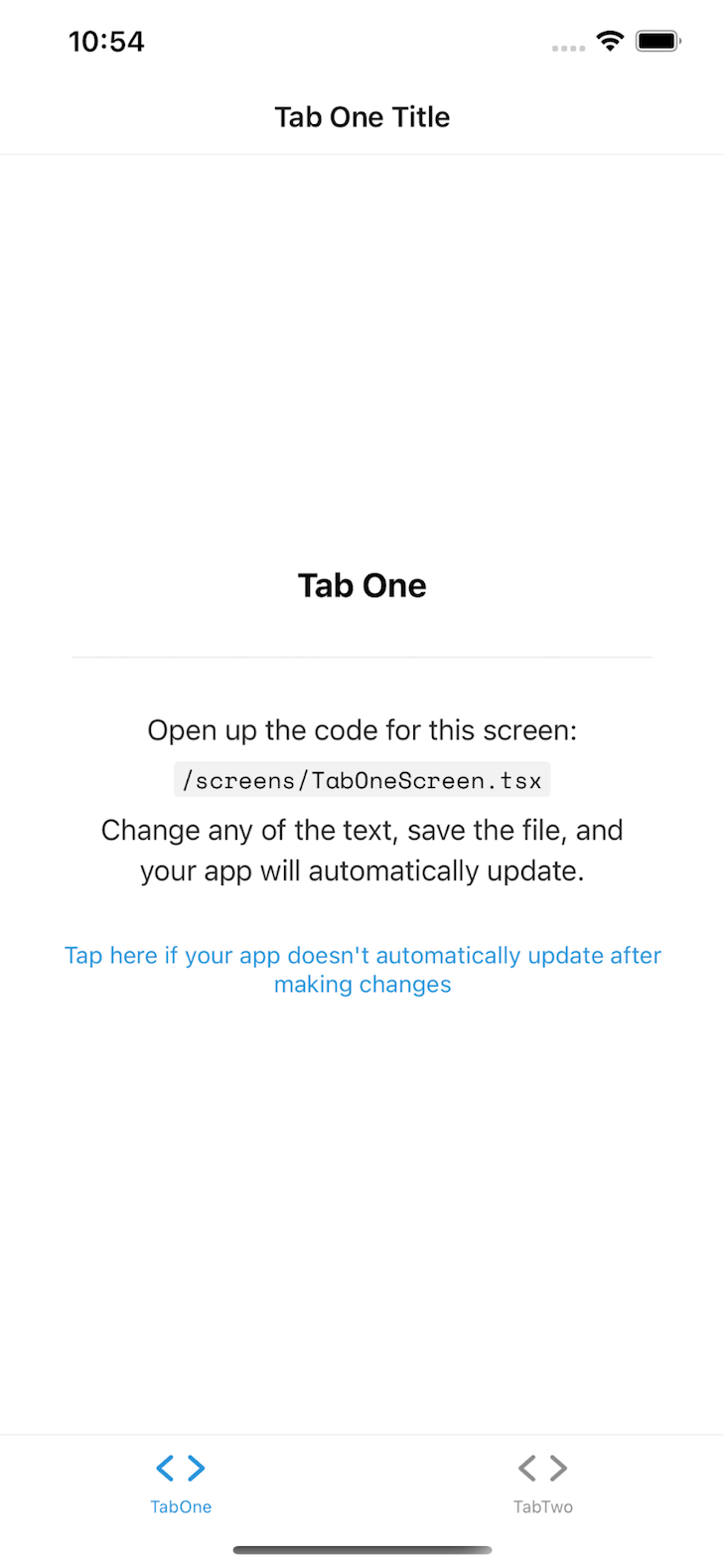
As you can see, we’ve got quite a bit of work to do to get this to look like the amazing Dribbble design we chose, so let’s get to it!
Styling our bottom tabs
The Expo tabs template comes built in with react-navigation implemented, including two tab screens. However, the tabs follow native default style based on the device OS. To make it look more like the design, we have to configure it a little bit.
Since react-navigation and our Expo boilerplate already built out most of it, we will try not to rewire too much with Magnus UI. Instead, we’ll just use some raw React Native configuration and styling to get it to look like the design.
In the boilerplate, we are only given two tabs, but the design has four. So let’s add a couple more tabs and add in icons for the tabs to look more like the design. We have a wide range of icons available through the @expo/vector-icons package, and for the tab icons, we’re using the Ionicons icon set.
First, open the navigation/BottomTabNavigator.tsx file and replace the BottomNavigator component with the following:
<BottomTab.Navigator
      initialRouteName="TabOne"
      tabBarOptions={{
          showLabel: false,
          activeTintColor: Colors[colorScheme].tint,
          style: {
              marginLeft: 50,
              marginRight: 50,
              marginBottom: 30,
              borderRadius: 35,
              paddingBottom: 10,
              borderTopWidth: 0,
              position: 'absolute',
              paddingHorizontal: 20,
              backgroundColor: Colors[colorScheme].tabBarBackground,
          }
      }}>
      <BottomTab.Screen
        name="TabOne"
        component={TabOneNavigator}
        options={{
          tabBarIcon: ({ color }) => <TabBarIcon name="ios-home" color={color} />,
        }}
      />
      <BottomTab.Screen
        name="TabTwo"
        component={TabTwoNavigator}
        options={{
          tabBarIcon: ({ color }) => <TabBarIcon name="ios-folder-outline" color={color} />,
        }}
      />
      <BottomTab.Screen
        name="TabThree"
        component={TabTwoNavigator}
        options={{
          tabBarIcon: ({ color }) => <TabBarIcon name="ios-chatbox-outline" color={color} />,
        }}
      />
      <BottomTab.Screen
        name="TabFour"
        component={TabTwoNavigator}
        options={{
          tabBarIcon: ({ color }) => <TabBarIcon name="ios-cog" color={color} />,
        }}
      />
    </BottomTab.Navigator>
The additions here are:
styleandshowLabelfields in thetabBarOptionsprop in theBottomTab.Navigatorcomponent. This adds some custom styling to make it look like the designTabThreeandTabFourtabs that are just pointing at existing screens, essentially duplicatingTabTwobut using different icons
Now, these icons look a bit too large compared to the design, so in the same file, look for the TabBarIcon component and change the size prop to 25. To adjust spacing with the new size, change the marginBottom to -5:
return <Ionicons size={25} style={{ marginBottom: -5 }} {...props} />;
Due to the above changes, TypeScript will complain a bit because we added two new tabs without defining their types properly. Open up the types.tsx file, and in the BottomTabParamList definition, add TabThree and TabFour, like below:
export type BottomTabParamList = {
  TabOne: undefined;
  TabTwo: undefined;
  TabThree: undefined;
  TabFour: undefined;
};
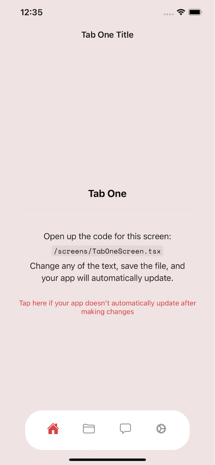
If you’re looking at the current state of the app, you’ve probably realized that colors look way off on the screen compared to the design, so let’s fix those. Change the tint color for the tabs in constants/Colors.ts by setting const tintColorLight = '#D84343';, and then change the tab bar background by setting background: '#EFE3E3'.
This boilerplate comes with support for both dark and light mode, so let’s adjust our design a bit for dark mode, too. Add a new property to both light and dark scheme: tabBarBackground: '#fff', because we used this property in the style property of the tabBarOptions prop.
FYI, I extracted these hex values directly from the Dribbble design, so if they don’t match your expectation or preference, feel free to tweak them as you see fit.
Once the above changes are done, your screen should look like this:
Configuring Magnus UI to build our React Native UI
Finally, we get to focus on building our page content with Magnus UI. In order to use all the Magnus UI utility props for styling, we need to configure it with some basic details. First, let’s import the Magnus ThemeProvider in the App.tsx file and define a custom theme with our primary color:
import { ThemeProvider } from "react-native-magnus";

const ElarnTheme = {
  colors: {
    pink900: '#D84343',
  }
}
These color definitions help build a subset of color variations that you can use throughout your app with more memorable and easily identifiable names. All we have to do now is just wrap our entire app with the ThemeProvider and pass the theme object to the provider:
<ThemeProvider theme={ElarnTheme}>
          <Navigation colorScheme={colorScheme} />
          <StatusBar />
        </ThemeProvider>
Now, let’s build our home screen from the top. The first thing I’m noticing is the header that says Tab One Title sticking out like a sore thumb. To get rid of that, we need to go back into BottomTabNavigator.tsx and pass a new prop to the TabOneScreen definition:
<TabOneStack.Screen
        name="TabOneScreen"
        component={TabOneScreen}
        options={{
            headerShown: false
        }}
      />
Obviously, headerShown: false is what’s hiding the header.
Step 1: Building the home screen UI
As you might have noticed, the filenames, code inside them, etc. are written in a generic way, with TabOne, TabTwo, etc. Feel free to rename them if you’d like, but I’ll keep them as they are. Let’s start with screens/TabOne.tsx, remove all the style definitions from it, and then place in the following code:
import * as React from 'react';
import Constants from "expo-constants";
import {Avatar, Div, Icon, Input, Text} from "react-native-magnus";

import { categories, CategoryCard } from '../components/CategoryCard';
import {ScrollView} from "react-native";

export default function TabOneScreen() {
  return (
      <ScrollView>
        <Div px={25}>
            <Div mt={Constants.statusBarHeight} row justifyContent={"space-between"} alignItems="center">
                <Div>
                    <Div row>
                        <Text fontSize="5xl" mr={5}>Hi</Text>
                        <Text fontSize="5xl" fontWeight="bold">Sheila</Text>
                    </Div>
                    <Text fontSize="lg">Let's upgrade your skill</Text>
                </Div>
                <Avatar shadow={1} source={{uri: 'https://i.pravatar.cc/300'}}/>
            </Div>
            <Div my={30}>
                <Input
                    py={15}
                    px={25}
                    bg="white"
                    rounded={30}
                    placeholder="Search Class"
                    prefix={<Icon name="search" color="gray900" fontFamily="Feather" />}
                />
            </Div>
            <Div row pb={10} justifyContent="space-between" alignItems="center">
            <Text fontWeight="bold" fontSize="3xl">Popular</Text>
            <Text fontWeight="bold" fontSize="lg">See all</Text>
        </Div>
            <Div row flexWrap="wrap" justifyContent="space-between">
                {categories.map((category) => (
                    <CategoryCard {...category} />
                ))}
            </Div>
        </Div>
      </ScrollView>
  );
}
Let’s break this down. We’re wrapping our entire page in a ScrollView component so that the list of course categories is scrollable. Then there’s another wrapper named Div with a prop px={25}.
Div is a Magnus UI alternative to a basic View component from React Native. It can take in any utility prop for styling, and px is one of those props; it sets horizontal padding around the container.
Since we removed the header area, the content inside the tab screen will start overlapping with the status bar area of your device. To prevent that, we’re wrapping the top area content in a div and adding a top margin that is equal to the device’s status bar, which can be extracted using Constants.statusBarHeight from the expo-constants library.
Thanks to row justifyContent={"space-between"}, the immediate children of this component will be positioned one after the other on the same row, and they will be pushed to the horizontal edges of the container and aligned in the vertical center of the container.
Inside of it, we have a Div that wraps all the text content to greet the user. To style the text, we are using the props fontSize and fontWeight. The value of fontSize is defined in sm, lg, xl, etc. instead of actual sizes to ensure consistency across the app.
On the right-hand side, to display a profile photo, we’re using the Avatar component from Magnus UI and passing it a URL from an avatar service. Notice how nicely this component puts the image in a circle and how easy it is to add some shadow to it by simply passing a shadow={1} prop.
Next, we have the search input field, which is another component from Magnus UI. We can easily style it with handy props like rounded={30}, which gives the input field’s border a 30px radius. color="gray900" is another interesting prop here, which pulls the gray900 color from the default theme definition.
You can override these colors by simply defining them in the custom theme that was passed to the ThemeProvider. The other props are kind of similar to the ones we have been seeing so far.
Now we need some data for the list of course categories. Ideally, in a real-life app, these would come from a server somewhere. For now, we will just hardcode them.
To keep our code clean, we will move the category display to its own component named CategoryCard and pass the category data to it while mapping over all the categories. Both of those are being imported from components/CategoryCard.tsx, which doesn’t exist yet. So let’s create that file and put the following code inside:
import * as React from "react";
import {Div, Image, Text} from "react-native-magnus";
import {ImageSourcePropType} from "react-native";

type Category = {
    count: number;
    category: string;
    picture: ImageSourcePropType;
}

export const categories = [
    {category: 'Marketing', count: 12, picture: require('../assets/images/illustration_one.png')},
    {category: 'Investing', count: 8, picture: require('../assets/images/illustration_two.png')},
    {category: 'Drawing', count: 22, picture: require('../assets/images/illustration_three.png')},
    {category: 'Marketing', count: 12, picture: require('../assets/images/illustration_one.png')},
    {category: 'Investing', count: 8, picture: require('../assets/images/illustration_two.png')},
    {category: 'Drawing', count: 22, picture: require('../assets/images/illustration_three.png')},
    {category: 'Drawing', count: 22, picture: require('../assets/images/illustration_three.png')},
];

export const CategoryCard = ({category, count, picture}: Category) => (
    <Div rounded="lg" bg="white" mb={10} w="48%">
        <Image source={picture} h={120} roundedTop="lg" />
        <Div p={10}>
            <Text fontWeight="bold" fontSize="xl">{category}</Text>
            <Text>{count} Courses</Text>
        </Div>
    </Div>
);
The component itself is quite straightforward. We have a Div with rounded borders and a white background. Each card takes up 48 percent of the available width so that every row fits only two cards with some spacing in the middle. The image is shown on top and some the category and course count at the bottom of the card.
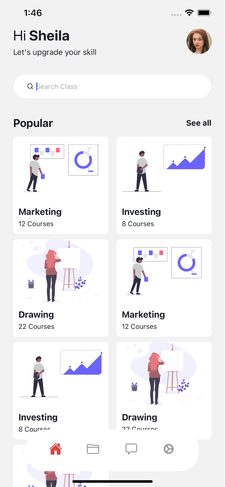
We are also defining some fake category data in an array to fill out the screen. The picture prop in each category points to a local file in the assets/images directory where I’ve put three illustrations downloaded from unDraw. At this point, you should see a screen like this on the home screen:
Step 2: Building the detail page UI
In the master–detail pattern, you’d usually have a list of items, and clicking on one of the items will take you to a different screen with more details about the item. To create our detail screen for every category, let’s create a new file called screens/CourseDetail.tsx and put the following code inside:
import * as React from 'react';
import {ScrollView} from "react-native";
import { useHeaderHeight } from '@react-navigation/stack';
import {Div, Icon, Image, Text} from "react-native-magnus";
import {StackScreenProps} from "@react-navigation/stack";
import {ListHeader} from "../components/ListHeader";
import {CourseVideo} from "../components/CourseVideo";
import {Category, TabOneParamList} from "../types";

export default function CourseDetailScreen({route}: StackScreenProps<TabOneParamList, 'CourseDetailScreen'>) {
    const { category }: { category: Category } = route.params;
    const headerHeight = useHeaderHeight();
    return (
        <ScrollView style={{marginTop: headerHeight}}>
            <Div px={25}>
                <Div row mt={15} mb={15} justifyContent="space-between">
                    <Div pb={50}>
                        <Text fontSize="4xl" fontWeight="bold">{ category.category }</Text>
                        <Div row>
                            <Text>by </Text>
                            <Text fontWeight="bold">{category.author}</Text>
                        </Div>
                        <Div row mt={15}>
                            <Div pr={30} row>
                                <Icon fontFamily="Ionicons" fontSize={20} name='people' color="pink500" />
                                <Text fontSize="lg" ml={5} fontWeight="bold">{ category.subscriberCount }</Text>
                            </Div>
                            <Div row>
                                <Icon fontFamily="Ionicons" fontSize={20} name='star' color="pink500" />
                                <Text fontSize="lg" ml={5} fontWeight="bold">{ category.rating }</Text>
                            </Div>
                        </Div>
                        <Div row mt={15}>
                            <Icon name="time-outline" fontFamily="Ionicons" fontSize={20} color="pink500" />
                            <Text fontSize="lg" ml={5}>{category.duration}</Text>
                        </Div>
                    </Div>
                    <Image source={category.picture} w="50%" />
                </Div>
                <ListHeader title="Course Content" />
                <Div mt={15}>
                    {category.videos.map(video => (
                        <CourseVideo {...video} />
                    ))}
                </Div>
            </Div>
        </ScrollView>
    );
}
This screen will have dynamic content based on whichever category the user selects, which is why it needs to accept the category as a route param. Route params are used to pass data from one screen to another when navigating between screens.
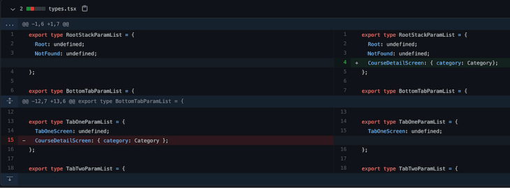
In our case, we want to pass the selected category data to this screen. To facilitate passing that data, we need to type this component properly via TabOneParamList, so open up the types.tsx file and update it as below:
export type TabOneParamList = {
  TabOneScreen: undefined;
  CourseDetailScreen: { category: Category};
};
Now, while we’re in this file, notice that the detail page for a category has a lot more data than was displayed in the home screen for every category — rating, subscribers, list of course videos, etc.
Thus, we need to update our category data, and since it’s raw data, we probably shouldn’t have this inside the card component. So let’s remove it from components/CategoryCard.tsx and add the below code in the types.tsx file:
export const categories = [
  {
    category: 'Marketing',
    count: 12,
    picture: require('./assets/images/illustration_one.png'),
    author: 'Jack Mi',
    subscriberCount: '11K',
    rating: 4.8,
    duration: '2 hours 30 minutes',
    bg: 'pink500',
    videos: [
      {title: '01. Introduction', duration: '03:53'},
      {title: '02. Whats investing', duration: '08:13'},
      {title: '03. Fundamentals', duration: '15:23'},
      {title: '04. Lessons', duration: '20:33'},
    ]
  },
  {
    category: 'Investing',
    count: 8,
    picture: require('./assets/images/illustration_two.png'),
    author: 'Jack Mi',
    subscriberCount: '11K',
    rating: 4.8,
    duration: '2 hours 30 minutes',
    bg: 'purple500',
    videos: [
      {title: '01. Introduction', duration: '03:53'},
      {title: '02. Whats investing', duration: '08:13'},
      {title: '03. Fundamentals', duration: '15:23'},
      {title: '04. Lessons', duration: '20:33'},
    ]
  },
  {
    category: 'Drawing',
    count: 22,
    picture: require('./assets/images/illustration_three.png'),
    author: 'Jack Mi',
    subscriberCount: '11K',
    rating: 4.8,
    duration: '2 hours 30 minutes',
    bg: 'red500',
    videos: [
      {title: '01. Introduction', duration: '03:53'},
      {title: '02. Whats investing', duration: '08:13'},
      {title: '03. Fundamentals', duration: '15:23'},
      {title: '04. Lessons', duration: '20:33'},
    ]
  },
  {
    category: 'Marketing',
    count: 12,
    picture: require('./assets/images/illustration_one.png'),
    author: 'Jack Mi',
    subscriberCount: '11K',
    rating: 4.8,
    duration: '2 hours 30 minutes',
    bg: 'blue500',
    videos: [
      {title: '01. Introduction', duration: '03:53'},
      {title: '02. Whats investing', duration: '08:13'},
      {title: '03. Fundamentals', duration: '15:23'},
      {title: '04. Lessons', duration: '20:33'},
    ]
  },
  {
    category: 'Investing',
    count: 8,
    picture: require('./assets/images/illustration_two.png'),
    author: 'Jack Mi',
    subscriberCount: '11K',
    rating: 4.8,
    duration: '2 hours 30 minutes',
    bg: 'pink500',
    videos: [
      {title: '01. Introduction', duration: '03:53'},
      {title: '02. Whats investing', duration: '08:13'},
      {title: '03. Fundamentals', duration: '15:23'},
      {title: '04. Lessons', duration: '20:33'},
    ]
  },
  {
    category: 'Drawing',
    count: 22,
    picture: require('./assets/images/illustration_three.png'),
    author: 'Jack Mi',
    subscriberCount: '11K',
    rating: 4.8,
    duration: '2 hours 30 minutes',
    bg: 'pink500',
    videos: [
      {title: '01. Introduction', duration: '03:53'},
      {title: '02. Whats investing', duration: '08:13'},
      {title: '03. Fundamentals', duration: '15:23'},
      {title: '04. Lessons', duration: '20:33'},
    ]
  },
];
As you can see, we have a few new properties in each category, including an array of videos. That means we need to adjust the type definition for Category. Let’s remove its type definition from components/CategoryCard.tsx and place this code in the types.tsx file:
import {ImageSourcePropType} from "react-native";
export type Video = {
  title: string;
  duration: string;
};

export type Category = {
  bg: string;
  count: number;
  author: string;
  rating: number;
  category: string;
  duration: string;
  videos: Video[];
  subscriberCount: string;
  picture: ImageSourcePropType;
}
OK, now let’s get back to the screen again. Similar to our homepage, we have a top area with some details on the left side. The image of the category is on the right side, so we use a flex wrapper to contain this.
Notice that the subscriberCount icon uses color="pink500". To match it with the design, we need to overwrite its default value via the theme modifier in App.tsx :
const ElarnTheme = {
  colors: {
    pink900: '#D84343',
    pink500: '#D59999'
  }
}
Then, underneath, we are mapping through all the videos for the course and rendering a CourseVideo component. Let’s create a new file called components/CourseVideo.tsx and put the following code in it:
import {Button, Div, Icon, Text} from "react-native-magnus";
import React from "react";

export const CourseVideo = ({title, duration}: {title: string, duration: string}) => (
    <Button block bg="white" mb={15} py={15} px={15} rounded="circle" shadow="xl">
        <Div row flex={1} alignItems="center" pr={10}>
            <Div bg="pink900" rounded="circle" p={10} mr={10}>
                <Icon name="play" fontFamily="Ionicons" color="white" fontSize="3xl" />
            </Div>
            <Div flex={2} row justifyContent="space-between">
                <Text fontWeight="bold" fontSize="lg">{ title }</Text>
                <Text fontWeight="bold" fontSize="lg">{duration}</Text>
            </Div>
        </Div>
    </Button>
);
The last thing I want you to note on this screen is that we are using a ListHeader component to show the video list header. Since this header is exactly the same as the list header we had on the home screen, it makes sense to abstract it into its own component.
Let’s create a new file, components/ListHeader.tsx, and put the following code in the file:
import * as React from "react";
import {Div, Text} from "react-native-magnus";

export const ListHeader = ({title}: {title: string}) => (
    <Div row pb={10} justifyContent="space-between" alignItems="center">
        <Text fontWeight="bold" fontSize="3xl">{title}</Text>
        <Text fontWeight="bold" fontSize="lg">See all</Text>
    </Div>
);
I simply copied the header content from the home screen and made the title dynamic through prop. So now we can replace the header in the home screen with this: <ListHeader title="Popular" />.
Now to allow the user to select a category and open the detail screen, we have to first turn every category card into a button and attach an onPress event handler. Open up the components/CategoryCard.tsx file and replace the wrapper Div with this:
export const CategoryCard = ({category, count, picture, bg, onPress}: CategoryCardProp) => (
     <Button
        block
        w="48%"
        mb={10}
        p="none"
        bg="white"
        rounded="lg"
        onPress={onPress}>
onPress is expected as a prop, so we need to go back to the home screen and pass this onPress function to every category. Every screen in react-navigation receives a navigation prop, which can be used to navigate between screens. Open up the screens/TabOneScreen.tsx and adjust the component definition like so:
export default function TabOneScreen({ navigation }: StackScreenProps<any>) {
Then pass the onPress prop to the CategoryCard component like below:
<CategoryCard
                        {...category}
                        onPress={() => navigation.navigate('TabOne',{
                            screen: 'CourseDetailScreen',
                            params: {category}
                        })}

                    />
So, when any of the categories are pressed, we are navigating to the CourseDetailScreen within the TabOne navigator and passing the category info to the screen as param. For this navigation to work, we need to register our newly created screen in the navigator by adding the below tab definition in navigation/BottomTabNavigator.tsx:
<TabOneStack.Screen
          name="CourseDetailScreen"
          component={CourseDetailScreen}
          options={{
              headerTransparent: true,
              headerBackTitleVisible: false,
              headerTitle: '',
              headerLeft: props =>
                  <Button bg="transparent" p="none" {...props} ml={20}>
                      <Ionicons name="arrow-back" size={30} />
                  </Button>
          }}
      />
      </TabOneStack.Navigator>
For this tab, we keep the header but replace its content with an icon to match the design. The icon itself is rendered using the Button component from Magnus UI and contains only a back arrow icon.
If you followed every step so far, you should be able to click on any category item on the home screen, and it should open up the detail page.
However, notice that the detail page has the same bottom tab as the home screen, whereas in the design, the detail page only has one action button in the same area occupied by the bottom tab on the home screen. This is a tricky bit and requires some rewiring of the navigators.
Final step: Replacing the bottom tab on the detail screen
Due to the way react-navigation works, you can’t hide bottom tabs in a nested screen in a tab navigator. So to hide the bottom tab from our detail screen, we need to move it out of the tab navigator and put it in the main stack navigator. Open the navigation/index.tsx and add the new screen like below:
<Stack.Screen name="Root" component={BottomTabNavigator} />
      <Stack.Screen
        name="CourseDetailScreen"
        component={CourseDetailScreen}
        options={{
            headerShown: true,
            headerTransparent: true,
            headerBackTitleVisible: false,
            headerTitle: '',
            headerLeft: props =>
                <Button bg="transparent" p="none" {...props} ml={20}>
                    <Ionicons name="arrow-back" size={30} />
                </Button>
        }}
      />
Then, remove our previously added CourseDetail screen in the bottom tab navigator from the navigation/BottomTabNavigator.tsx file.
Since the detail screen is now part of the stack, we need to change how we navigate to it. Go back into TabOneScreen.tsx and replace the onPress function to look like this:
<pre”> <CategoryCard {…category} onPress={() => navigation.navigate(‘CourseDetailScreen’, { category })} />
Notice how we’re passing the param directly with the field name category instead of under a params object? This means it will be passed differently to our screen component. Let’s adjust our screens/CourseDetail.tsx definition to:
export default function CourseDetailScreen({route}: StackScreenProps<RootStackParamList, 'CourseDetailScreen'>) {
So, instead of the TabOneParamList, we are now using the RootStackParamList. Before we look into the RootStackParamList definition, let’s add the action button on this screen since we’re already in the file. Add the following button component under the ScrollView component and wrap both of them in a Fragment (<>)
<>
         <ScrollView>
         //...previous code
         </ScrollView>
         <Button block bg="pink900" rounded="circle" mx={30} top={-30} pt={20} pb={15}>
            Get the course
        </Button>
        </>
Finally, open up the types.tsx file and move the detail screen param definition like below:
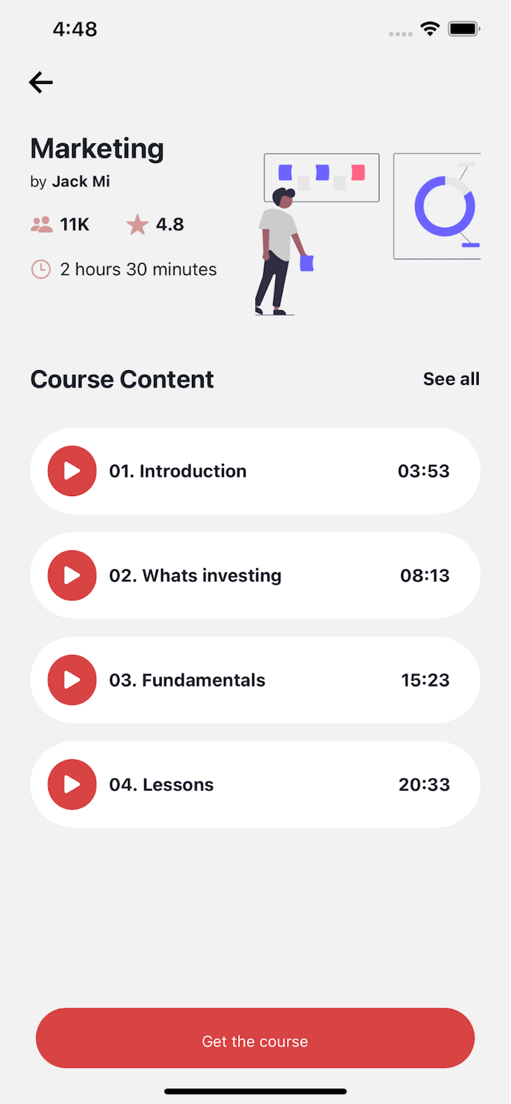
At this point, your detail screen should no longer have the bottom tab and instead show an action button like below:
Wrapping up
I hope that throughout the post, it’s been apparent how easy UI building becomes with Magnus UI. We did a lot of configuration steps since it’s an app from scratch, but once you get these out of the way, you get to continue building components with Magnus UI, and the props become second nature.