
Building a full mobile app with TypeScript, Ionic, React, and MobX - LogRocket Blog
In this post, I will walk you through building a mood tracker app with TypeScript, Ionic, React, and MobX. We will then make it publicly accessible by deploying the app on Netlify.
I have been building apps with Ionic for around four years now, and I still think it is a very impressive tool to have in your kit. It’s shiny, cutting-edge, full of features, developer-friendly, and, honestly, the list could go on.
I find it amazing how the Ionic team, after four years, still keeps the momentum and ships features and tools to empower its user base. React integration is one such feature that I believe is going to turn a lot of heads in the dev community towards Ionic and its ecosystem.
Ionic has been historically Angular/TypeScript-based, and while its core is still developed with Angular, the team has recently spent a lot of time and resources to integrate frameworks like React and Vue to lower the barrier to entry for developers of all tastes.
I personally have no agenda against Angular, but I would be lying if I said I don’t prefer React. So naturally, as soon as Ionic announced React integration, I jumped right in and started playing with it. So far, the ease of use and the plethora of components seem too good to be true.
If you’re familiar with my blogging style, you know that I am a firm believer in the “learn by building” approach. I like to get my hands dirty, make mistakes, and figure things out on my own instead of memorizing the documentation before using a new tool. If that sounds like a good approach to you, then please, do read on.
For the impatients
Ain’t nobody got time for reading a roughly 7,000-word blog post without knowing what they are getting into. So, for the impatients (like me):
- Here’s the GitHub repo that contains the entire app
- Here’s the app itself for you to take it for a quick spin. I recommend using a mobile device to access it since it’s only optimized for mobile viewing. However, it should also work on your desktop browser
- Here’s a quick look at the end product:
Who is this for?
In order to follow this post, I would expect you to:
- Be running a *nix based system (Linux or macOS) — sorry, Windows people (I know, it’s almost 2020, I should get off my high horse, right?)
- Have a basic understanding of npm, TypeScript, and React
- Have some familiarity with terminal and web development in general
- Have your development environment set up with at least Android Studio and Xcode
- Understand that all of the above rules are some authoritarian propaganda to stop you from reaching the supreme height in your career, and I’m not your mom, so I can’t really tell you what you can and can’t do — so it’s entirely up to you if you want to set sail on this epic journey or not
Scaffolding
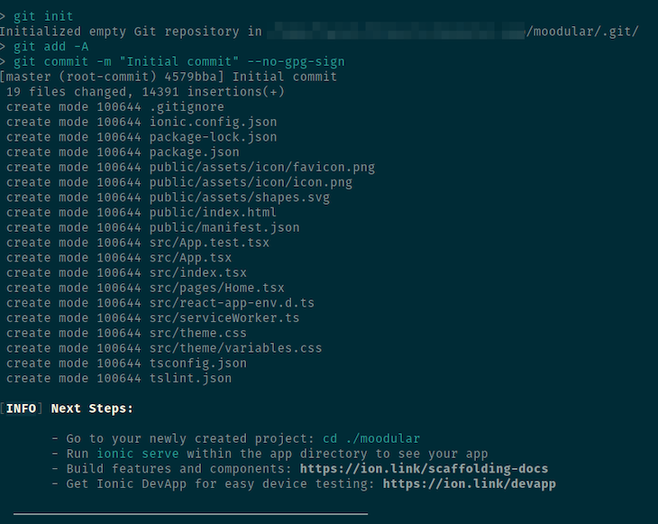
The first thing you need is the Ionic npm package installed on your machine. Running npm install -g [email protected] on your terminal should get that sorted for you. Now cd into the directory where you want to create your Ionic app folder and run ionic start moodular blank --type=react.
Click here to see the full demo with network requests
This will drop a new folder called moodular with a bunch of files and folders in it, and the output of the command will give you a preview of what to do next. Below is what I’m seeing at the time of writing this post.
Let’s do what Ionic told us to do:
cd ./moodular
ionic serve
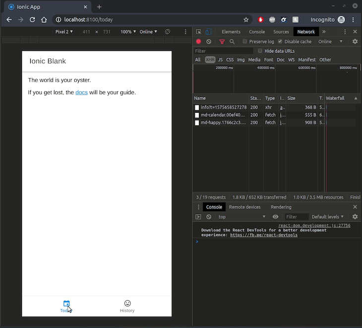
It should automatically open http://localhost:8100/home in your browser. If it doesn’t, open a new tab and navigate to that page in your browser to see it in action. Beautiful, right…? Nah! You’re right, it’s embarrassing. Let’s make it better — let’s get coding!
Tabs and pages
Let’s think through our app’s features for a second. For this very minimalistic app, we will need two pages. On the page that loads when I first open the app, I want to be able to log my current mood. Then, we will need another page where I can go through my previously logged moods — a History page, if you will. To allow navigating between the pages, we will use a bottom tab navigation.
The scaffolding in the previous page already gave us a page in the src/pages/Home.tsx file. Let’s create one more file in the folder, touch src/pages/History.tsx, and paste in the following code in that new file:
import { IonContent, IonPage } from '@ionic/react';
import React from 'react';

const History: React.FC = () => {
    return (
        <IonPage>
            <IonContent className="ion-padding">
                <p>History page</p>
            </IonContent>
        </IonPage>
    );
};

export default History;
Here, we are creating a React functional component named History and exporting it. The component renders an IonPage component with IonContent inside it. These components are layout building-block components Ionic provides out of the box. I just copied and pasted those from the autogenerated Home.tsx file and stripped some of the unnecessary markup.
Now that we have both pages, let’s show a footer tab bar and enable navigation between the pages. We want our tab bar to be available in every page, so it would make sense for it to be in a generic place. We will put it in the src/App.tsx file. Open that file and replace the App component’s internal with the following:
<IonApp>
        <IonReactRouter>
            <IonTabs>
                <IonRouterOutlet>
                    <Route path="/today" component={Home} exact={true} />
                    <Route path="/history" component={History} exact={true} />
                    <Route
                        exact
                        path="/"
                        render={() => <Redirect to="/today" />}
                    />
                </IonRouterOutlet>

                <IonTabBar slot="bottom">
                    <IonTabButton tab="today" href="/today">
                        <IonIcon icon={calendarIcon} />
                        <IonLabel>Today</IonLabel>
                    </IonTabButton>

                    <IonTabButton tab="history" href="/history">
                        <IonIcon icon={happyIcon} />
                        <IonLabel>History</IonLabel>
                    </IonTabButton>
                </IonTabBar>
            </IonTabs>
        </IonReactRouter>
    </IonApp>
We are using a few new Ionic components here that weren’t there before, so we have to make sure they’re imported properly. Scroll back up to the top of the file and find the line that looks like import {...} from '@ionic/react' and replace that with this:
import { IonApp, IonRouterOutlet, IonTabs, IonTabBar, IonTabButton, IonIcon, IonLabel } from '@ionic/react';
Throughout this post, in various places, we will be using Ionic components, and sometimes, I might forget to explicitly remind you to import it from
'@ionic/react'. Please let me know if you find such instances and I will fix it.
Now, let’s break down the code and see what we are doing.
IonRouterOutlet component
<IonRouterOutlet>
    <Route path="/today" component={Home} exact={true} />
    <Route path="/history" component={History} exact={true} />
    <Route
        exact
        path="/"
        render={() => <Redirect to="/today" />}
    />
</IonRouterOutlet>
This component lets you define your routes/pages for your app. Its children need to be <Route> components with a path and a component prop at least. The path prop tells Ionic what the URL will look like when the route is hit, and the component defines which component will be rendered when that URL/route is hit.
In our code, we have defined two routes for two of our pages: Home and History. Notice that we haven’t imported our newly created History component yet, so let’s go back to the top again and import it right after our Home import:
import Home from './pages/Home';
import History from './pages/History';
The third <Route> here is a default catcher. If the user does not specify a route, it takes them to /today by default using the <Redirect>, which, in turn, renders our Home component.
You can read on about routing in Ionic here.
Note: This is mostly using the
react-router-dompackage and has nothing to do with Ionic itself, so if you’re familiar with the React ecosystem, this should look familiar to you.
IonTabBar component
<IonTabBar slot="bottom">
    <IonTabButton tab="today" href="/today">
        <IonIcon icon={calendarIcon} />
        <IonLabel>Today</IonLabel>
    </IonTabButton>

    <IonTabButton tab="history" href="/history">
        <IonIcon icon={happyIcon} />
        <IonLabel>History</IonLabel>
    </IonTabButton>
</IonTabBar>
This component creates a tab bar that you can either put at the top or the bottom of your page using the slot prop. Inside the component, we are rendering two IonTabButton components that each contain an icon and text.
Each of the buttons specifies an href prop that pretty much works as a link button. So, when you tap on them, the browser will take you to the designated URL. Here, the href values have to match with the path prop values we defined for our <Route> components.
The icons are rendered using the IonIcon component, where the icon prop specifies which icon to show. We need to import those icons from the ionicons package. Add the following import near the top of the file:
import { calendar as calendarIcon, happy as happyIcon } from 'ionicons/icons';
Read more about Ionicons and ion-tab-bar.
IonTabs component
Finally, we wrap all of that in the IonTabs component, which needs to be inside the IonReactRouter component for the navigation to work properly.
Let’s check out what we have done so far. Going back to the browser, you should see something like this:
That wasn’t too complicated, right? With the help of a few out-of-the-box tools, we managed to set up a seamless navigation between two pages that plays nicely with browser URLs.
Best invention of the 21st century: Emojis!
OK, maybe that’s a bit of an overexaggeration, but you can’t deny how intertwined our daily lives are with emojis these days. There’s always an emoji for almost anything you want to say. So for this app, we will use emojis to represent our moods. We will use emoji-mart as the picker instead of built-in native/keyboard emojis.
First, of course, install the package: npm install --save emoji-mart. And since we are going to be using it through TypeScript, we will need to run npm i --save-dev @types/emoji-mart to install the types for that package.
Next, we need to include its stylesheet. Let’s add that in the src/App.tsx file where other CSS files are included:
/* Third-party styles */
import "emoji-mart/css/emoji-mart.css";
Now, let’s open the src/pages/Home.tsx file and get rid of the autogenerated content to put our emoji picker in it:
// ... other imports
import { Picker } from "emoji-mart";
// ... component definition
<IonPage>
<IonContent className="ion-padding">
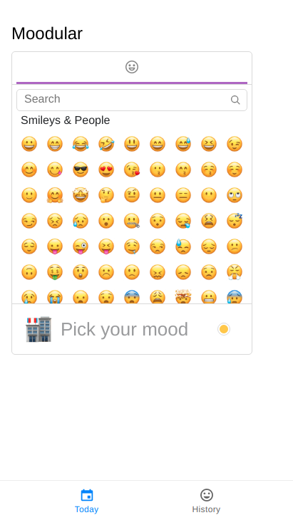
<h2>
Moodular
</h2>
<Picker
title="Pick your mood"
include={["people"]}
/>
</IonContent>
</IonPage>
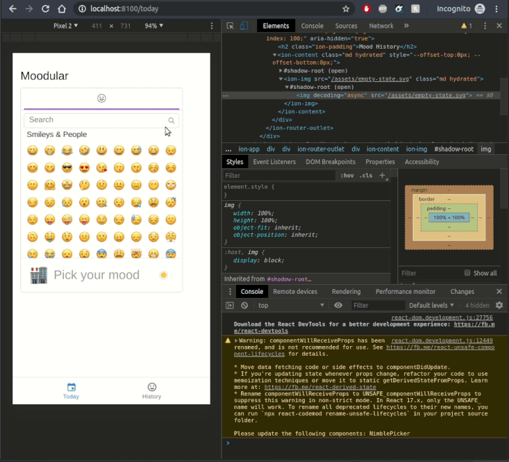
In the Picker component, we are passing the include prop to make sure that only the “people” emoji set shows up in the picker. The package has a number of other emoji sets that you can include/exclude as per your need.
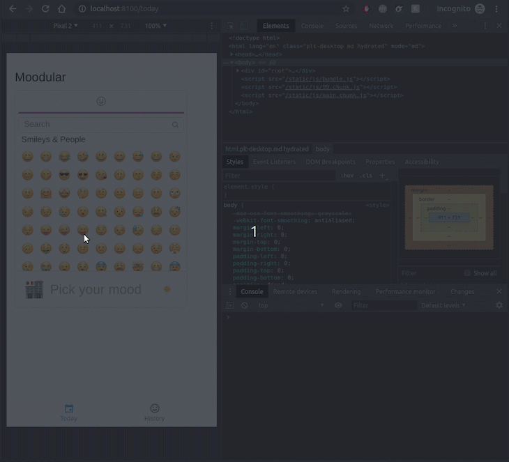
At this point, on the homepage, you should see the emoji picker like below:
Data and state
Heads-up, things will get a bit more muddy now. Scaffolding and layouts are usually the easier side of an app when compared to data and state management — especially when using Ionic since you get all these built-in components to make your app look good.
But Ionic lets you choose your own data management tool. I don’t want this post to be your intro to data science or big data, so I’ll keep it minimal. All our data will be stored in the browser’s localStorage, and for reactively managing state, we will use MobX. Before we get into those, though, let’s think through the behavior we want to implement.
As a user, I would like to select an emoji that represents my current mood, and additionally, I would want to write a brief note regarding my mood and maybe set a date for the entry just in case we want to log a mood from a past date. Once logged, the mood entry should go into a list of my previously logged moods that I can browse through in the History page.
With the above considerations, we can conclude that each mood can be an object with an emoji, a details, and a date property. To give every entry a unique identifier, let’s add an id property to the mood object as well.
This is pretty much how you would model your data if a backend/database was involved here, and staying close to that kind of data structure helps in integrating a backend later on.
Let’s create a MoodService.ts file in the src/pages/ folder. I know that’s not an ideal place for a service file, but we don’t have a lot of modules for this app, so let’s leave it there for now. Add the following code in it:
import { EmojiData } from "emoji-mart";
import { persist } from "mobx-persist";
import { observable, computed, action } from "mobx";

export interface Mood {
    emoji: EmojiData,
    details: string,
    date: Date,
    id: number,
};

export class MoodStore {
    @persist('list')
    @observable
    list: Mood[] = [];

    @computed get entries(): Mood[] {
        const sortFunc = (firstItem: Mood, secondItem: Mood): number => {
            if (firstItem.id > secondItem.id)
                return 1;

            if (firstItem.id < secondItem.id)
                return -1;

            return 0;
        };

        return this.list.slice().sort(sortFunc);
    };

    @action
    save(emoji: EmojiData, details: string, date: Date) {
        this.list.push({emoji, details, date, id: Date.now()});
    };

    @action
    remove(moodId: number) {
        const moodIndex = this.list.findIndex(({ id }) => moodId === id);
        this.list.splice(moodIndex, 1);
    };
};
That’s a lot to take in, but don’t worry — we will break it down into manageable bits and go through them one by one.
Before we do that, though, please go to the MobX website and read its summary, concepts, and principles to get a basic understanding of why this package exists and why it is used. Oh, and don’t forget to install the two new packages we are importing in this file first: npm install --save mobx mobx-persist.
The first thing you will notice is the Mood interface. As planned above, we have the necessary properties defined in this interface, and it will be used as a single mood entity logged by the user. Noteworthy here is the EmojiData type. Each emoji in the emoji-mart package is represented as EmojiData, which is why the emoji data in this interface has that data type.
Observables
export class MoodStore {
    @persist('list')
    @observable
    list: Mood[] = [];
Here, we are creating a MoodStore class, which will be our main state container for the app. It has one observable property, list, which is an array of Mood entries.
Using the @observable decorator, we are telling MobX to keep track of changes made to this property. Using the @persist('list') decorator, we are telling the mobx-persist package to save this array in the browser’s localStorage, and the list parameter tells the persistor that this property is an array.
Decorators are not yet universally supported, so you might need to tell Ionic’s TypeScript compiler to recognize the use of it in your code. Add "experimentalDecorators": true to the compilerOptions property in the tsconfig.json file in the root of the project.
Actions
@action
    save(emoji: EmojiData, details: string, date: Date) {
        this.list.push({emoji, details, date, id: Date.now()});
    };

    @action
    remove(moodId: number) {
        const moodIndex = this.list.findIndex(({ id }) => moodId === id);
        this.list.splice(moodIndex, 1);
    };
MoodStore also has a couple of actions that are essentially operations on the store’s data. Quite apparent from their names, the save action adds a new mood to the list and the remove action removes a mood from the list.
We are simply using JavaScript array manipulation methods to perform those actions in this case, but eventually, you would hook it up with a server API or a local database for persistence.
The list property, being an @observable, will be reactive, and MobX will automatically update our React components when anything is added/removed/updated to the property when we link the store and the component.
When calling save, we have to pass it emoji, details, and date, then the method will fill in the id property automatically using Date.now(), which returns a Unix timestamp. Not super unique in the grand scheme of things, but since all our data is local right now, this will do.
For remove, we only need to pass in the id of the mood entry, and it will take it out of the list array using the splice() method.
Computed properties
@computed get entries(): Mood[] {
        const sortFunc = (firstItem: Mood, secondItem: Mood): number => {
            if (firstItem.id > secondItem.id)
                return 1;

            if (firstItem.id < secondItem.id)
                return -1;

            return 0;
        };

        return this.list.slice().sort(sortFunc);
    };
In MobX, we use observables to keep data in raw state. For display purposes, we might need to access and derive different representations of the data in various ways, which is where @computed properties come in. They let you define properties that return a derived/computed version from a store’s raw data.
In this case, we define an entries property, which sorts the observable list array and then sorts it descendingly by its date property. When displaying our previously logged moods in the History page, we will use this property to show moods in reverse chronological order.
Notice that we are doing
slice()on thelistarray because JavaScriptsortis mutating, and directly mutating an@observablearray can cause all sorts of problems.
This is pretty much the core of the entire data/state management system of our app. Pretty concise, right? I hope the explanation above helped you understand it, but don’t worry if it didn’t. We will slowly start integrating this service into our Home and History components, and then it will become more apparent why things are the way that they are in this file.
Connecting MobX store with components
Right now, our MoodService exists in a vacuum in the sense that none of our pages/components are using the store. Let’s fix that. We need a new package, mobx-react, for that. Install it with npm i --save mobx-react, then open the src/App.tsx file and wrap the IonicReactRouter component like this:
//... other imports
import { Provider } from "mobx-react";
import { create } from "mobx-persist";

//... other imports
import { MoodStore } from "./pages/MoodService";

//... other imports
const App: React.FC = () => {
    const hydrate = create({});
    const moodStore = new MoodStore();

    hydrate("moodStore", moodStore);

    return (
        <IonApp>
            <Provider moodStore={moodStore}>
                <IonReactRouter>
                //....tabs and other components
                </IonReactRouter>
            </Provider>
        </IonApp>
    );
};
First we are instantiating our MoodStore class. Then we are hydrating the moodStore instance to ensure that, on first load, mobx-persist loads up the previously saved state of the store from localStorage.
It looks a bit complicated with all the functional programming mumbo-jumbo and terms like “hydrating,” but in plain English: if we close our app and reopen it, or close the browser tab and reopen it, all our previously saved moods will still be there in the moodStore instance. The Provider component makes our moodStore instance available as props to the internal components.
This only connects our pages with the MobX store, but we are not using the store in our pages… yet.
Still with me? I hope so. We have done so much, and you deserve a break. Go have a walk, drink a glass of the liquid of your choice, and then come back to continue on with the rest of the post.
… Back? Alright, let’s finish it off.
Saving mood with MobX
Now we get to play more with the magic of React’s and MobX’s state management. We will start with the src/pages/Home.tsx file. When users tap on an emoji, we will show a popup where additional details and a date for the mood entry can be specified. We will use the IonAlert component for this:
<Picker
        title="Moodular"
        include={["people"]}
        onSelect={handleEmojiSelect}
    />

    <IonAlert
        isOpen={showInputs}
        subHeader="Add more details or set the time/date for your mood"
        onDidDismiss={() => setShowInputs(false)}
        header={`Add Details`}
        inputs={[
            {
                type: "text",
                name: "details",
                placeholder: "Write out how you are feeling..."
            },
            {
                name: "date",
                type: "date",
                max: `{new Date()}`,
                min: "2017-09-09",
                value: new Date(),
                placeholder: "Change date"
            }
        ]}
        buttons={[
            {
                text: "Cancel",
                role: "cancel",
                cssClass: "secondary",
                handler: () => {
                    setShowInputs(false);
                    setEmoji(null);
                }
            },
            {
                text: "Ok",
                handler: data => {
                    moodStore.save(emoji, data.details, data.date)
                }
            }
        ]}
    />
Before we break down this code, let’s import IonAlert from @ionic/react at the top of our file: import { IonContent, IonPage, IonAlert } from '@ionic/react';
The first change in our existing code is the new onSelect prop in the <Picker> component, and it takes a function as it’s value. We are giving it the function handleEmojiSelect, which we haven’t defined yet.
Before we define that, let’s take a quick look at the IonAlert component. Its isOpen prop determines whether the alert box should be on display. We want to show the alert box when an emoji is tapped, right? So, naturally, the value of isOpen should be a state variable that is toggled between true and false based on user interaction.
Also, we won’t be logging the mood entry as soon as the emoji is tapped. We will only log it after getting confirmation from the user through the alert box along with additional details. So, to keep the selected emoji memorized while user fills in other details through the alert box, we will need another state variable.
We will use the useState React Hook to define that variable, and we will define our handleEmojiSelect function to modify those state variables accordingly. Add the following code right above the return statement in the page component:
const [showInputs, setShowInputs] = useState(false);
    const [emoji, setEmoji] = useState<any>(null);

    const handleEmojiSelect = (selection: EmojiData) => {
        setEmoji(selection);
        setShowInputs(true);
    };

    return (
        <IonPage>
useState needs to be imported from React, so add that to the react import line: import React, { useState } from 'react';. As explained above, the value of isOpen is the showInputs state variable, which is initially set to false, so the alert will not show up on first load.
To contain selected emoji, we create the other state variable aptly named, emoji. Then of course, we define our handleEmojiSelect function to take one parameter — the selected emoji — and then the function stores the emoji in state and toggles the showInputs state to true. At this point, the alert box should show up.
Note that we are defining the type of selection to be EmojiData, but we haven’t imported it yet. Make sure you add that to the import statement from emoji-mart:
import { Picker, EmojiData } from "emoji-mart";
Now let’s take a look at the content of our alert box. We give it a header and a subHeader to show some instruction text for the user. The onDidDismiss component is a function that is called when user closes the alert box. We simply toggle our showInputs state variable back to false in that function.
The most interesting parts of this component are the inputs and buttons props. They allow us to add action buttons and various types of input fields to the alert box. In this case, we are adding two inputs: first is the details text field, and the second is a date picker. Pay attention to the name properties in here — we will need them in a bit.
We have two action buttons to either confirm and save the mood entry or cancel and discard the entry. Naturally, when cancel is clicked, we simply toggle showInputs back to false so that the alert box goes away and then empty out the emoji selection by setting the emoji state variable to null.
The confirm button, however, calls a function with all the input field values encapsulated in the data object, where the object properties match the name we gave to each of the inputs. Following our definitions, we will have data.details and data.date. Within the function, we are using the save action method we defined in our mood store and pass the emoji from state variable and the other parameters from data variable.
However, you will notice that within the Home component, we don’t have access to the moodStore instance, right? Good catch. Remember all the setup we did in our src/App.tsx file with Provider and hydrate and store instances? This is where those come into play.
First, we need to import { inject, observer } from "mobx-react"; at the top of our file and then replace export default Home at the bottom of the file with export default inject("moodStore")(observer(Home));.
This looks confusing, I know, but you can consider it boilerplate code that you will just copy and paste. In plain English, it means: make the Home component an observer of the MobX store, and specifically give it access to a store named moodStore.
MobX knows where to get moodStore from because in our <Provider> component, we passed it a prop named moodStore with the value being an instance of our MoodStore MobX store. With this in place, we now have access to moodStore within our component as a prop.
Since we are using TypeScript, we have to tell the transpiler that the Home component can actually get a prop named moodStore provided to it. We do that by replacing const Home: React.FC = () => { with the following:
import { MoodStore } from "./MoodService";

type HomeProps = {
    moodStore: MoodStore,
};

const Home: React.FC<HomeProps> = ({ moodStore }) => {
That’s it for the Home page. You should now be able to log a mood entry like this:
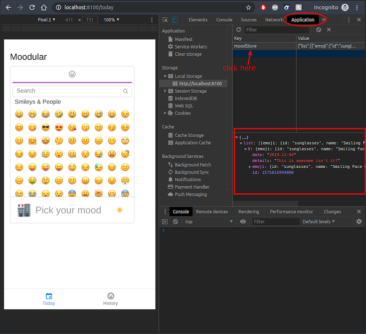
It’s good and all, but how do we know whether our mood is actually being stored? Well, until we make them appear in our History page, we need to resort to looking under the hood.
Remember we used a library called mobx-persist? That library will take our input — specifically, all the @observable properties (i.e., the list property) of our moodStore — and save it in the browser’s localStorage. The screenshot below should help you figure out how to look into that, and sure enough, you see the mood entry in there:
Showing mood history
You and I, being the smartest programmers of the world, can easily look under the hood of the running machine that is our app and consume raw JSON data as if we were reading a romance novel, but we need to pay more mind to our users, right? So, let’s fill in our History page to show the perviously logged moods, as we’ve planned since the beginning.
Having learned our lesson about TypeScript and React components and the MobX provider, this time, we will start by ensuring that our History page component is all set to receive the moodStore component:
import { inject, observer } from "mobx-react";
import { MoodStore } from "./MoodService";

type HistoryProps = {
    moodStore: MoodStore;
};

const History: React.FC<HistoryProps> = ({ moodStore }) => {
    //... component code
};
export default inject("moodStore")(observer(History));
Now that we have access to our MobX store, we can simply use the computed entries property to access moods. We will use the IonList component to show the moods:
//... other imports

import { Emoji } from "emoji-mart";
import { trash as trashIcon } from "ionicons/icons";

//... previous code

            <IonContent>
                <IonList>
                    {moodStore.entries.map(mood => (
                        <IonItemSliding key={mood.id}>
                            <IonItem>
                                <IonAvatar>
                                    <Emoji emoji={mood.emoji} size={30} />
                                </IonAvatar>
                                <IonLabel>
                                    <h3>{printDate(mood.date)}</h3>
                                    <p>{mood.details || "No Details"}</p>
                                </IonLabel>
                            </IonItem>{" "}
                            <IonItemOptions side="end">
                                <IonItemOption
                                    color="danger"
                                    onClick={() => setRemovingMoodId(mood.id)}
                                >
                                    <IonIcon icon={trashIcon} />
                                </IonItemOption>
                            </IonItemOptions>
                        </IonItemSliding>
                    ))}
                </IonList>
            </IonContent>
Let’s take a closer look at what we are doing here, shall we? Within the IonList component, we are mapping through the entries list and rendering IonItemSliding components for each mood entry. This component takes an IonItem component and an IonItemOptions component as its children.
The IonItem component is what we will see for each mood, and the IonItemOptions component is what we will see when we swipe the items to the left because we set a side="end" prop.
Within the IonItemOptions component, we have one option that displays a button with an icon in it. When the button is tapped, we are executing a setRemovingMoodId function. We will get back to this in a bit.
The IonItem component displays an avatar on the left, which simply shows the emoji and details text, with the date of the mood to the right of the avatar. If there is no details text attached to the entry, we simply show No Details text just so the item doesn’t look empty. To display the date, we are using a helper function, printDate, for two reasons:
- Dates are hard! JavaScript has a
Dateprimitive, but when it needs to be saved in a storage that doesn’t support it, it gets converted into a string. In our case, when MobX saves a date in the browser’s localStorage, it converts it into a string. Thus, when we access the date of a mood entry from storage, it’s in string format, but when the user enters it, it’s aDateinstance. - Dates are used in various formats across the world, and to show it to users in their own locale, we will use the
toLocaleDateString()method built into the date object in JavaScript.
To abstract away this complexity, we define printDate outside of the component, as below:
const printDate = (date: Date | string): string => {
    if (typeof date === "string") {
        date = new Date(date);
    }

    return date.toLocaleDateString();
};
It takes in a date value in either string or Date format. If it’s a string, it creates a Date instance out of it, then it returns the localized version of the date as output of the function.
Another place to define
printDatewould be within the mood entry instance itself through TypeScript. I will leave that as homework for you, the reader, to figure out.
Removing mood from history
We have already set up a way to remove a mood from history in our MobX store, and we have given each mood entry a swipe to show a remove button. All we need to do is hook those two up with a good UX. I specify good UX because user data is precious, and removing it without confirmation is always a bad UX.
We will try to avoid that. As usual, let’s sprinkle some React state magic with Ionic components’ fairy dust in our code. Add the following state variable at the top of the History component definition and add an IonAlert component within the page:
const [removingMoodId, setRemovingMoodId] = useState<number>(0);

    return (
        <IonPage>
            <IonAlert
                isOpen={removingMoodId > 0}
                onDidDismiss={() => setRemovingMoodId(0)}
                header={"Remove Mood?"}
                message={`Sure you want to remove mood?`}
                buttons={[
                    {
                        text: "Cancel",
                        role: "cancel",
                        cssClass: "secondary",
                        handler: () => setRemovingMoodId(0)
                    },
                    {
                        text: "Yes, Remove It",
                        handler: () => {
                            moodStore.remove(removingMoodId);
                            setRemovingMoodId(0);
                        }
                    }
                ]}
            />
We are already setting the mood ID to be removed in the removingMoodId state variable when the remove button is tapped. The IonAlert component is only shown when removingMoodId has a number in it and contains some content that asks the user if they are certain that the mood should be removed.
It has two buttons: one to confirm and one to cancel. The cancel simply sets removingMoodId to 0, which hides the alert box. Tapping confirm will trigger two function calls: one that removes the mood entry from the moodStore using our previously created remove action method, and the other resets the removingMoodId state variable to 0 to hide the alert box.
You have worked real hard to get to this point, so give yourself a pat on the back and get yourself ready to see the beauty that we have created:
Epic! Isn’t it?
We have built a well-functioning app that works, but again, let’s think about the users! Apps should be self-explanatory and interactive. We are going to make a few improvements to bring its usability up a notch.
Action feedback
Have you ever tapped a button in an app and wondered what happened because it didn’t do anything, but you have that suspicious feeling that it did and chose not to tell you what? …No? OK, maybe I’m just a bit paranoid, but I like it when apps tell me when it does things — an action feedback, if you will. In our case, let’s add a feedback when the user logs a mood entry.
Let’s get back to the src/pages/Home.tsx file and add the following code right after the Picker component:
//...previously written code

    const [showMoodLoggedToast, setShowMoodLoggedToast] = useState<boolean>(false);
    const [showInputs, setShowInputs] = useState(false);

    //...previously written code

                <Picker
                    title="Pick your mood"
                    include={["people"]}
                    onSelect={handleEmojiSelect}
                />

                <IonToast
                    duration={2000}
                    isOpen={showMoodLoggedToast}
                    message="Your mood has been logged."
                    onDidDismiss={() => setShowMoodLoggedToast(false)}
                />

    //...previously written code

                        {
                            text: "Ok",
                            handler: data => {
                                moodStore.save(emoji, data.details, data.date);
                                setShowMoodLoggedToast(true);
                            }
                        }
We have added an IonToast component that shows up when the showMoodLoggedToast state variable is true, and then after two seconds (2000ms), it disappears. Then all we have to do is make sure the toast shows up when a new mood is logged by calling setShowMoodLoggedToast(true); after saving a mood entry.
Now, if you add a new mood from the home screen, you will see a small popup at the bottom of the screen that says, “Your mood has been logged.”
Much better, right? See, Ionic has these very handy components right out of the box that just makes implementing a great UX so much easier.
The toast, by default, shows up at the bottom of the screen, but that’s also where our tabs are, and while the toast is on display, we will not be able to navigate between pages anymore. That’s exactly the opposite of good UX, isn’t it?
You can fix that by showing the toast somewhere less invasive, and Ionic makes that really easy. I will leave that for you, the reader, to find out from its documentation.
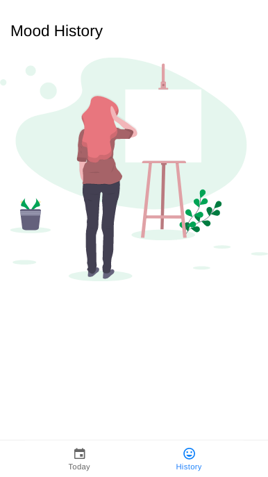
Another thing I noticed is that the History page looks really empty for first-time users since they won’t have any moods logged just yet. And those are our most valuable users — the ones we want to convert into regular ones. An empty screen won’t cut it for them, would it? Let’s spice it up a bit.
Empty state
I went over to Undraw, which is an absolute gold mine for non-designers like me for finding amazing illustrations for my web and mobile apps. I looked for a fitting illustration that represents both empty state and personal mood at the same time and downloaded the SVG file for it. I put the file in the public/assets/ folder with the name empty-state.svg.
Before we show the image in the History page, let’s add a @computed property in our store to easily determine whether we have an entry in the store. Open the src/pages/MoodService.ts file and add the following code in the MoodService class:
@computed get hasNoHistory(): boolean {
        return this.list.length < 1;
    };
Then, in the src/pages/History.tsx file, we add a ternary if statement that shows the illustration using the IonImg component if hasNoHistory is true. Otherwise, it shows the list of moods. IonImg will make sure that the image is nicely scaled for the user’s device screen size:
<IonContent>
                {moodStore.hasNoHistory ? (
                    <IonImg src="/assets/empty-state.svg" />
                ) : (
                    <IonList>
                    //...previously written code
                    </IonList>
                )}
Now go back to the History page in your browser and remove all your mood entries to get a glorious view of the illustration:
That pretty much wraps up our application code. We have a solid feature that works seamlessly and provides a great user experience. However, this is still a web application, for all we know. One of the most appealing features of Ionic is that it lets you create web and mobile application from one codebase. Let’s turn ours into a mobile application.
Capacitor
The Ionic team has been hard at work with their Cordova successor named Capacitor, and I’m really optimistic about its future after seeing their progress so far. I hope you will feel the same way by the end of this post.
We will use Capacitor to turn our web app into Android and iOS applications. Before you read on, please make sure that you have your development environment set up for Android and iOS according to this documentation. Then, from your terminal, within the root of your project, run the following commands:
ionic integrations enable capacitor
npx cap add android
ionic build
npx cap copy
npx cap open android
That’s it. That’s all you need to run the app as a mobile app. Replace android with ios in the above commands to build for iOS. After running the last command in the above list, Ionic will open up Xcode or Android Studio for you with the appropriate app folder.
From there, you can run your app in a simulator or in a connected device, just like you would for any native app. There are plenty of detailed blog posts where you can learn about how to go from here to releasing your app onto the App Store or Google Play, so I won’t get into too much detail about that in this post.
Go live on the web
Being able to create your own app feels magical, but the ultimate gratification comes from being able to show the world what you have built — otherwise, it’s just some code that’s sitting in your hard drive collecting dust.
So let’s show the world what we have built. Ionic, having PWA support out of the box, makes it super easy for our app to behave as an app for our end users once deployed to a publicly accessible server.
We will use Netlify to deploy our app, which is one of my absolute favorite services out there. It allows you to put any client-side application up online with https for free, and even connect with your domain name for free. I can honestly keep on going, but I’d like you to find out. So, if you haven’t already, please go ahead and create an account on Netlify.
Disclaimer: I am in no way affiliated with or paid by Netlify. I am a user of their free tier and I love their tools, which is the only reason I’ve decided to demonstrate how to deploy on its platform. There are many other platforms that provide similar services, and you’re free to use any of those.
Once you have done that, we will take a quick detour and put our code up on GitHub because, firstly, you should always keep your code backed up, and I personally prefer using GitHub for that; and, secondly, because Netlify lets you deploy new updates to your app every time you push new commits to GitHub. We will take advantage of that in a bit.
If you are not familiar with Git/GitHub, there are plenty of resources online that can get you started.
I have created a new repository on GitHub named moodular-ionic, and I’ll add my GitHub repo as a remote to my local Git repo: git remote add origin [email protected]:foysalit/moodular-ionic.git. Now we can synchronize our code with GitHub by running git push -u origin master.
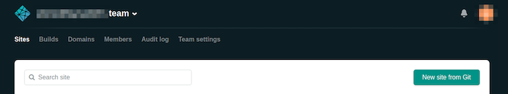
Now let’s get back to Netlify. After logging in, you should see a button on your homepage that says New site from git. Click that or manually go to this URL: https://app.netlify.com/start.
It should take you to a page that looks like the image below:
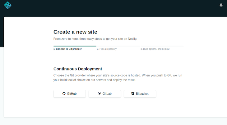
Click the GitHub button on that page, and authenticate with GitHub to give Netlify access to your GitHub repositories. It should bring up a list containing all your repositories from GitHub.
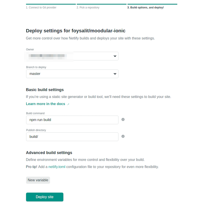
Select the repository where you have put your moodular app; for me, it’s moodular-ionic. Next, it will ask you to specify which branch you want to use for deploy, what’s your build command, etc. Most of it should be pre-filled for you, but if they aren’t, check out the below image to see my config:
Confirm everything looks good and hit Deploy site. It will then take you to a page that looks like the below image and let you know that Netlify is bringing your code from GitHub and deploying it on their servers. Hang tight…
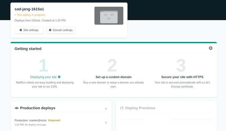
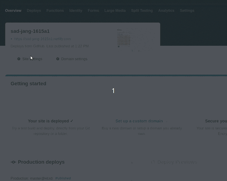
Once the app is up and running, the yellow text that says Site deploy in progress will go away and a link will appear. Click on that link, et voilà! There’s our beautiful app, loaded on the browser, accessible by anyone.
Notice that the URL is kind of confusing and doesn’t have anything to do with our app. That’s because Netlify autogenerates these links for you. The good thing is that you can change it to your own domain name or, at the very least, you can specify a particular subdomain name under netlify.com. Let’s do that real quick.
Click on the Site settings button, and from the settings page, click on the Change site name button. Within the popup, change the autogenerated name to something you like, something meaningful to our app. Follow the gif below to see how I did it.
Unfortunately, since I have already taken the name moodular, you can’t have it — but I’m quite sure you can come up with a name more creative than that.
Closing remarks
If you are reading this, I assume you have followed through all of the above and are now the proud developer of your own Ionic app. I would encourage you to go ahead and read Ionic’s documentation to find out more about its amazing offerings and take this app further to build up your skills.
Here are a few ideas that can take this app to the next level:
- Add a more persistent and performant storage layer like SQLite instead of using localStorage
- Add pagination in the History page so that the page doesn’t have to load every entry on load, which can become a performance issue over time
- Add a search bar in the History page so that users can find mood entries with fuzzy text/emoji search
- Add a graphical chart to show map mood history in a more visual way over a period of time that users can define
If you complete any or all of the above tasks, give me a shout out on Twitter and I would be more than delighted to do a quick review of your code.