
Tutorial: Getting Started with Keen
Ever wanted to do custom analytics for your website, but just didn’t know where to start? This tutorial will teach you how to use Keen to record events, set custom properties, and explore your data once it’s collected.
Keen is a fully managed cloud API that lets developers build complex, custom, large-scale analytics and data science features directly into their web, mobile, or Internet of Things applications.
The text below is a summary done by the Codementor team and is based on the office hour hosted by Josh Dzielak, Open Sorcerer at Keen. The summary may vary from the original video and if you see any issues, please let us know!
Introduction
Today we’ll start with a very simple walkthrough on how to instrument something using the Keen Javascript library, and how to create a dashboard based on the sample project. We’ll also go through how to get that same data and run very similar queries from our command line interface as well as the Keen workbench itself, which you can find from keen.io once you’ve created a free account.
The Sample Web Page
Here is what our sample project looks like when loaded on a Chrome Web Browser (you can download it along with the instructions via github):
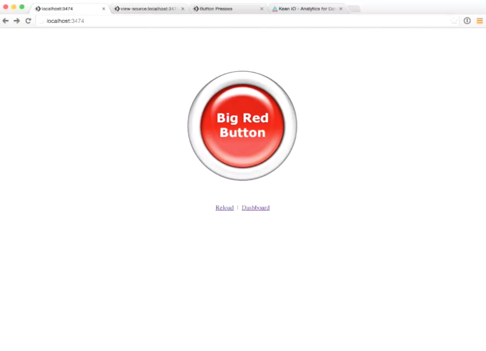
You can see that on the web page there is a button that says “big red button”, and it is the thing we’re going to instrument today. This is a deliberately simple example where all we’re going to wire up for analytics is how many times this button has been pressed. Then we’ll examine the events generated after the button has been pressed and see how the Keen stack/tools play together.
This is an overly simple example, but it lets us look into a lot of different operations you can perform with Keen such as:
- how to use the workbench
- how to the command line interface
- how to make a dashboard
- how to use all of these layers together to get the most out of your data
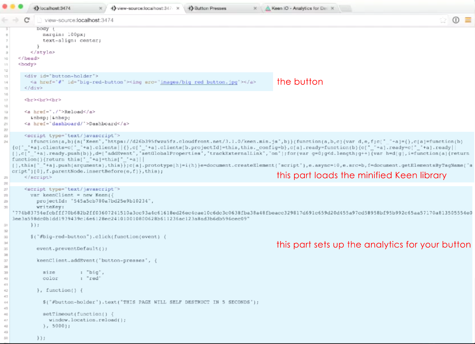
Here is a quick breakdown of the web page’s source:
 jQuery is also included in the page for location and convenience.
The boilerplate/JavaScript snippet can be found in the Keen javascript library documentation, and it loads the Keen minified library from the Keen CDN to give you access to this Keen object that comes after it.
The KeenClient
As you can see from the source code above, once we’ve concluded this boilerplate, we have this line of JavaScript called “keenClient”.
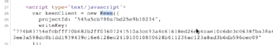
Our keenClient is a new keen object, and when we configure it, we give it a project id and a writeKey. You can think about the writeKey as an API key you’d use to the write to the project. However, for security reasons, you can’t read from the project using that key, since everyone can see it by viewing your source code. So, there’s a separation of concerns in terms of security when it comes to being able to write to the collection and being able to read from it. When someone has this writeKey, they can write to the collection and add events to the collection. This is very much what you’d be used to in web analytics, since in web analytics there’s a unique identifier and anyone can write into it.
After the keenClient configuration, we have a line-by-line click handler for the big red button
$("#big-red-button").click(function(event) { event.preventDefault();
So when we click it, we will prevent the default behavior that reloads the page inside an anchor tag.
Here’s a really interesting thing that comes after it:
Basically, we’ll be making a call to add an event to the keenClient we configured and pass it a couple of parameters.
The first part is a string argument “button-presses”, which refers to the collection inside the Keen project that will record interactions with the button. You can think of the collection almost as an event type, where you’re trying to capture there what happened. Common collection names would be sign-ups, logins, page-views, and so on. Therefore, your projects inside Keen is a container of multiple collections. The nice thing about collections is that you don’t have to create events; they will be created on the fly the first time you send an event. For example, if I have a brand new project I’ve created today and it totally has no data in it, we’ll see that the first time we actually press the button, the collection will get created, and then we can go and look at the collection.
After the collection name “button-presses” are two other arguments.
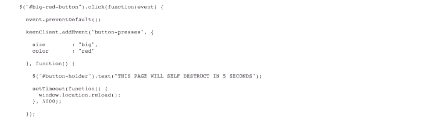
The first one is the set of properties we’d want to attach to the event. You can think of this as capturing the state of the event and the information about the event. For instance, if you’re tracking a signup, then this would be a username or some kind of attribute about the user to help you identify where they came from or what their demographics were.
In our deliberately simple example, we have size and color. As in the actual web page, the size here is big and the color is red──these are the only two properties that we’re really going to care about. There are some other properties that get created behind the scene by Keen, such as timestamp and unique id, and we’ll look at those later. The last thing is simply a callback when the event is successfully sent to Keen. This callback will get triggered, and we’re just going to replace the text and refresh the page.
So let’s go and try it out. We’ll open the console and open the network tab so we can actually see what happens when we press it.
Looking at the video, you can see that after I pressed the button, we see the message “this page will self-destruct in 5 seconds”, and for a moment we saw there’s a JSON p-webrequest that went through and basically sent that event in. Then I hit the button again, totaling two different times. Theoretically we should have 2 events inside of our keen “button-presses” collection.
Verifying the Event
There are three different ways we can verify and look at the properties to confirm if it was a big and red button that was actually pressed.
-
You can see it using workbench on keen.io where you log in and have a workbench for all different projects. 2. Inside the terminal using your command line interface
-
Use a dashboard created just for this button press project.
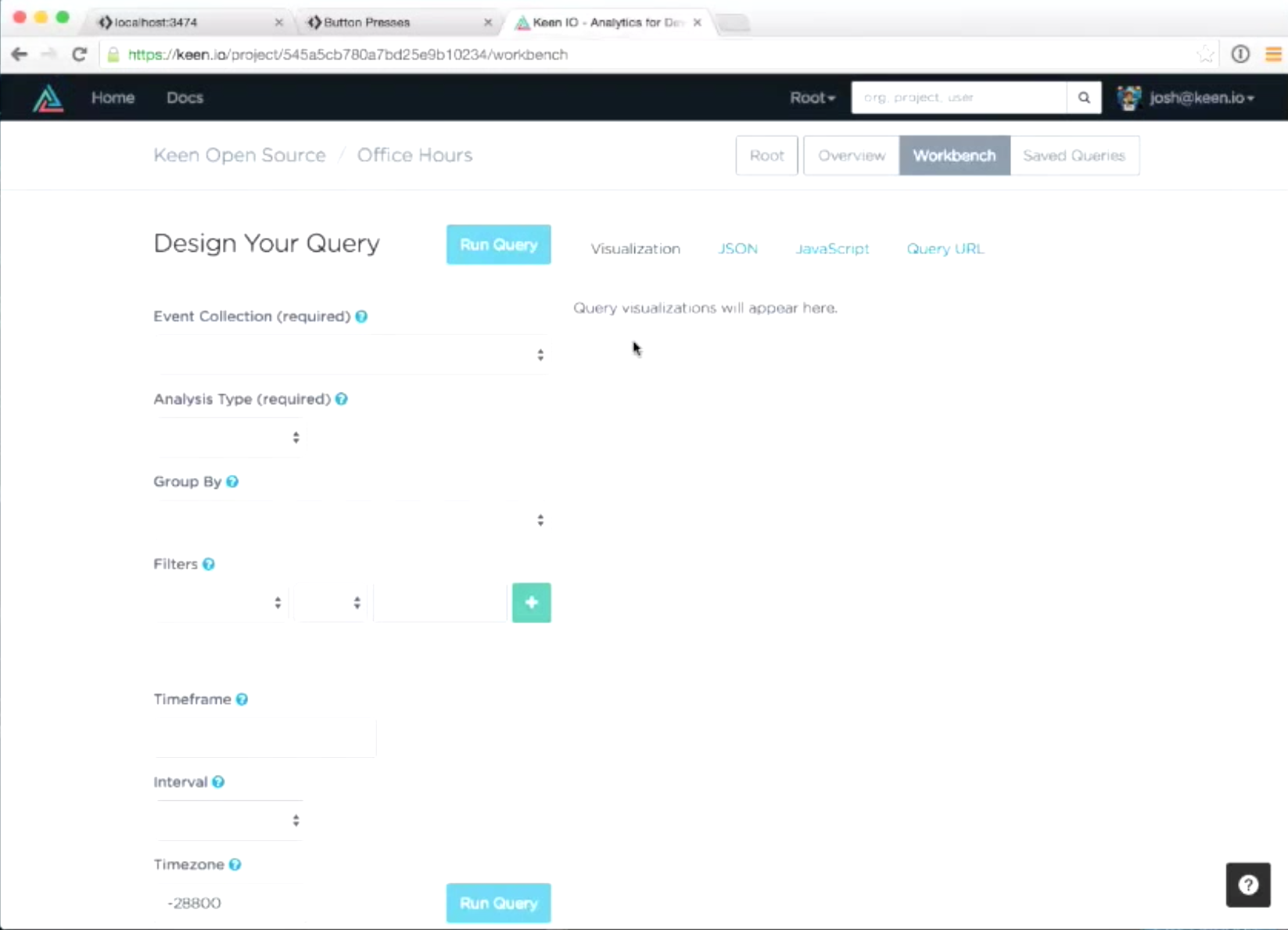
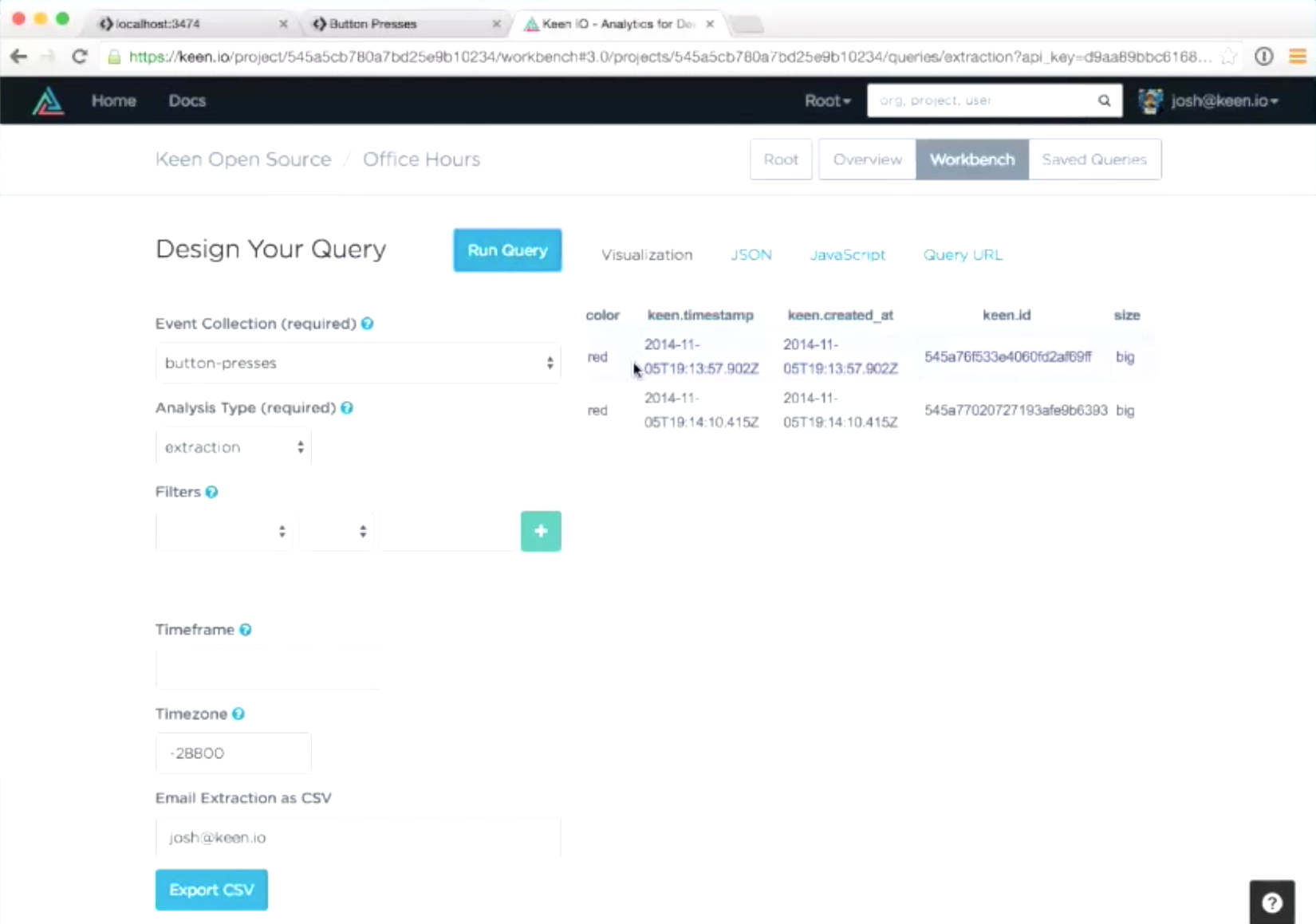
The Workbench
You can think of your workbench as a query designer. You can go through your data, run queries, and it will help you take those queries and embed them on dashboards. You can also get URLs for those queries so you can bookmark them and run those at any time, as all keen queries are represented in the URL and are transportable that way.
Here is what the workbench for this project will look like:
To look at how many times the button was pressed, select the “button-presses” collection from the dropdown and “count” for the analysis type. There are a bunch of analysis types that the Keen API supports, but we’re going to go ahead and choose count. That’s all I have to fill out: the collection and the count, and then I’ll just hit run query, and it will come back and tell me there are 2 events in this collection.
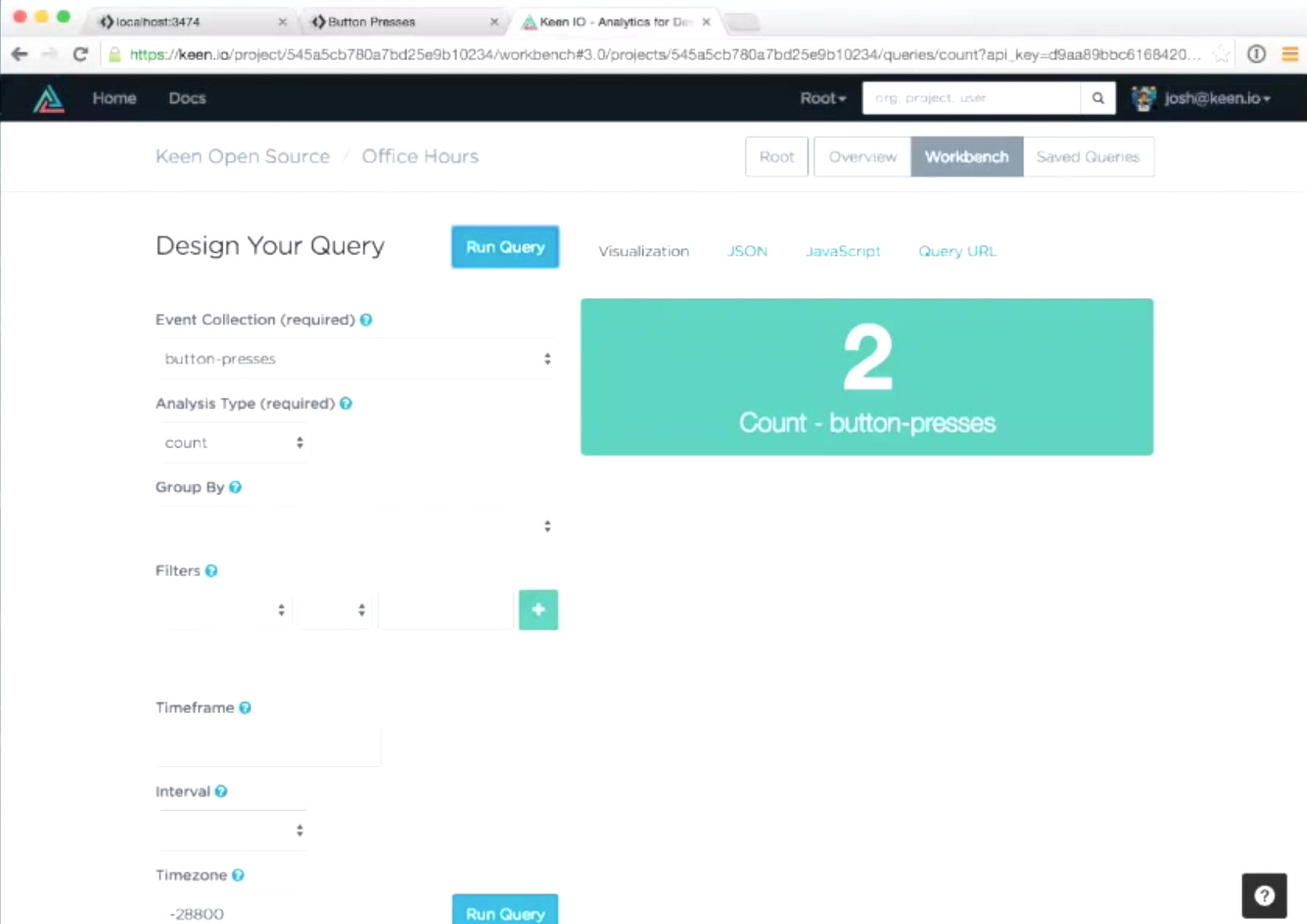
There are four tabs on the right, the first being visualization, which as the name implies shows a nice visual representation of the data. If we had different types of queries, there may be a line chart, pie chart, or bar chart.
The second tab is JSON.

This is just the raw JSON the API returned for this type of query. The number 2 is a key value to results.
The third tab is JavaScript.
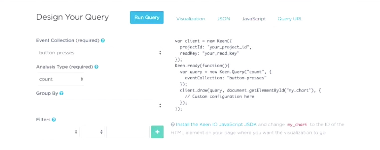
This is just pastable code you can use to run the same exact query and put the visualization inside your dashboard or any page you need to.
The fourth thing is the Query URL
 As I mentioned before, you can represent any Keen query inside of a query URL. Sometimes they do get a little long when there’s JSON involved among other things, but it’s base64 encoded and URL escaped. This one isn’t too bad in terms of length. We can grab this URL, open a new tab, paste it in, hit enter, and see the result.
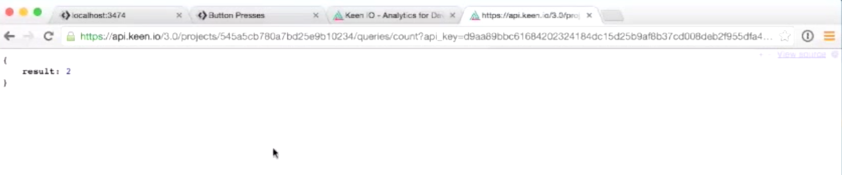
So there are a variety of different ways to run that query and get the information back.
In addition to running the count query, we can do something called an extraction. The extraction is going to let us look at the full event that we sent in, so it’s a way to get the raw data out. Extractions are full fidelity, there are no pre-aggregations or rolling of the data. For every event you send in to extract, you’ll get the exact thing out, so you can think of extractions as a select-query and a default. You can filter data by properties if you want to, but by default it’s select* where you get every property for the event back.
At any rate, since we’re still looking at the “button-presses” collection, we’ll select analysis type as extraction, run that query again, and now that visualization has changed.
It’s a table that shows us all our properties. If you switch to the JSON, I think it will be a little easier to look at the structure and the nesting of the properties, which will explain a little about the keen namespace.
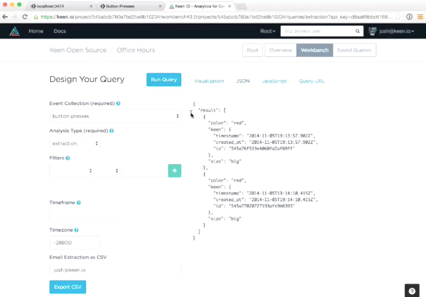
Before that, there are two events in the JSON. The result is 2, and both events are with the correct color and size properties. The other thing you’re seeing in the event body is the Keen namespace. This is created for every event that comes in, contains a timestamp, which is when the event was recorded and is also an overwriteable property. So, when you’re sending data in, you can specify the timestamp yourself if you’re loading historical data, and that should be quite useful. Another great thing about timestamp is that you can still reflect the time that you did something when queuing things into a batch upload, in which the API is real time but there are certain use cases where you may want to batch up events on your side for efficiency or put them in a background queue.
Altogether, this is a little introduction to the workbench. There are a lot of different kind of things you can do, as we have some really cool updates coming down from the pipelines that will let you do even more options such as specifying time frames, using more chart types, etc.
Workbench is just a really simple way to come in, design your query, and make sure the data you’re tracking is what you think it is.
The Dashboard
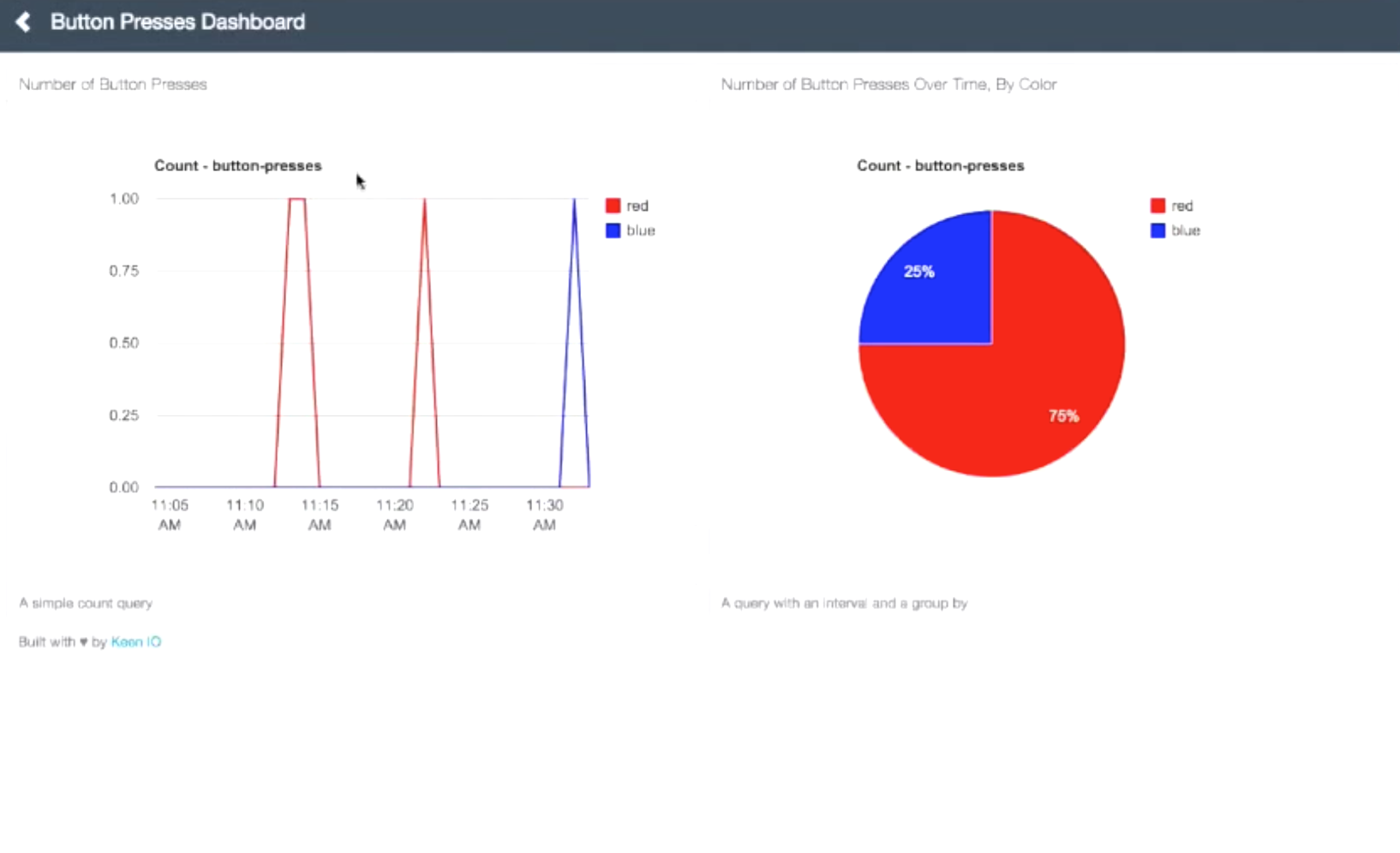
Let’s say the point of our button-presses project is to show the world how many people are coming in to press our button. It’s not something the people who want this info will want to log into Keen for, so we’d want to put this on our webpage somewhere or on a dashboard. Perhaps you’d want to show your customers certain views of analytics, or just show your internal team. The way we’d do that is we’d put that stuff on a dashboard. So, if we flip over to the dashboard for button-presses, now we can see the data recorded about our button presses.
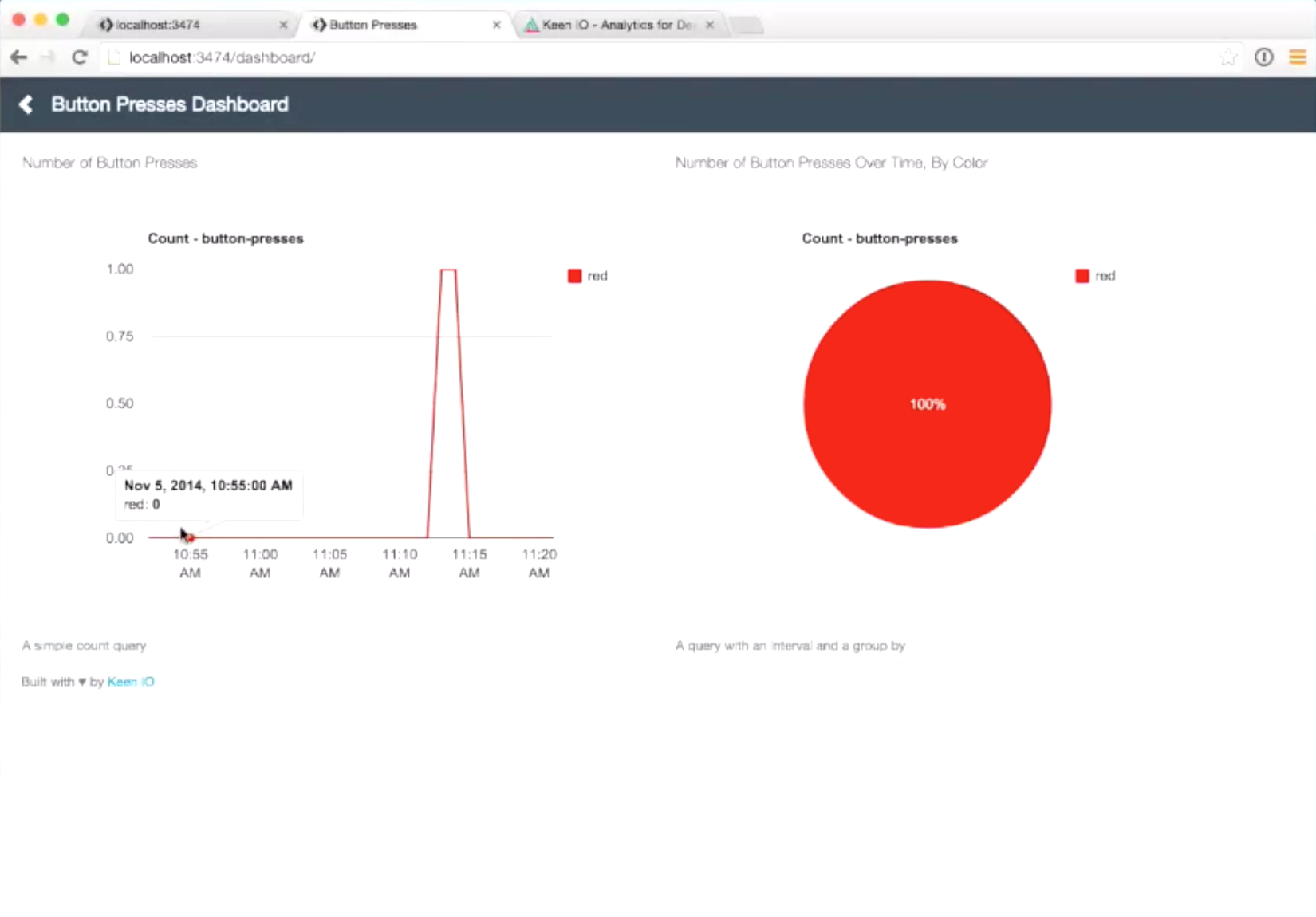
There are two charts, button presses over time, and the color of the buttons pressed. You can see something called a series query, which records the number of times the button was pressed per minute. Since I pressed the button about five minutes ago, we see a spike during these two minutes. Other than that, nothing is happening. The pie chart is a count query where we view the color of the button presses.
This layout is actually from a template of a project we just launched last week. It has grid-based responsive dashboard templates, and you can grab any of them and modify the HTML and get a nice, easily maintainable dashboard that will work on mobile. It’s fully customizable, with HTML5 and CSS on bootstrap. It’s fully open source so you can clone it. Furthermore, this example is built on the dashboard framework, so you can see a similar styling. If we look at the code behind it, there’s basically some bootstrap and grid code, and some places with chart titles.

Most of the interesting stuff are in the dashboard.js, in which the file runs the queries to get the data and then puts them into HTML containers.
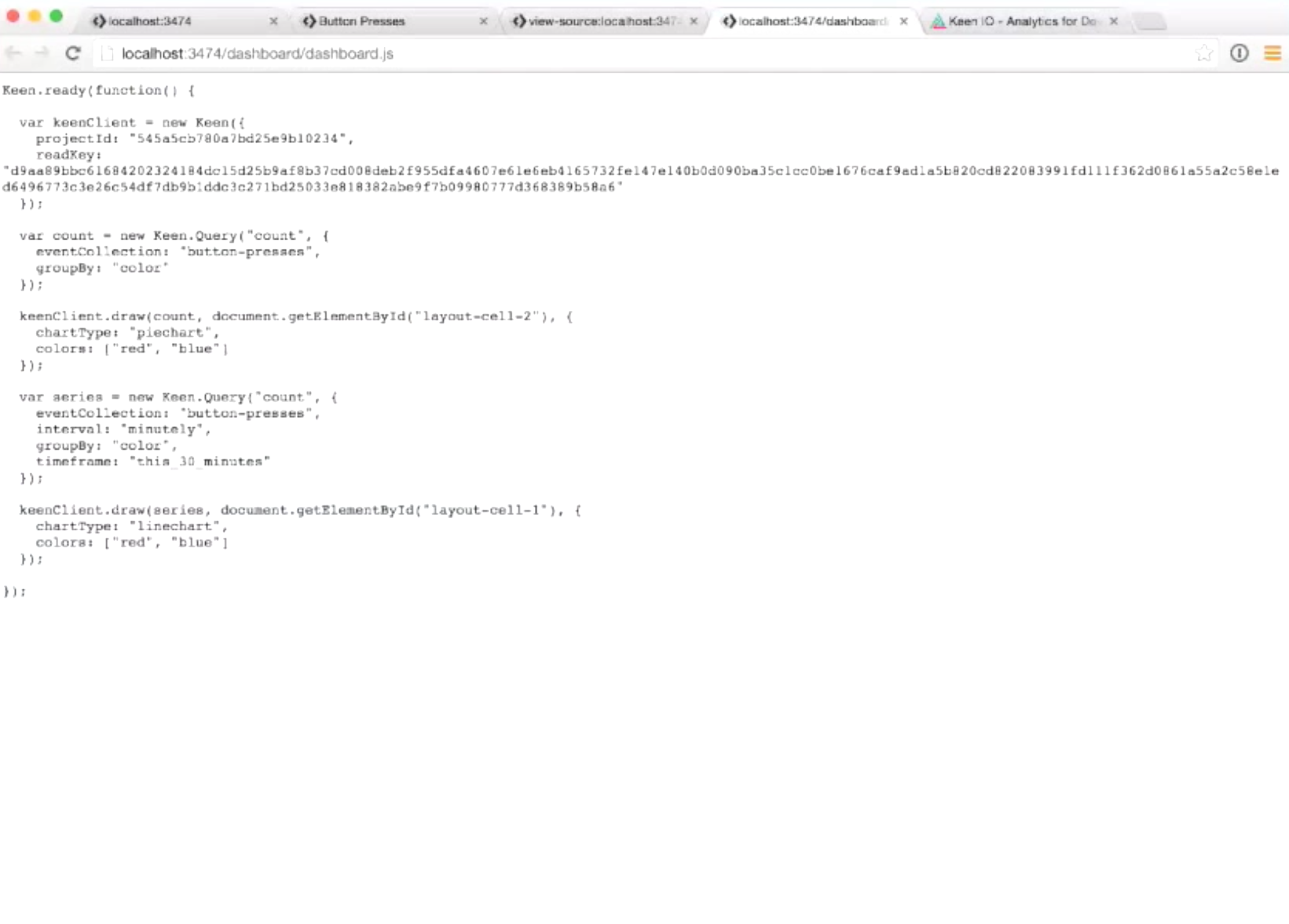
Just like when we’re sending in data, we’re creating a keenClient object. However, instead of initializing with a writeKey, we’re now initializing with a readKey, which will let us get access to that data. Remember, if you put a readKey on the webpage, remember that key will be accessible to everyone, so I’d advise you to host the dashboard somewhere password protected, for example admin tool or somewhere only your team can access. If your goal is to show the dashboard to the public, you can use proxying and scoped keys. For an example of how to use scoped keys you can look around our API documentation.
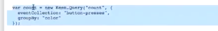
Once we have our keenClient, everything becomes easy. We create a query object count, which is our analysis type, and we’re going to count the button presses collection and group it by color. Then we’re going to draw it on a pie chart, where the domino is layout-cell-2, and we’ll give the pie chart two colors (red and blue).
The line graph, on the other hand, is very similar. The interval is every increment of the line chart, and the timeframe this_30_minutes is a shortcut the API understands.
In the end, you’d get the dashboard like this:
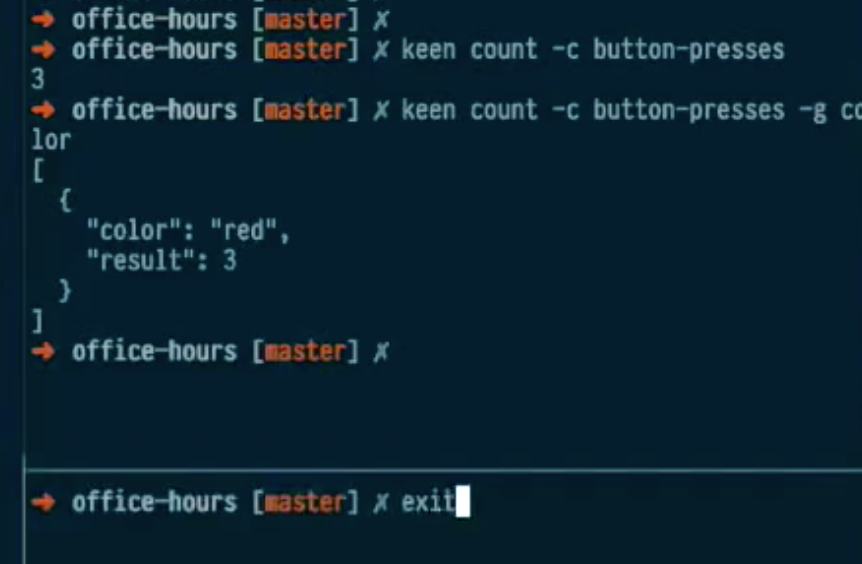
Command line interface
To get keen to count the number of button presses, simply enter the commandline
keen count –c button-presses
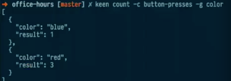
To group by color, use the command
keen count –c button-presses –g color
And you’d get the result.
The terminal knows what project and what API keys we’re querying against because there is a .env file in the repository. The .env file is sort of a conventional place to put environment variables, and the pattern in the tool is like Heroku’s environment tool. It’s a nice way to keep your credentials for certain services inside of the project directory. Alternatively, you can specify the project with the project ID, but I usually like to keep them in my .env file to keep the commands really short and sweet.
If you want to manually add an event, you can use the command
keen events:add –c button-presses –d '{ "color" : "blue" }'
After entering that command, you’d get a JSON ping to know that it was successfully recorded.
So if you count the button presses again you’d get 4, and if you group by color you’ll now have 2 groups. If you look back at the dashboard, you’ll see the changes.
And that’s about it with the basics of how to use Keen to get customized analytics!