
Building a GitHub Repo Explorer with React and Elasticsearch
Originally published on FreeCodeCamp
Elasticsearch is one of the most popular full-text search engines which allows you to search huge volumes of data quickly, while React is arguably the best library for building user interfaces. During the past few months I’ve been co-authoring an open-source library, ReactiveSearch, which provides React components for Elasticsearch and simplifies the process of building a search User Interface (UI).
This is the app which I’ll be building in this story:

Check out the app on CodeSandbox
A brief idea of Elasticsearch
Elasticsearch is a NoSQL database which can search through large amounts of data in a short time. It performs a full-text search on the data which is stored in the form of documents (like objects) by examining all the words in every document.
Here’s what the Elasticsearch docs say:
Elasticsearch is a highly scalable open-source full-text search and analytics engine. It allows you to store, search, and analyze big volumes of data quickly and in near real time.
Even if you’ve never used Elasticsearch before you should be able to follow along with this story and build your very own Elasticsearch powered search using React and ReactiveSearch. 😃
What is ReactiveSearch?
ReactiveSearch is a React UI components library for Elasticsearch. In order to search data in Elasticsearch, you need to write queries. Then you will need to format and render the JSON data in your UI. ReactiveSearch simplifies the entire process since you don’t need to worry about writing these queries. This makes it easier to focus on creating the UI.
Here is an example that generates a search-box UI with category specific suggestions:
<CategorySearch
  componentId="repo"
  dataField={["name", "name.raw"]}
  categoryField="language.raw"
/>

Component rendered from the above code
This would likely have taken us 100+ lines without the library, and knowledge of Elasticsearch Query DSL to construct the query.
In this post, I’ll use different components from the library to build the final UI.
You should try out the final app before we deep-dive. Here’s the CodeSandbox link for the same.
Setting things up
Before we start building the UI, we’ll need the dataset containing GitHub repositories in Elasticsearch. ReactiveSearch works with any Elasticsearch index and you can easily use it with your own dataset.
For brevity, you can use my dataset or clone it for yourself by following this link and clicking on Clone this App button. This will let you make a copy of the dataset as your own app.

The GitHub repo dataset
After you enter an app name, the cloning process should start importing the 26K+ repos to your account.
All the repos are structured in the following format:
{
  "name": "freeCodeCamp",
  "owner": "freeCodeCamp",
  "fullname": "freeCodeCamp~freeCodeCamp",
  "description": "The [https://freeCodeCamp.org](https://freeCodeCamp.org) open source codebase and curriculum. Learn to code and help nonprofits.",
  "avatar": "[https://avatars0.githubusercontent.com/u/9892522?v=4](https://avatars0.githubusercontent.com/u/9892522?v=4)",
  "url": "[https://github.com/freeCodeCamp/freeCodeCamp](https://github.com/freeCodeCamp/freeCodeCamp)",
  "pushed": "2017-12-24T05:44:03Z",
  "created": "2014-12-24T17:49:19Z",
  "size": 31474,
  "stars": 291526,
  "forks": 13211,
  "topics": [
    "careers",
    "certification",
    "community",
    "curriculum",
    "d3",
    "education",
    "javascript",
    "learn-to-code",
    "math",
    "nodejs",
    "nonprofits",
    "programming",
    "react",
    "teachers"
  ],
  "language": "JavaScript",
  "watchers": 8462
}
- We will use create-react-app to set up the project. You can install create-react-app by running the following command in your terminal:
npm install -g create-react-app
- After it’s installed, you can create a new project by running:
create-react-app gitxplore
- After the project is set up you can change into the project directory and install ReactiveSearch dependency:
cd gitxplore
npm install @appbaseio/reactivesearch
- You may also add fontawesome CDN, which we’ll be using for some icons, by inserting the following lines in
/public/index.htmlbefore the</body>tag ends:
<script defer src="[https://use.fontawesome.com/releases/v5.0.2/js/all.js](https://use.fontawesome.com/releases/v5.0.2/js/all.js)"></script>
Diving into the code
I’ll follow a simple directory structure for the app. Here are the important files:
src
├── App.css // App styles
├── App.js // App container
├── components
│ ├── Header.js // Header component
│ ├── Results.js // Results component
│ ├── SearchFilters.js // Filters component
│ └── Topic.js // rendered by Results
├── index.css // styles
├── index.js // ReactDOM render
└── theme.js // colors and fonts
public
└── index.html
Here’s the link to final repo if you wish to reference anything at any point.
1. Adding styles
I’ve written responsive styles for the app which you can copy into your app. Just fire up your favorite text editor and copy the styles for /src/index.css from here and /src/App.css from here respectively.
Now, create a file /src/theme.js where we’ll add the colors and fonts for our app:
const theme = {
  typography: {
    fontFamily: 'Raleway, Helvetica, sans-serif',
  },
  colors: {
    primaryColor: '#008000',
    titleColor: 'white'
  },
  secondaryColor: 'mediumseagreen',
};

export default theme;
2. Adding the first ReactiveSearch component
All the ReactiveSearch components are wrapped around a container component ReactiveBase which provides data from Elasticsearch to the children ReactiveSearch components.
We’ll use this in /src/App.js:
import React, { Component } from 'react';
import { ReactiveBase } from '@appbaseio/reactivesearch';

import theme from './theme';
import './App.css';

class App extends Component {
  render() {
    return (
      <section className="container">
        <ReactiveBase
          app="gitxplore-app"
          credentials="4oaS4Srzi:f6966181-1eb4-443c-8e0e-b7f38e7bc316"
          type="gitxplore-latest"
          theme={theme}
        >
          <nav className="navbar">
            <div className="title">GitXplore</div>
          </nav>
        </ReactiveBase>
      </section>
    );
  }
}

export default App;
For the app and credentials prop you may use the ones I’ve provided here as it is. If you cloned the dataset in your own app earlier you can get them from the app’s credentials page. If you’re already familiar with Elasticsearch you may instead pass a url prop referring to your own Elasticsearch cluster URL.
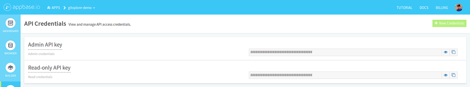
Getting app’s credentials from appbase.io dashboard. Just copy the Read-only API key
Alternatively, you can also copy your app’s credentials from the apps dashboard. Hover over your app’s card and click on Copy Read Credentials.

Alternative to above link: Copy the read credentials from apps dashboard
After adding this you would see a basic layout like this:

After adding the first ReactiveSearch component
3. Adding a DataSearch

DataSearch component
Next, I’ll be adding a DataSearch component to search through repositories. It creates a search UI component and lets us search across one or more fields easily. The updated render function in /src/App.js would look like this:
// importing DataSearch here
import { ReactiveBase, DataSearch } from '@appbaseio/reactivesearch';

...
<ReactiveBase ... >

// Adding the DataSearch here
    <div className="flex row-reverse app-container">
        <div className="results-container">
            <DataSearch
                componentId="repo"
                filterLabel="Search"
                dataField={['name', 'description', 'name.raw', 'fullname', 'owner', 'topics']}
                placeholder="Search Repos"
                autosuggest={false}
                iconPosition="left"
                URLParams
                className="data-search-container results-container"
                innerClass={{
                    input: 'search-input',
                }}
            />
        </div>
    </div>

</ReactiveBase>
...
The DataSearch component goes inside the ReactiveBase component and receives all the necessary data from it so we don’t have to write Elasticsearch queries ourselves. The surrounding divs add some className properties for styling. These just add a layout to the app. You can go through all the styles at /src/App.css which we created earlier. You might have noticed that we have passed some props to the DataSearch component.
Here’s how they work:
componentId: a unique string identifier which we’ll use later to connect two different ReactiveSearch components.filterLabel: a string value which will show up in the filters menu later.dataField: an array of strings containing Elasticsearch fields on which search has to performed on. You can check the dataset and see that these fields also matches the column name. All fields specified here matches the structure of data, for examplenamerefers to the name of repo,descriptionrefers to its description, but there is a field with a.rawadded here,name.rawwhich is a multi-field of thenamefield. Elasticsearch can index the same data in different ways for different purposes, which we can use to get better search results.placeholder: sets the placeholder value in the input box.autosuggest: setting afalsevalue for the prop causes the results to update immediately in the results.iconPosition: sets the position of the 🔍 icon.URLParams: is abooleanwhich tells the component to save the search term in the browser’s URL so we can share a URL to a specific search query. For example, check this link to see all results related to “react”.className: adds aclassfor styling using CSS.innerClass: adds aclassto different sections of a component for styling using CSS. Here, I’ve added aclassto theinputbox for styling. A detailed description can be found in the docs.
With this, our app should get a working search bar:

Adding DataSearch component
4. Adding the Results view
Next, we’ll be adding the Results component at /src/components/Results.js and importing it in /src/App.js.
Here’s how you can write the Results component:
import React from 'react';
import { SelectedFilters, ReactiveList } from '@appbaseio/reactivesearch';

const onResultStats = (results, time) => (
  <div className="flex justify-end">
    {results} results found in {time}ms
  </div>
);

const onData = (data) => (
  <div className="result-item" key={data.fullname}>
    {data.owner}/{data.name}
  </div>
);

const Results = () => (
  <div className="result-list">
    <SelectedFilters className="m1" />
    <ReactiveList
      componentId="results"
      dataField="name"
      onData={onData}
      onResultStats={onResultStats}
      react={{
        and: ['repo'],
      }}
      pagination
      innerClass={{
        list: 'result-list-container',
        pagination: 'result-list-pagination',
        resultsInfo: 'result-list-info',
        poweredBy: 'powered-by',
      }}
      size={6}
    />
  </div>
);

export default Results;
I’ve imported two new components from ReactiveSearch, SelectedFilters and ReactiveList. SelectedFilters will render the filters for our ReactiveSearch components at one place:

SelectedFilters renders removable filters
ReactiveList renders the search results. Here’s how its props work:
dataField: orders the results usingnamefield here.onData: accepts a function which returns a JSX. The function is passed each result individually. Here we’re generating a basic UI which we’ll modify later.onResultStats: similar toonDatabut for the result stats. The function is passed the number ofresultsfound andtimetaken.react: thereactprop tells theReactiveListto listen to changes made byCategorySearchcomponent, we’ve provided thecomponentIdof theCategorySearchcomponent here calledrepo. Later we’ll add more components here.pagination: abooleanwhich tells the ReactiveList to split the results into pages, each page containing the number of results specified in thesizeprop.
Now we can import and use the Results component in /src/App.js. Just add it inside the div with results-container class.
...
import Results from './components/Results';
...

render() {
  return(
    ...
    <div className="results-container">
      <DataSearch ... />
      <Results />
    </div>
    ...
  )
}
With this component, a basic version of our search UI should start coming together:

Adding the Results component
5. Adding a Header component
Lets create a Header component at /src/components/Header.js which we’ll use to render more search filters.
Here’s how to create a simple Header component:
I’ve moved the navigation code in <nav>...</nav> from /src/App.js here. The Header component has a method which toggles visible in the state. We’re using this to add a class which would make it take up the entire screen size on mobile layout. I’ve also added a toggle button which calls the toggleVisibility method.
It also renders another component called SearchFilters and passes all the props from the parent App component. Let’s create this component to see things in action.
Create a new file /src/components/SearchFilters.js:
import React from 'react';

const SearchFilters = () => (
    <div>
        Search filters go here!
    </div>
);

export default SearchFilters;
Next, I’ll update the App component to use the Header component that we created just now.
6. Updating App component and handling topics in state
We’ll add a state variable in App component called currentTopics which would be an array of currently selected topics in the app.
We’ll then use the currentTopics and pass them to the Header and Results components:
Updating the App component
The setTopics method will set whichever topics are passed to it, which we’ll pass to the Header component. The toggleTopic method will remove a topic from the state in currentTopics if it’s already present and add the topic if it is not present.
We’ll pass the toggleTopic method to the Results component:

Its starting to come together, cheers!
7. Adding more filters
Lets add more filters to the UI in /src/components/SearchFilters.js. I’ll be using three new components from ReactiveSearch here, MultiDropdownList, SingleDropdownRange and RangeSlider. The components are used in a similar fashion as we used the DataSearch component earlier.
Here’s the code:
The SearchFilters component we’ve created above takes in three props from the Header component, currentTopics, setTopics and visible. The visible prop is just used to add a className for styling.
The first component we’ve used here is a MultiDropdownList which renders a dropdown component to select multiple options. The first MultiDropdownList has a dataField of language.raw. It’ll populate itself with all the languages available in the repositories dataset.

The language MultiDropdownList
We’ve used another MultiDropdownList to render a list of topics:
<MultiDropdownList
    componentId="topics"
    dataField="topics.raw"
    placeholder="Select languages"
    title="Repo Topics"
    filterLabel="Topics"
    size={1000}
    queryFormat="and"
    defaultSelected={currentTopics}
    onValueChange={setTopics}
/>
Here’s how the props work here:
componentId: similar to the previous ReactiveSearch components, this is a unique identifier which we’ll later associate in theResultscomponent that we created to get search results.dataField: maps the component to thetopics.rawfield in Elasticsearch.placeholder: sets the placeholder value when nothing is selected.title: adds a title for the component in the UI.filterLabel: sets the label of the components in the removable filters (theSelectedFilterswhich we used in theResultscomponent).size: tells the component to render a maximum of1000items in the list.queryFormat: when set to'and'as we’ve used here, it gives results which matches all the selected tags (exactly like intersection).defaultSelected: sets the selected items in the component. Here we’re passingcurrentTopicswhich we’ve stored in thestateat/src/App.js.onValueChange: is a function that will be called by the component when we make a change in its value. Here we call thesetTopicsfunction which we received in the props. Therefore, whenever we select or deselect a value in the component it would update thecurrentTopicsin thestateof mainAppcomponent.

The topics MultiDropdownList component
The next ReactiveSearch component we’ve used here is a SingleDropdownRange. It uses a new prop called data.
Here’s how it works:
<SingleDropdownRange
    ...
    data={[
        { start: 'now-1M', end: 'now', label: 'Last 30 days' },
        { start: 'now-6M', end: 'now', label: 'Last 6 months' },
        { start: 'now-1y', end: 'now', label: 'Last year' },
    ]}
/>
The data prop accepts an array of objects with start and end values and shows the specified label in the dropdown. It’s mapped to the pushed field in the dataset which is a date type in Elasticsearch. One cool way to specify date range in Elasticsearch is using the now keyword. now refers to the current time, now-1M refers to one month before, now-6M to six month before and now-1y to a year before now.
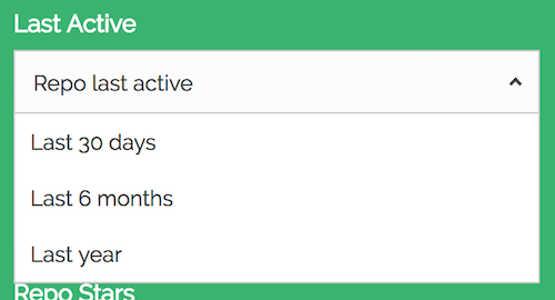
The pushed SingleDropdownRange component
I’ve used another SingleDropdownRange component for the created field in the dataset.
Here I’ve specified year ranges in datetime for different years:
<SingleDropdownRange
    ...
    data={[
        {
            start: '2017-01-01T00:00:00Z',
            end: '2017-12-31T23:59:59Z',
            label: '2017',
        },
        {
            start: '2016-01-01T00:00:00Z',
            end: '2016-12-31T23:59:59Z',
            label: '2016',
        },
       ...
    ]}
/>

SingleDropdownRange component for the created field
The third component I’ve used is a RangeSlider which renders a slider UI. I’ve used to RangeSlider components, one for the stars field and the other for forks.
Two main props that this component introduces are range and rangeLabels:
<RangeSlider
    ...
    showHistogram={false}
    range={{ start: 0, end: 300000 }}
    rangeLabels={{
        start: '0 Stars',
        end: '300K Stars',
    }}
/>
range: prop specifies a range for the data with astartandendvalue.rangeLabels: prop takes the labels to show below the slider.showHistogram: is abooleanprop which shows a histogram with the distribution of data. Here I’ve set it tofalsesince it’s not needed.

RangeSlider components for the stars and forks fields
Now we just need to connect these filters to the Results component. We just have to update one line in the ReactiveList rendered by the Results component to include the componentIds of these components.
Update the react prop in the ReactiveList that we rendered in the Results component:
const Results = () => (
  <div className="result-list">
    <SelectedFilters className="m1" />
    <ReactiveList
      ... // updating the react prop here
      react={{
        and: ['language', 'topics', 'pushed', 'created', 'stars', 'forks', 'repo'],
      }}
    />
  </div>
);
That should make your results update for all the filters 😃

After connecting the filters in the ReactiveList component
8. Updating the results view
Up until now, we’ve been seeing only a basic version of the results. As the final piece of this app, lets add some flair to the results ✌️
We’ll be using another component inside our Results components to render different topics.

Topics component to render these little guys
Here’s how you can create your own at /src/components/Topic. Feel free to add your own taste 😉
Adding the Topic component
This component renders its children and adds a click handler to toggle the topics which updates the currentTopics inside the main App component’s state.
Next, we just need to update our Results component at /src/components/Results.js:
Adding some flair to the Results 😄
I’ve updated the onData function to render more detailed results. You’ll also notice a new sortOptions prop in the ReactiveList. This prop accepts an array of objects which renders a dropdown menu to select how you wish to sort the results. Each object contains a label to display as the list item, a dataField to sort the results on and a sortBy key which can either be asc (ascending) or desc (descending).
That’s it, your very own GitHub repository explorer should be live!
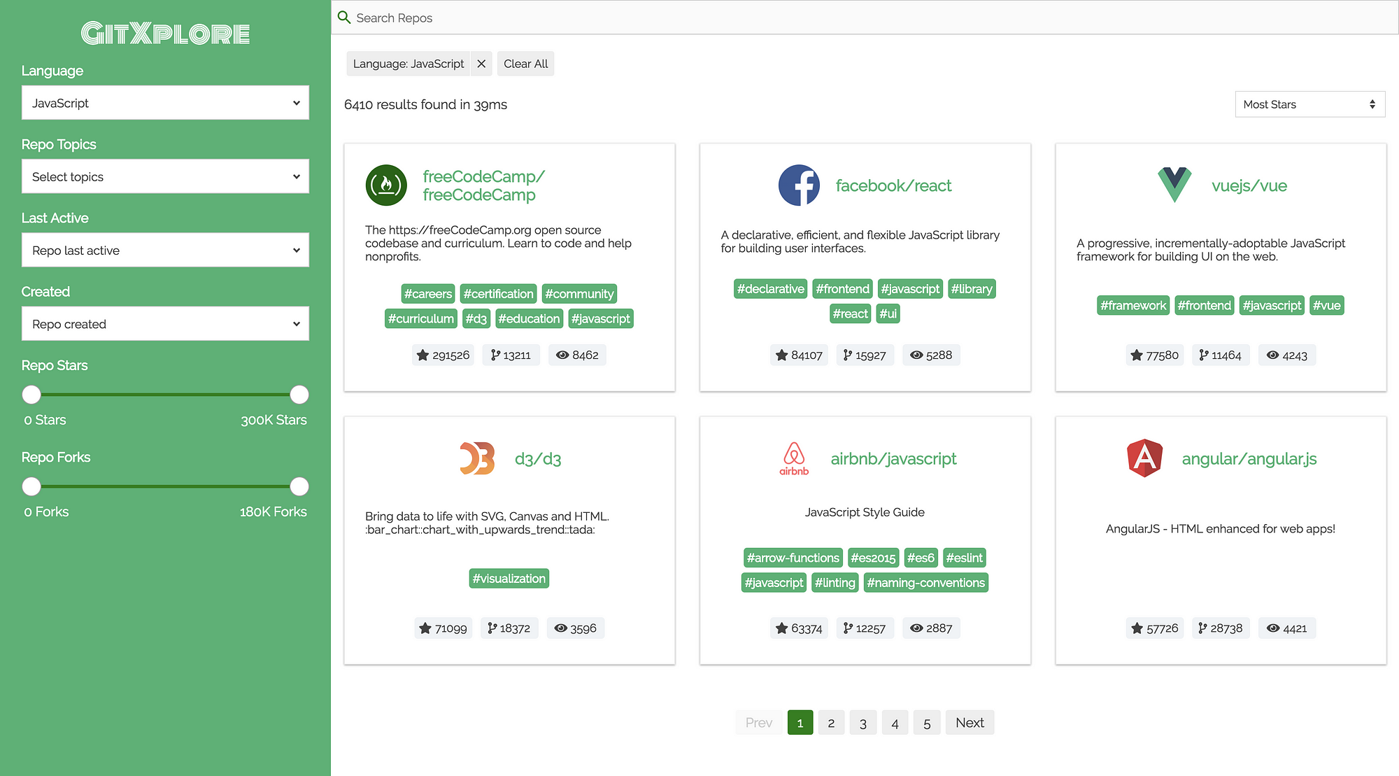
GitXplore final app preview
Useful links
- GitXplore app demo, CodeSandbox and source code
- ReactiveSearch GitHub repo
- ReactiveSearch docs
Hope you enjoyed this story. If you have any thoughts or suggestions, please let me know and don't forget to star the ReactiveSearch repo ⭐.