
Creating a Mobile-Friendly Responsive Menu for Your WordPress Site
This WordPress tutorial will teach you how to create a WordPress responsive menu to optimize your WordPress site for the mobile web.
Introduction
Mere installation of your favorite responsive theme in your WordPress site doesn’t make it accessible on a variety of mobile devices. You need to pay attention to incorporation of responsive design elements that can enhance the user experience of mobile visitors for your WP site. With navigation holding a significant position on any site, it is vital for you to include menus that can enable mobile users to easily navigate from one location to another within the site. Paying heed to this prime concern of WordPress website owners, I’ve written this post which familiarizes you with the stepwise approach for adding a mobile responsive menu to your WordPress website for rendering an awesome viewing experience to mobile viewers. So, let’s get started with the same rightaway!
Step 1
Create a Child theme
In order to create a responsive menu for your WordPress theme(in this tutorial it is Twenty Twelve), first create a child theme. For this, all you need to to is simply create a folder called wp-content\themes\twentytwelve_child and in this folder, add a style.css containing the below mentioned text:
/*
 Theme Name:        Responsive menu theme
 Theme URI:
 Description:    Create Responsive menu for WP sites catering mobile visitors
 Author:         xyz
 Template:       twentytwelve
 Version:        1.0
 */
 @import url("../twentytwelve/style.css");
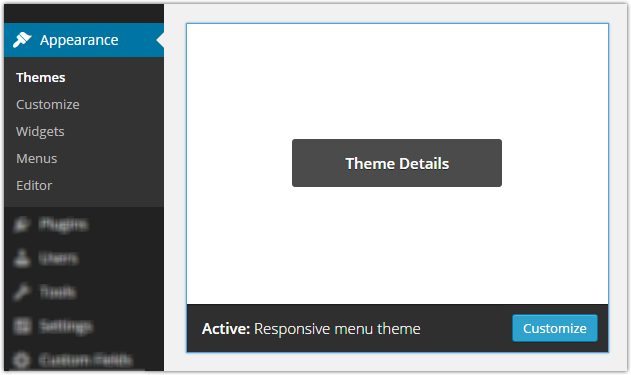
In the above code, Twenty Twelve is the parent theme and the template field represents the child theme. By importing twentytwelve style.css into a new style.css, you are in a way fetching all the styles of the parent theme. After adding the style.css, you’ll be able to view the child theme in the WP admin section. Just activate this child theme for your site. Here’s a screen-shot for the same:
Step 2
Register a new responsive menu for your WordPress website
After having created and activated a child theme for your WP site, it’s time for you to add a separate responsive menu which would be specifically used for the mobile version of the website under focus. Here, the very first thing you need to do is create a file called functions.php using the following code snippet:
<?php
 function twentytwelve_child_setup() {
   register_nav_menu( 'primary-res-navigation', __( 'Primary MobRes Navigation', 'twentytwelve_child' ) );
 }
 add_action( 'after_setup_theme', 'twentytwelve_child_setup' );
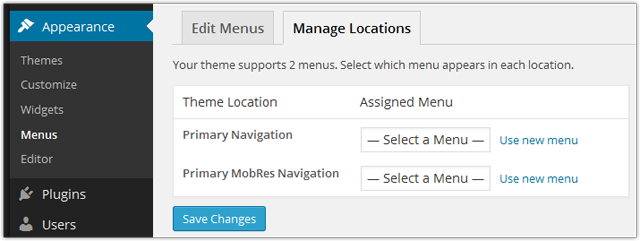
On observing the above code carefully, you’ll find that I’ve hooked into the action after_setup_theme and called a function names twentytwelve_child_setup. The action hook after_setup_theme is being called after each page, once the WP theme has been initialized. Additionally, by calling the function named twentytwelve_child_setup, I’m registering a new custom responsive menu which I’ve named as “primary-res-navigation”. For this, I’ve used the WordPress function called register_nav_menu. Once you’re done with all this, you’ll be able to view a custom menu in the WP admin section as shown in the below screen-shot:
Since the custom menu is the main header menu, you will be required to add a code for displaying the same( primary-res-navigation menu) in the header.php file. For this, you simply need to create an exact copy of the header.php file using your parent theme and just add the below line of code:
<?php wp_nav_menu( array( 'theme_location' => 'primary-res-navigation', 'menu_class' => 'nav-res-navigation' ) ); ?>
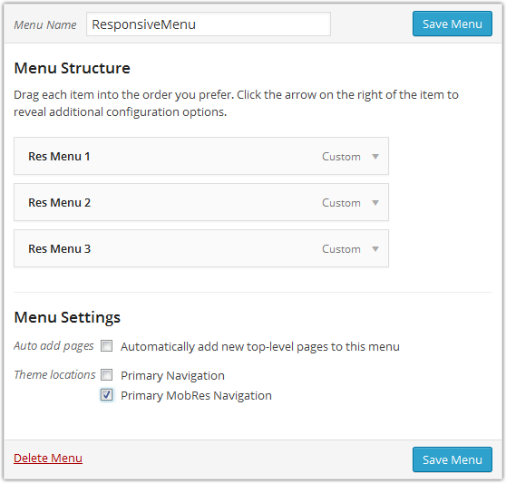
After this, simply go to the menu admin and go ahead with creating a new mobile menu, followed by adding specific links that you want to display on the mobile menu. Attach all this to your primary mobile menu theme location. Screen-shot for this is displayed below:
If you’ve done everything as expected, then you’ll be able to view both the menus viz: primary menu and primary-mobile menu as shown in the below screen-shot:
Step 3
Style the primary-res-navigation menu
Now that you’re done with adding the new custom menu i.e. primary-res-navigation menu, you’d want it to show up only on mobile devices and not on the desktop computers. For achieving this, you can use the css media queries. Add the below line of code to style.css for not showing up the mobile menu by default:
.nav-res-navigation {
  display:none;
}
Next, when the website is being viewed on mobile screens, you’d want to hide the main menu and display only the primary-res-navigation menu(the one that has been created by you). Additionally, you might also be interested in embellishing your menu with a differently styled border. For this, you simply need to add the below code snippet to your style.css file:
@media only screen and (max-width:480px) {
 .nav-res-navigation{
   display:block;
 }
.nav-res-navigationa{
   background:#333;
   color:#FFF;
   padding:5px0;
   text-align:center;
   display:block;
 }
.main-nav-menu{
   display: none;
 }
}
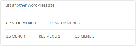
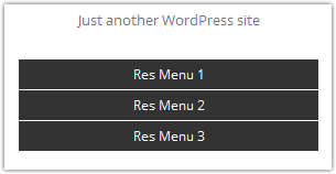
Through the above code, I’ve displayed the mobile menu for small screens, followed by hiding the main menu. The media query tags get activated only under the situations where the screen size matches the one specified by us. Hence, whenever a user visits your WP site on a small screen, he/she will be able to view only the mobile menu as shown in below screen-shot:
We’re done!
Summing Up
In order to ensure that your mobile visitors’ aren’t frustrated while surfing your web pages, it is vital to provide them a fully-functional menu that is easy-to-use. Here’s hoping the above post would have helped you in understanding the approach that needs to be followed for achieving a responsive menu that’s capable of pleasing the mobile visitors for your WordPress website.
About the author: Amanda Cline

Currently employed with Xicom Technologies Ltd., one of the leading mobile app development companies, Amanda can serve as an excellent asset for your web and mobile development projects. You can contact her via @amandacline111. She has also written interesting and informative articles on Custom Software Development, Mobile Application Development etc.