
Bulma CSS - Short introduction and Samples
Hello Coders,
This article is a short introduction to Bulma Css - the popular open-source CSS framework based on Flexbox. For newcomers, Bulma Css is a great alternative to Bootstrap being modular, developer-friendly, and easy to customize. At the and I will mention a few open-source production-ready starters (and commercial) styled with Bulma for all curious minds that read this content.
Thanks for reading! TL;DR;
- What is Bulma CSS
- How to use/import Bulma CSS
- Bulma basics: layouts, elements, components, forms, hero components
Bulma Starters - the short-list for fast runners
- (New) BulmaPlay - open-source starter
- (Free) Bulma Starter - super simple one page starter
- (Free) Bulma Fresh - Playful one-page design styled with Bulma CSS
- (Free) Bulma Krypton - Cryptocurrency Starter styled with Bulma CSS
- Flask Dashkit - premium Bulma starter
- Django Dashkit - premium Bulma starter
Bulma Play
Simple, one-page starter styled with Bulma v0.9.1 released under the MIT license on Github. Being a simple Flask starter, this Bulma-based design can be integrated with ease into any Python-based framework like Django, FastAPI.
- BulmaPlay - product page
- BulmaPlay Demo - LIVE deployment
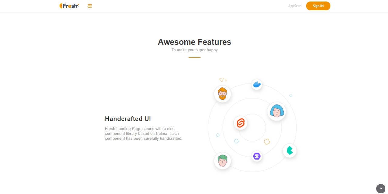
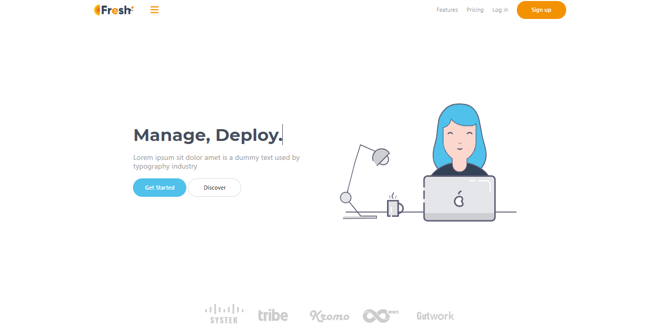
Bulma Fresh
This is a super simple one-page starter with a hamburger menu and a popup for authentication forms. The UI is crafted by Css Ninja agency and the code can be downloaded directly from Github under the MIT License.
- Bulma Fresh - source code
Bulma Krypton
Krypton is a one-page landing page starter built by Css Ninja Studio. Krypton is licensed under the MIT license and based on this permissive license, the UI can be used for unlimited hobby & commercial projects
- Bulma Krypton - source code

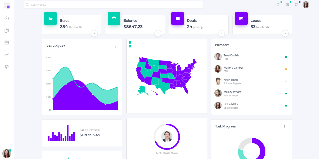
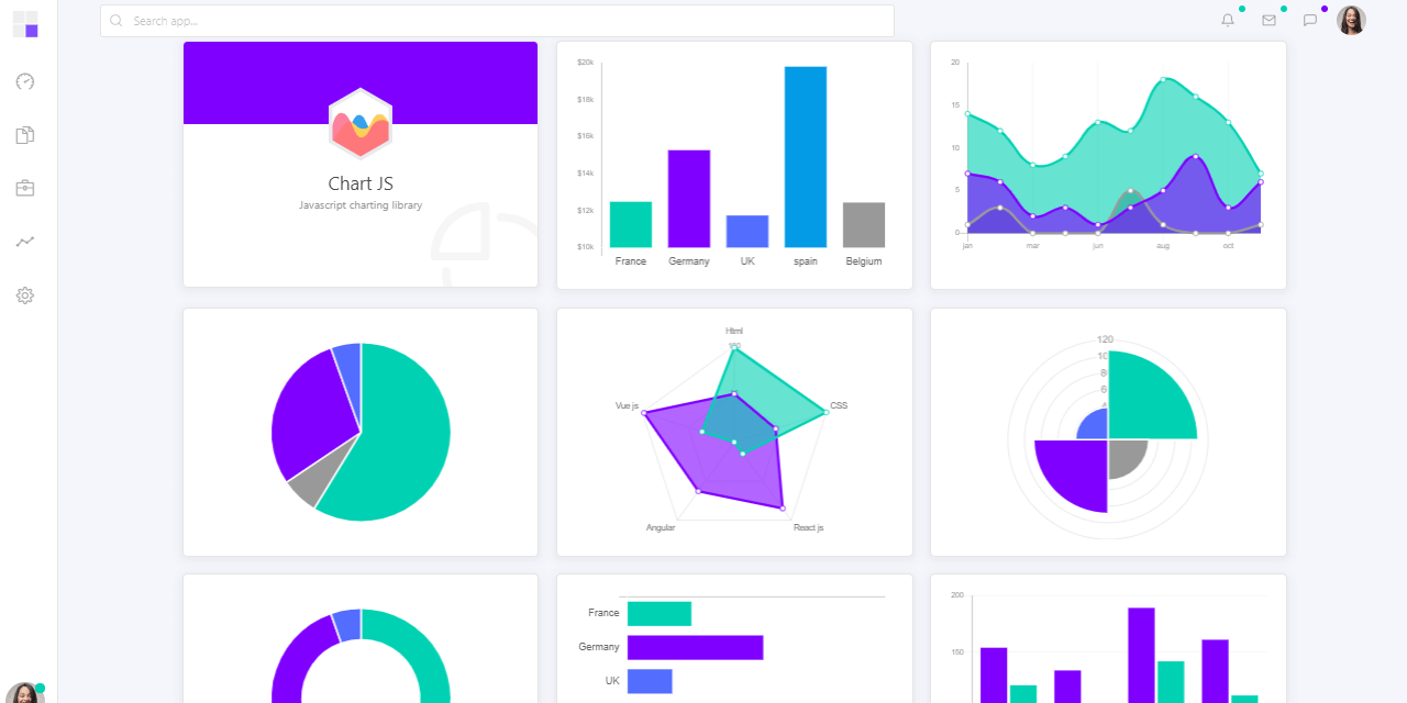
Flask Dashkit
Admin Dashboard coded in Flask Framework on top of Dashkit Dashboard design (PRO Version) designed by CssNinja.
- Flask Dashkit PRO - product page
- Flask Dashkit PRO - Demo - LIVE deployment
Django Dashkit
Admin Dashboard coded in Django Framework on top of Dashkit Dashboard design (PRO Version) designed by CssNinja.
- Django Dashkit PRO - product page
- Django Dashkit PRO - Demo - LIVE deployment
Bulma CSS
A few reasons to use it
- Lightweight, modular, and JS Free
- Modern Framework - based on Flexbox specifications
- Mobile-first, responsive
- Built-in components: Cards, Tabs, Menus
- Actively supported and versioned by 300+ contributors
To get started with Bulma is quite easy. We can open an editor, create a minimal HTML file that includes Bulma CSS from a CDN source:
<!DOCTYPE html>
<html lang="en">
<head>
    <title>Bulma CSS - Starter Page</title>
    <link rel="stylesheet" href="https://cdn.jsdelivr.net/npm/bulma@0.9.1/css/bulma.min.css"  crossorigin="anonymous" />
    <link rel="stylesheet" href="https://cdnjs.cloudflare.com/ajax/libs/font-awesome/5.15.1/css/all.min.css" crossorigin="anonymous" />

</head>
<body>
    <div class="container is-fluid">
        <!-- Add Bulma Magic Here -->
    </div>
</body>
</html>
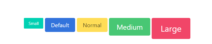
Bulma - Buttons
The code snippet that code some simple buttons is fairly simple:
<button class="button is-primary is-small">Small</button>
<button class="button is-link">Default</button>
<button class="button is-warning is-normal">Normal</button>
<button class="button is-success is-medium">Medium</button>
<button class="button is-danger  is-large">Large</button>
The output for this code looks like on this screenshot:
Bulma - Contact Form
In this section, we will style a contact form with an image on the left and the form fields on the right.
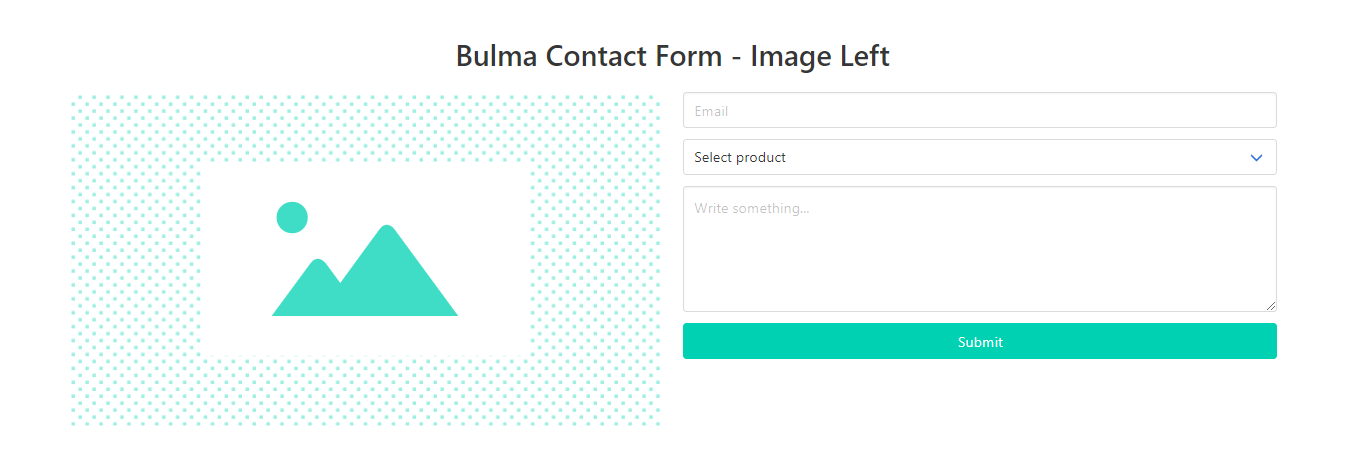
The relevant code:
- Define a container for all elements: class "container"
- Define two columns with 6 rows each: class "column is-6"
- The left container will expose the image
- The right container will contain the form:
<form>
    <div class="field">
        <div class="control">
            <input class="input" type="email" placeholder="Email">
        </div>
    </div>
    <div class="field">
        <div class="select is-fullwidth">
            <select>
            <option disabled selected>Select product</option>
            <option>Product 1</option>
            <option>Product 2</option>
            <option>Product 3</option>
            </select>
        </div>
    </div>
    <div class="field">
        <div class="control">
            <textarea class="textarea" rows="5"></textarea>
        </div>
    </div>
    <div class="field">
        <div class="control">
            <button class="button is-primary is-fullwidth">Submit</button>
        </div>
    </div>
</form>
Bulma - Team Cards
Using cards for our team or pricing is quite a common component used in many templates. Bulma helps us to code a team section using a minimum CSS code:
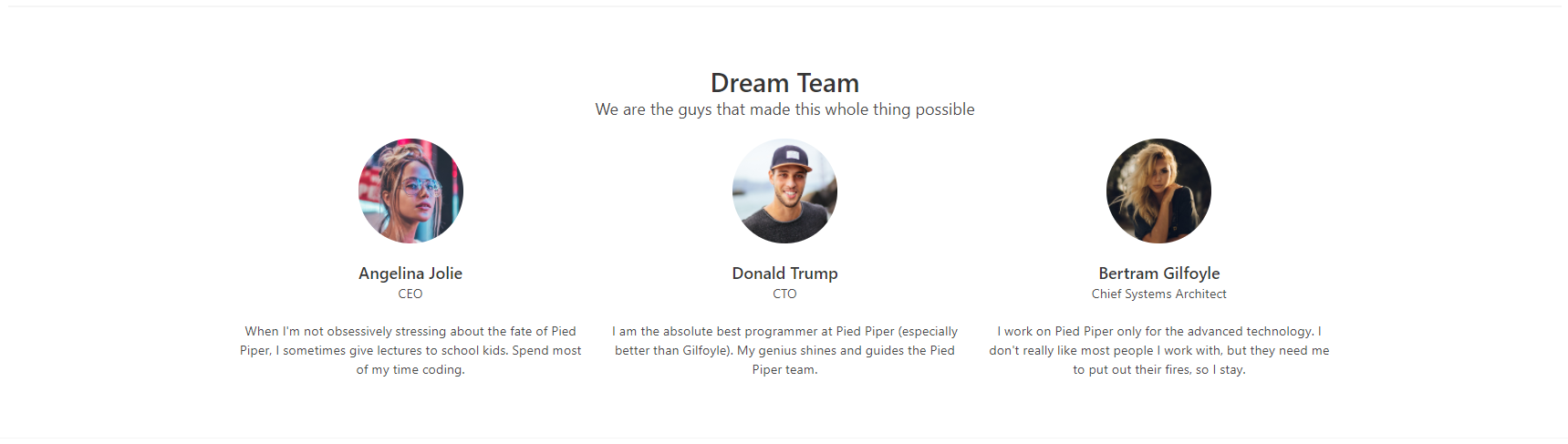
Let's take a look at the first card and analyze the relevant CSS classes:
<div class="column is-4">
    <div class="level">
        <div class="level-item">
            <figure class="image is-128x128">
                <img class="is-rounded" src="media/team-1.jpg" alt="">
            </figure>
        </div>
    </div>
    <h5 class="title is-5">Angelina Jolie</h5>
    <p class="subtitle is-6">CEO</p>
    <p>When I'm not obsessively stressing ...</p>
</div>
- The card width has 4 cells (we need three cards on a row)
- The Image has the figure container and the inner "is-rounded" image
- The descriptors "is-5" and "is-6" are classes defined for headings objects
Bulma - Hero Component
This component can be invoked by using class "hero" as the main container and this will code a full-width banner on the page.

Bulma - Cards
The card component comprises several elements that you can mix and match. All card elements should be bundled inside a "card" container:
- card header
- card image
- card content
- card footer
Let's visualize a sample with for cards styled with an inner image, text, and a loading bar.
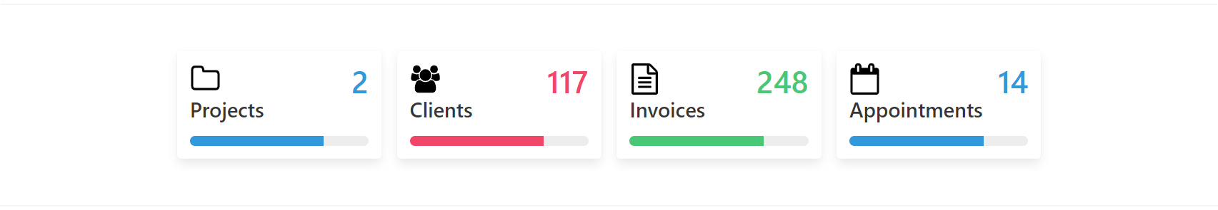
Here is the code for the first card:
<div class="box">
    <div class="media">
        <div class="media-left">
            <figure class="image is-48x48"><img src="media/icons/folder-o.svg">
            </figure>
        </div>
        <div class="media-content has-text-right">
            <h3 class="title is-1 has-text-info">2</h3>
        </div>
    </div>
    <h4 class="title">Projects</h4>
    <progress class="progress is-info" role="progressbar" value="75" max="100">
    </progress>
</div>
This card can be customized by changing the CSS qualifiers provided by Bulma:
- Resize the image by using class is-96x96 (image gets a double size)
- Update the Number and class to has-text-warning
- Progress bar to use is-success class and value 25 of 100
With all those changes applied, the new layout is:

To learn more about this amazing framework feel free to access the official Bulma CSS website or jump directly and read the docs. To pass over the theory, we can take a look at a few Bulma CSS starters already coded and customized.
Thanks for reading! For more resources please access:
- Bulma CSS - official website and docs
- More Bulma CSS apps and starters provided by AppSeed
- Bulma Builder - a handy tool to create Bulma -based templates in minutes
Thank you! Btw, my (nick) name is Sm0ke and I'm pretty active also on Twitter.