Find a developer for live mentorship & freelance projects
Get help from vetted software developers
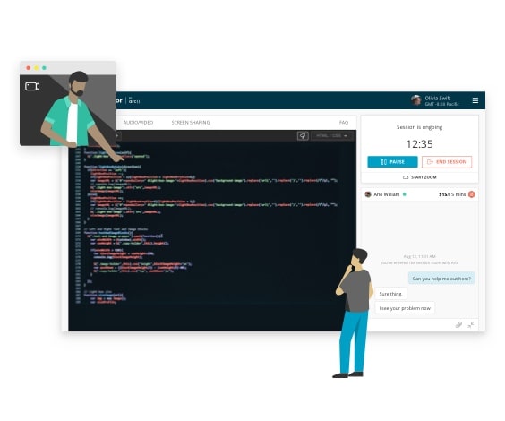
One-on-one live mentorship
- Debug with the help of an expert
- Personalize your learning experience
- Get answers to complex problems
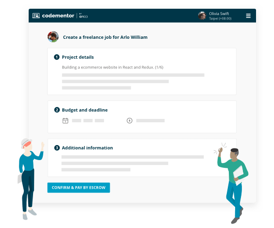
Project-based freelance work
- Find experts for on-demand code review
- Build features for your existing product
- Turn your idea into an MVP

Hiring for a bigger project?
Arc helps you find senior developers for both permanent full-time roles and 40+ hour contract projects.
Visit Arc to learn moreConnect with 12000+ top developers anytime

Jessamyn Smith
Experienced Full-Stack Web Developer


Daniel Hamilton
Senior Software Engineer @ Indeed


Martijn Pieters
#1 Stack Overflow Python Answerer


Ionică Bizău
Full-Stack Developer


Miroslav Kuťák
Senior iOS Developer


Ben Gottlieb
Senior iOS Developer and Consultant
Start working with our developers
What you'll find on Codementor

A variety of technologies
From JavaScript and React to Swift and Go, our developers cover it all.

Code help from experts
Our developers go through a strict application and vetting process, leaving only the best.

Effortless setup
Take advantage of our easy set up and billing process to connect with a developer right away.